- In The News

How to Make an Essay Look Longer
It’s somewhat difficult to make demands on essays for students – demanding that they have 500 words, for example, leads to really, really, very, extremely superfluous lists of adjectives and describing words like this sentence to up the word count. Other teachers use the page count as a metric of completion. But what happens when you have 4 and a half pages done of your five page essay? There are plenty of writing techniques to flesh ideas out and make it longer, but I’m assuming that your essay is perfect as it is and you want a more technological answer. Here are a few techniques that have served me well. I use them all the time.
Note: This tutorial is for Microsoft Word as a part of Office 2007, although many of the same techniques can be used in previous or subsequent versions of Word.
Font Choice and Font Size
First, font or font size is a fairly easy way to make an essay longer. Some teachers demand that Times New Roman size 12 be used. However, when they forget to add that to the rules, you can change it to whatever you want (assuming there’s no blanket statement about it on the syllabus). You want to choose a font that maximizes height. Obviously you don’t want to choose a font that’s too difficult to read, as it may annoy the person grading it. Below is a picture of the word “Hello” printed four times, each at size 12. The fonts, from left to right, are “Angsana New”, “Calibri”, “Times New Roman”, and “Algerian”.
Font size can also make a big impact on your paper. Going with a size 72 font will undoubtedly make your paper surpass the required page count, but isn’t the best idea. Just changing the font size from 12 to 13 can add a few lines to your paper. Below is a picture of identical text in two columns, both in Times New Roman, but size 12 on the left and size 13 on the right.
Even if your teacher demands size 12 Times New Roman, you might be tempted to change it anyway. Slight changes are fairly hard to measure in a printout, however, it is possible. For instance, if a teacher were to print out the word “the” in Times New Roman size 12 on a piece of transparency paper, they could then hold it over a word “the” in your essay and confirm whether or not it’s identical. Probably not going to happen, but it actually has happened to me before.
Space Between lines
The spacing between lines is very difficult to measure because although in most fonts the top and bottom edges vary significantly. In some fonts, there is a common edge except for letters that hang above or below the line, but in fonts that are meant to look more like handwriting, there is not. In any case, even with common edges, it’s not likely that your teacher will whip out a ruler and measure. Too large a gap may arouse suspicion, but changing an essay from double spaced to 2.1 spacing may actually make a large difference. The thing to remember is that the longer the base essay, the more they amplify the length. So for instance, if your essay is 10 lines with double spacing, and you change the spacing to 2.1, you get an extra 0.1 of a line for every line you’ve written, and 0.1×10 = 1. So, for every ten lines you actually write, you get the effect of having written eleven instead. For an essay that’s 4.5 pages, this tiny change can easily bring you over the 5 page mark and is virtually undetectable. Below is two paragraphs, the left with single spacing and the right is 1.1 spacing. This really demonstrates the potential of the small change.
To change the spacing between lines, you’ll need to access the “Paragraph” menu (I believe that in older versions of Word this could be done by going to Format -> Paragraph). In Word 2007, it can be accessed by going to the “Page Layout” tab of the ribbon and clicking on the pop-out button of the Paragraph rectangle.
From there, under Line Spacing, choose “Multiple”, and under At, choose a number close to something normal, like 1.1 or 2.1. You can increase this difference at the risk of the teacher noticing.
Changing the margins of a page is another great way to change the length of your paper. By decreasing the amount of space the words can take up per page, you increase the number of pages required to fit your existing content. Changing the left margin is a bit risky since most papers are left-justified, meaning that the left edge will be relatively the same for all papers. The right margin, however, can be changed to your heart’s content, since the length of words, number of letters, and number of spaces greatly affect each line’s right edge. You can also increase the amount of space taken up by the header and footer of a document.
Lengthen Header Content
One final way you can make a paper appear longer is by adding more lines to the header of your document. If you make it too long, be sure to have it on only the first page and not every page, as this would be incredibly obvious.

Other Notes
If your teacher demands that an essay be 5 pages long and no longer , but your paper is slightly longer, you can use these same techniques in reverse to make your paper look shorter . For instance, you can change double spacing to 1.9 spacing, or increase the margins.
110 Comments
If you must have MLA format and the essay is turned in electronically the teachers will be able to see the changes of font size and other things. So the easiest thing for me is to increase the font size of just the periods to 14 instead of the required 12 font. This makes your essay lines more spaced out and sentences longer. Even though it is not a huge change, it makes a very big difference.
In addition to that, I usually add just enough description to my sentences in order to barely create one new line of text before going to the next paragraph. It is also beneficial to end a paragraph on the second to last line of a page. That way the next paragraph is forced to appear on the next page altogether.
If you are turning in your essay online, use these and the larger font periods only, as everything else will likely be checked by the system when you upload it.
If you turn it in online, turn it in in PDF format, it’s standardized and they can’t see the font size easily
Unfortunately, this is not true. While it may not be obvious ow to inspect a PDF to get the font, the easiest thing to do is copy some text and paste it into Microsoft Word – it’ll retain its font.
This + the commas
THANKS GANG
REALLY REALLY LIKE THIS
This helped me so much!!!
It’s 5 am, my paper’s topic would have sent me to sleep hours ago if it weren’t for the Red Bulls, and you’ve been added to my list of “People I Will Buy a Drink for if I Ever Meet Them”.
You my good sir have just made my night! If you’re ever in Atlanta I will be MORE than happy to buy you a drink as well! 🙂
I don’t know you. But I love you.
You are amazing. Another thing that I tried at one time was to bold the periods. it made my 4 1/4 page research paper into a 5 page paper. Just trying to help out some more.
Recently I had to write a 12-page essay on a mostly-factual topic. It wasn’t pretty. I was on the eleventh page when I found that I simply couldn’t add any more to the paper no matter how I tried. A quick change to all the margins from 1.0 to 1.1 boosted my essay to fill the entire twelfth page! I wish I had found this article earlier, though, as I didn’t know that modifying the left margin is risky.
In retrospect, I really should have just changed the line spacing from 2.0 to 2.1, but I couldn’t figure out how to do that thanks to Word’s confusing line spacing interface. Now I know that I can set the spacing to “multiple” and achieve the desired effect!
I also recommend “adding space between paragraphs of the same style” as is done by default in Word 2010. It doesn’t make a really significant difference, but for every paragraph you write you’ll gain about 1 extra line.
To all you essay writers out there: these techniques should really only be used as a last resort. If you are able to flush out your entire essay, do that instead of modifying its layout. Only when you are completely stuck and need just one more page or so should you use the strategies here.
I was struggling to write 10 pages of term paper. Thank you for the tips!!!!
10? I can barely write 5 wow
Thank you!! =,) Thank you so much!
tnx so much that helps a lot .I had to write 3 pages and I only had 1 page and ur advice works!!!!!!!!!!!!!!!!!!!!!!!!
You sir are amazing. Thank you SO SO SO much.
I owe you a drink sir. It’s 5:00 A.M. and this paper is due in a few hours. Five and a half pages out of eight! Tough night oh and screw Marry Shelley and Frankenstein.
in college i made my periods a font size bigger and doing that to all puntuation can add up to 1/4 to a page and teacher will NEVER know
I have two 12-15 page research essays due in the same week and this post just saved my life. I never would’ve thought of changing the line spacing from 2.0 to 2.1, but it added about another page length to what I’d already typed. Bless you.
ERMERGERD these pointers helped out sooo much I absolutely hate typing term papers for my class and this helps out a bunch THANKS A MILLION.
praise the man, you are the new black baby jesus. bruh, you are my sunshine on a cloudy day, I am your loyal friend to the ends of the fiery underworld, all of the twinkies shall be yours. may your palm tree forever sway high.
This…I…well, thank you, brother. This is the greatest comment I have ever received. I feel giddy.
Hey, I’m a TA and when I have to grade lab reports, I always select all and change to 12pt times new roman even if it looks like it is already, and I check the margins and spacing. I don’t actually ever have to take points off for length, just check to make sure that the essay has x number of examples of y thing and an explanation for each. Be careful because I know a few of the English TAs do that to all the papers before the prof. grades them if the TAs aren’t grading.
thank you sooo much you just saved my English grade and my date that was depending on my English grade. you are the best person ever I love you!!!
3 page assignment due by the end of tomorrow, and had really hit my limit at around 2 1/2 pages of B.S’ing. You’re the real MVP tonight.
Go to the Font Dialog box (Ctrl+D) and under character spacing change from normal to expanded very subtle but gives you a couple lines
I love you.
You are amazing, this helped me so much, Thank you
i literally used to use all of these in high school, i just wish i could have found this page instead of having to figure it out on my own
If your page is a little too long, try changing the font to Garamond, it looks the same as Time New Roman, but is smaller
Are you married? If not, I’d totally marry you for this advice. Thank you so much, brilliant person!
For me I had a required 12 point font size but if you type in a 12.5 point font size the it really helps without being too noticeable on a printed copy.
Another good tip is to change the font color to grey instead of black (on the printed papers) This is a good tip because it will make the words pop off the page less, and therefore the teacher will have a harder time reading what you wrote. This is also good because if your teacher magically notices your letters are the wrong shade, you can blame it on your printer.
There’s something so rewarding about sitting here screwing with margins, spacing, adding random and pointless space lines to the header, and going through the entire paper making every blessed period 14 pt font until the paper is long enough. Thank you so much for the tips!
Arial looks to be larger than Times New Roman and is a standard looking font
Useful… very useful… although I turn my work in electronically, my teacher allows this stuff, because he used this kind of thing in school
there is a font on 2013 word called verdena, its like calibra but a little bigger. changing all of the periods to size 16 is very useful too
Another tip-increase the size of periods, commas, apostrophes etc. Ex if I’m typing in 12 size font, I increase the size for periods, commas etc to size 14.
Another thing that might help is to have more paragraph breaks.
Thxs so much man ur a life saver! 2.1 Is the best spacing and so hard for my teachers to notice
Thank You… Thank You Very Much.
Another good way to increase the amount of writing without actually writing more is to mess around with widow-orphan controls (Under line-spacing options). You can set it so that if you write a paragraph with one word on the next page, it’ll put another line on that page to make the one word less lonely. That can add at least a half-page if you work it right.
This is so helpful!
Awesome. Better tip – Courier font is the biggest font and still passes as acceptable on essays. Check it out, I promise.
You just made my 15 page paper much more delightful. AP classes in high school are an absolute pain! 🙂
Another way to make your paper longer is to double space between sentences. Not the double space between the lines, but in between the sentences double click the space bar. It’s what I’m doing right now and you might not have noticed until I told you.
Its 2016, I’m exhausted, and I had to crank out 12 pages. You may not even read this comment. But you are a true American Hero. If you are ever in the state of Michigan (particularly the lower peninsula), I will purchase you a beverage. Infinitely grateful. Best of luck to you, sir!
THIS HELPED SO MUCH WITH MY 30 PG ESSAY
Verdana seems to be the largest proper looking font I’ve seen so far. I highly recommend it.
The thing i do the most to make a paper longer if specifics are required is 2 spaces after the periods. depending on the length of the paper it can add half a page or more. I wrote a 75 page paper over the summer, with every detail specified, except nothing about spaces between sentences. 69 with one space, 72 with 2.
This just saved my life. English 1101 is going to be the death of me….can’t wait for next semester.
OMG. Heart u! My teacher says she knows a font near identical Times N Roman, but a teeny bit wider, so it makes 3 pages 3.5 pgs. Any Ideas?
Also, changing the file type to a pdf if you have to turn it in electronically will confuse the hell out of most english/humanities teachers to the point where they’ll never discover a 2.3 spacing change in between paragraphs
http://cdn1.thecomeback.com/wp-content/uploads/sites/94/2015/02/Screen-Shot-2015-02-19-at-11.56.00-AM.png You the real MVP
Not a typical trick but if it is permitted use Chicago style citations (or any footnote based citation style… if any others exist). While it does not technically add to the length of an essay as references do not count the lines upon lines of footnotes can add pages upon pages to an essay. At certain points I have literally had half the page just be lines of footnotes. While it obviously adds nothing it does provide the illusion of a lot more going on, especially if it is something you have to print out. Plus you know it looks better, is easier to read, and makes paraphrasing a breeze.
I use the Courier New font. It is by FAR the best font, not only because it looks cool, but because it is MEGA HUGE. It saved me a TON of space on my English Essay. My teacher passes it because it is an “adequate font” and “not a fancy, hand-writing-type font.”
If your essay is to be turned in digitally, there is an extremely underhanded tactic that can be used to increase word/character count. Turn the font color to white, then place random periods in your essay. This will cause the character count to go up, and is almost impossible to detect unless it is being actively searched for.
This man has saved me on around 50 essays and will continue saving me. Tank you Jacob Binstein.
Thx sooo much!!
Thank you so much! This is very helpful:) Xx Ali
THX SO MUCH!!!!
Oh my god thank you so much
Another cool trick is to use the replace all tool to change just the punctuation from size 12 to size 14 fonts.
I have a 2-page essay due in 9 days and I can’t include pictures or sites in the length. This will help a lot. Thanks!
wow this actually really helped with my paper. thanks so much but I wish I found this a few years ago.
this saved my aSS LAST YEARRRR
THANK YOU SO FUCKING MUCH
thIS SAVED ME LAST YEAR THANK YOU SO MUCH BRO
Thank you, so much man you are so amazing btw a really good font that you can use is courier new and it makes it look good and takes up a lot of space just saying think about using it.
Merriweather is bigger than all of your fonts.
Cambria looks exactly like Times New Roman but is slightly larger which will make it still look like it is in MLA format
A G I W Y A (a genius is what you are)
Nice job! thank you!
Thank you!! I am bolding the periods and changing the line spacing!! Helped so much! <3
Thanks, bro. More like Jacob Einstien bro. Heck yeah, man.
Hi, I’m a college instructor, and we know all these tricks. Some of them I deduct points for. Others I will return an essay ungraded for. You know what is an even better idea? Write to the actual demands of the assignment.
Or don’t, but ooh I hope you end up in my class.
Some instructors know some of these tricks. But it would be a far cry to say that all instructors look for all of these.
You know what’s an even better idea than searching out articles which, to you, are apparently irrelevant? Writing assignment instructions which don’t require an exact number of words.
Good Job Jim! Congrats on killing the creativity of the nation and forcing students to suffer through your class by making them meet arbitrary standards that teach them to use fluffy jargon instead of clear concise points! Pat yourself on the back Jim!
You can also hit enter a couple times in the header sections, which effectively makes each page start a couple lines farther down.
Thx this is a great advice. I have to write a paper for civics and i will totally use this!!!!!! 🙂 😉
Lol that professor’s comment cracked me up Thx for the laughs.
Some of the best advice I have ever received on increasing page length of an essay, is to go through each paragraph, and try to find a way to add words so that the last line just barely word-wraps.
What I mean is that the last line of each paragraph should have only 1 or 2 words. This makes a huge difference, especially if you have a lot of paragraphs.
I don’t think I’ll worry about my teacher noticing any of these tricks since when I asked him if he wanted the paper in MLA, he asked what MLA was… Thanks for this!
any one here in 2019?? Oh and thks
Courier New is way bigger that Algerian.
the font “Press Start 2p” is the largest font for Google Docs
I just finished a 20-page paper for a test and this has really helped. One other thing I recommend is adding a space before and after each paragraph. Press Ctrl+A to select everything, then add a space before and after each paragraph to get every paragraph.
I’m on week 8 of procrastinating and have a paper due in 5 days. These tips helped! Thanks so much 🙂
bro your a genius i got a A on my book report
Im on page 9 of a 10 page essay and I was wondering if I change the font size from 12 to 12.5, would it be too noticeable? It adds length, i’m just hoping my professor and TurnItIn won’t detect it.
Thank you so much! Ur a Lifesaver!
This is so funny, looking at all the comments they are either written really late at night or super early in the morning hahaha.
This is genius! They didn’t tell me anything about margins, so I changed it!
fuckin genius, bro
*adds yours name to ‘list of fckin geniuses’*
i just realised one more thing that can help— use the REALLY REALLY long dashes instead of colons or semicolons. It takes more space and though it’ll barely make a difference, im so proud of thinking of that myself
It has been 10 years, and we are all still struggling with essays.
the biggest font is actually roboto mono
My teacher only said 1 page size thirteen and what it had to be about. thank you
Hey! Nice article. I agree with you that choosing the right font and font size is very essential. Your content contains different valid points and is very beneficial for all designers. Thanks.
ooooh thanks for the advice!
don’t forget typing random words and making them white
thanks for the advice
MY ass is saved It’s almost 8pm and i have an english 5 pg essay to write. A Geography 5 page essay to write and presentation. And 20 lessons of calculus to get done before tomorow morning.
Leave a Comment Cancel Comment
Your email address will not be published. Required fields are marked *
SEND A MESSAGE
Times Newer Roman is a sneaky font designed to make your essays look longer
For when you need to hit that five-page minimum, but you’ve run out of things to say.
By Chaim Gartenberg
Share this story
:format(webp)/cdn.vox-cdn.com/uploads/chorus_asset/file/13110849/ilqnZzOw.png)
As someone who is ostensibly a professional writer, I can say with some authority that sometimes, writing is hard. And when you’re staring at page three of an essay that your professor has insisted should be at least five pages, single-spaced, in size 12 Times New Roman font ... sometimes, you need a little help.
Any skiving student worth their salt knows the usual tricks to make an essay look longer: use larger punctuation marks and spaces, mess around with the margins, maybe even try to creep up to a larger font size. But now, there’s an easier solution: Times Newer Roman , a font from internet marketing firm MSCHF (which you may remember from the Tabagotchi Chrome extension ). Times Newer Roman looks a lot like the go-to academic font, but each character is subtly altered to be 5 to 10 percent wider, making your essays look longer without having to actually make them longer.
Please note: The Verge does not actually condone cheating on your essays
According to Times Newer Roman’s website, a 15-page, single-spaced document in 12 point type only requires 5,833 words, compared to 6,680 for the standard Times New Roman. (That’s 847 words you don’t need to write, which is more than twice the length of this post!)
:format(webp)/cdn.vox-cdn.com/uploads/chorus_asset/file/13111019/Screen_Shot_2018_09_18_at_2.07.59_PM.png)
To get around things like the fact that actual Times New Roman is a licensed font, Times Newer Roman is actually “an altered version of Nimbus Roman No.9 L (1), a free and open-source font meant to mimic the size and look of the original Times New Roman typeface.” All the changes that MSCHF has made simply make the Nimbus Roman No.9 L characters wider, leaving the vertical heights untouched. So, hopefully, it’s tougher to notice the difference.
Of course, it’s the digital age, so there are some downsides: Times Newer Roman will only work for assignments you have to submit by hand or in a PDF. If you’re sending in a Word document using a custom font that professors almost certainly don’t have installed won’t help. Similarly, Times Newer Roman is only useful for hitting larger page counts; if you have a strict word count limit, you’re out of luck.
Times Newer Roman is available now as a free download. (Please note that The Verge does not actually condone cheating on your essays.)
Elon Musk says X staff can get their stock — if they prove they deserve it
No one’s ready for this, valve officially announces deadlock, a game ‘in early development’, starlink has a pricey new plan to stop scalpers, black myth: wukong is too mediocre for all this drama.
More from TL;DR
:format(webp)/cdn.vox-cdn.com/uploads/chorus_asset/file/25286461/247024_Pilot_Pen_CVirginia.jpg "biggest font for essay")
Why can’t I buy a refillable version of my favorite pen in the US?
:format(webp)/cdn.vox-cdn.com/uploads/chorus_asset/file/25261414/1245969948.jpg "biggest font for essay")
Car-tech breakup fever is heating up
:format(webp)/cdn.vox-cdn.com/uploads/chorus_asset/file/6778339/akrales_160629_1114_A_0269.jpg "biggest font for essay")
GM should just bring back the Chevy Volt
:format(webp)/cdn.vox-cdn.com/uploads/chorus_asset/file/25250592/1236120928.jpg "biggest font for essay")
Hey Gen Z, I promise you aren’t aging like milk
- PRO Courses Guides New Tech Help Pro Expert Videos About wikiHow Pro Upgrade Sign In
- EDIT Edit this Article
- EXPLORE Tech Help Pro About Us Random Article Quizzes Request a New Article Community Dashboard This Or That Game Happiness Hub Popular Categories Arts and Entertainment Artwork Books Movies Computers and Electronics Computers Phone Skills Technology Hacks Health Men's Health Mental Health Women's Health Relationships Dating Love Relationship Issues Hobbies and Crafts Crafts Drawing Games Education & Communication Communication Skills Personal Development Studying Personal Care and Style Fashion Hair Care Personal Hygiene Youth Personal Care School Stuff Dating All Categories Arts and Entertainment Finance and Business Home and Garden Relationship Quizzes Cars & Other Vehicles Food and Entertaining Personal Care and Style Sports and Fitness Computers and Electronics Health Pets and Animals Travel Education & Communication Hobbies and Crafts Philosophy and Religion Work World Family Life Holidays and Traditions Relationships Youth
- Browse Articles
- Learn Something New
- Quizzes Hot
- Happiness Hub
- This Or That Game
- Train Your Brain
- Explore More
- Support wikiHow
- About wikiHow
- Log in / Sign up
- Education and Communications
- College University and Postgraduate
- Academic Writing
How to Make an Essay Appear Longer Than It Is
Last Updated: February 2, 2024 Fact Checked
This article was co-authored by Jake Adams . Jake Adams is an academic tutor and the owner of Simplifi EDU, a Santa Monica, California based online tutoring business offering learning resources and online tutors for academic subjects K-College, SAT & ACT prep, and college admissions applications. With over 14 years of professional tutoring experience, Jake is dedicated to providing his clients the very best online tutoring experience and access to a network of excellent undergraduate and graduate-level tutors from top colleges all over the nation. Jake holds a BS in International Business and Marketing from Pepperdine University. There are 7 references cited in this article, which can be found at the bottom of the page. This article has been fact-checked, ensuring the accuracy of any cited facts and confirming the authority of its sources. This article has been viewed 1,779,487 times.
You are writing a paper and the deadline is approaching, but you are nowhere near the page limit. Many students find themselves in this position. Luckily for you, you can lengthen your paper by using a few tricks. Increasing the font size, adding a lengthy header, and manipulating the spacing between lines are just a few strategies you can use to make your essay appear longer. However, be aware that breaking your teacher’s guidelines may result in a lower grade.
Playing with the Font

- Don’t pick a very large font like Arial Black or Lucida Handwriting. Your teacher will notice that you are trying to make your essay longer by choosing a larger font.

Manipulating Spacing and Margins

- If the increase is too noticeable, then try 1.15 or 1.1 instead.
- Because all documents are left justified, avoid increasing the left margin. Adjusting the left margin will produce a noticeable change that your teacher will detect.

Adjusting the Header and Footer

Expanding the Content

- Additionally, if you are quoting or paraphrasing research or literature, make sure to cite it properly. Citations can add extra length to a paper as well.

- Expand your introductory paragraph with an attention-getting statement to hook the reader in.

- However, try to avoid being descriptive when it is unnecessary since this may cause your paper to appear embellished or sound verbose.

Community Q&A
- Copy and paste your paper into a new document. Make these changes to the new document. Then compare and contrast the document with the changes to the original document. Remove any adjustments that seem obvious. Thanks Helpful 0 Not Helpful 0
- Use a thesaurus to find longer synonyms to use in place of shorter ones. Thanks Helpful 0 Not Helpful 0
- Spell out abbreviations; for example, write out “United States" instead of using "US." Thanks Helpful 0 Not Helpful 0

- Be aware that breaking your teacher’s guidelines may be considered cheating, which may result in a lower grade or even a zero. Thanks Helpful 12 Not Helpful 1
- Don't be redundant. Thanks Helpful 5 Not Helpful 1
You Might Also Like

- ↑ https://www.paperhelp.org/blog/how-to-make-a-paper-longer.html
- ↑ https://www.jakebinstein.com/blog/how-to-make-an-essay-look-longer/
- ↑ https://studentshare.org/study-guides/how-to-make-your-essay-look-longer
- ↑ http://www.seventeen.com/life/school/advice/a27491/tricks-you-try-to-make-your-school-paper-longer/
- ↑ https://www.thoughtco.com/how-to-make-paper-longer-793288
About This Article

To make an essay appear longer than it is, pick a font that's slightly larger than Times New Roman, like Arial, Courier New, or Cambria. If you're required to use 12-point font, try increase the font to 12.1 or 12.2 to gain some extra length without the font looking noticeably larger. Then, press on Control and the F key at the same time to activate the find and replace function, and replace all of the commas and periods with 14-point font. If the essay still isn't long enough, increase the line spacing by 0.1 or 0.2 and make the right margin 0.1-0.2 inches larger. For tips on adjusting the header and footer or adding more content to your essay, read on! Did this summary help you? Yes No
- Send fan mail to authors
Reader Success Stories
Grace Baker
Nov 19, 2018
Did this article help you?
Dec 7, 2017
Lucan Wrigley
May 22, 2017
Susan Smith
Aug 10, 2016
May 27, 2017

Featured Articles

Trending Articles

Watch Articles

- Terms of Use
- Privacy Policy
- Do Not Sell or Share My Info
- Not Selling Info
Don’t miss out! Sign up for
wikiHow’s newsletter
- Color Palettes
- Baseball Team Colors
- NHL Team Colors
- Superhero Fonts
- Gaming Fonts
- Brand Fonts
- Fonts from Movies
- Similar Fonts
- What’s That Font
- Photoshop Resources
- Slide Templates
- Fast Food Logos
- Superhero logos
- Tech company logos
- Shoe Brand Logos
- Motorcycle Logos
- Grocery Store Logos
- Pharmaceutical Logos
- Graphic Design Basics
- Beer Brand Ads
- Car Brand Ads
- Fashion Brand Ads
- Fast Food Brand Ads
- Shoe Brand Ads
- Tech Company Ads
- Motion graphics
- Infographics
- Design Roles
- Tools and apps
- CSS & HTML
- Program interfaces
- Drawing tutorials

The Sheffield United Logo History, Colors,

Pittsburgh Pirates Colors – Hex, RGB,
The West Ham United Logo History,

Color Matching Fun: How to Match
Design Your Way is a brand owned by SBC Design Net SRL Str. Caminului 30, Bl D3, Sc A Bucharest, Romania Registration number RO32743054 But you’ll also find us on Blvd. Ion Mihalache 15-17 at Mindspace Victoriei
Academic Appeal: The 11 Best Fonts for Academic Papers
- BY Bogdan Sandu
- 26 February 2024

Imagine settling into the rhythm of crafting your academic magnum opus—the words flow, ideas chime, yet it all hinges on how your prose meets the reader’s eye. You’re well aware that the best fonts for academic papers don’t just whisper to the intellect; they shout to the discerning critic in each evaluator. Here unfolds a narrative, not merely of typography but your academic saga’s silent ambassador.
In forging this guide, I’ve honed focus on one pivotal, often underestimated player in the academic arena: font selection .
Navigate through this roadmap and emerge with a treasure trove of legible typefaces and format tips that ensure your paper stands hallmark to clarity and professionalism.
Absorb insights—from the revered Times New Roman to the understated elegance of Arial —paired with indispensable formatting nuggets that transcend mere compliance with university guidelines .
Dive deep, and by article’s end, unlock a dossier of sage advice, setting your documents a class apart in the scrutinous world of academic scrutiny. Here’s to typography serving not just as a vessel but as your ally in the scholarly discourse.
The Best Fonts for Academic Papers
| Serif | High | Formal papers, journals | Standard and widely accepted | |
| Sans-serif | High | Presentations, less formal | Clean and modern appearance | |
| Sans-serif | High | General academic work | Default in Microsoft Word, well-balanced | |
| Sans-serif | High | Professional papers | Classic and neutral, can be less formal | |
| Serif | Moderate | Long texts, books | Old-style, gives a classic look | |
| Serif | High | Humanities papers | Elegant and easy-to-read | |
| Serif | Moderate | Formal and traditional works | Professional and authoritative | |
| Serif | High | Academic journals | Traditional and long-lasting readability | |
| Serif | High | Online and printed text | Specifically designed for screen readability | |
| Serif | High | Electronic and printed papers | Designed for on-screen readability and output |
Traditional Choices and Their Limitations
Times new roman : ubiquity and readability vs. overuse.

The Pittsburgh Penguins Logo History, Colors, Font, And Meaning
The dallas stars logo history, colors, font, and meaning.

You may also like

Ad Impact: The 19 Best Fonts for Advertising
- Bogdan Sandu
- 20 December 2023

T-Shirt Typography: 30 Best Fonts for T-Shirts
- 21 December 2023
12 Best Fonts for Academic Papers in Microsoft Word
Good academic papers deserve good academic fonts. You might not have thought too much about which font you use before, but they play a big part in whether people will take your paper seriously or not. This article will explore the best fonts for academic papers.
Best Fonts for Academic Papers in Microsoft Word
The best fonts for academic papers are Times New Roman, Baskerville Old Face, and Georgia. There are plenty of good options, but you’ll mainly want to stick to serif fonts. They look much neater and more professional while showing that the reader can trust what you say.

Times New Roman
Times New Roman is the most famous font on Microsoft Word. It should come as no surprise that it’s a good pick when writing academic papers. It’s got everything you could possibly need when it comes to professionalism and readability.
Times New Roman is the best font to use in most situations. If you’re looking for a more formal font, you’ll find that Times New Roman ranks very highly on the list, regardless of what else is required.
It’s a fairly small font, which looks more appealing for an academic paper. A common pitfall that most people fall for is they try to use a font that’s too large, which can make their paper look less trustworthy and more informal. Neither of those traits is good for academics.
Baskerville Old Face
Baskerville Old Face is a great font to use in an academic paper. There have been studies in the past about different fonts and how they engage readers. It’s believed that Baskerville is one of the most reliable fonts, and the writer tends to be more “truthful” when using it.
Whether you buy into studies like this or not isn’t important. What is important is that Baskerville Old Face is a fantastic choice for most academic papers. It looks really good (like a more concise Times New Roman), and it’s very popular.
Baskerville is a fairly popular choice for published novels, so you might already be familiar with the font style. If you like the way it looks in some of the novels or publications you’ve read, you’ll find that it converts very well to your academic papers.
Georgia ranks very highly when looking for a formal font that will work well in an academic paper. It’s slightly larger than Times New Roman, but a lot of people say that this helps it to become a more “readable” font.
When writing academic papers, it’s wise not to overwhelm your reader with information. The more condensed the font is, the harder it can be to make sense of what you’re writing. With Georgia, this isn’t an issue.
Georgia might be one of the larger fonts listed here, but it makes for an easy read. Plenty of readers will be happy to read through an entire paper written in Georgia, but they might be a bit against reading one in something smaller.
Garamond is another decent option that can work well for academics. Garamond is the smallest font we have included on the list, which can allow you to get a lot of information into a very small space without overwhelming a reader too much.
While it’s not always ideal for including lots of information, Garamond does it really well. It’s readable and professional, allowing your readers to make sense of even the most concise explanations you might include.
It’s also quite a popular choice for many writers. You’ll find that it ranks quite highly simply because of how popular it’s become among a lot of writers on Word.
Cambria is a solid font choice that a lot of people like to use. It’s another default font (though it’s mainly reserved for sub-headings in most Word formats). It runs true to the font size, making it a fairly decent choice if you’re looking for something compact.
The serif style of this font makes it easy to read. It’s nearly indistinguishable from some of the other more popular serif fonts like Times New Roman and Georgia, which is why it is such a popular choice.
However, since it looks so similar, it can make it difficult for people to recognize the font or to figure out which font you’re using. While this isn’t the end of the world, it certainly won’t help you to create a unique feel for your paper either.
Book Antiqua
Book Antiqua is another suitable serif font. It’s not as popular as some of the others, but it looks really good as far as formal fonts go. People like it because it offers a slightly more authentic feel and looks like it could be used in a published novel or academic study.
It’s a standard-sized font, and it’s quite easy to read. A lot of people enjoy using it because it can offer a lot of character to their writing. You might not think that a font has that much power, but you’d be surprised once you try and use Book Antiqua a bit more.
Bookman Old Style
Bookman Old Style is another good font that can look like something out of a published paper. What makes this one special is its size. It’s quite a large font with a decent amount of width to each letter (without going too overboard with the letter spacing).
This font is quite popular for people looking to make their academic papers stand out. It’s not the same style as most of the other serif fonts, allowing your paper to bring a little bit extra that some other people might miss out on.
We encourage you to try this one in multiple different situations. It can work both formally and informally, depending on what you’re looking to get out of it.
Palatino Linotype
Palatino Linotype is a good font for many occasions. You’ll often find it used in academic papers because of the interesting style that comes with it. It looks like a classical font, which takes inspiration from some of the older styles of writing that came before computers.
If you want your academic paper to come across as a bit more traditional or formal, you’ll love this font.
Palatino Linotype offers a great deal of character without changing too much of the original formula that makes fonts like Times New Roman and Georgia so special.
Lucida Bright
Lucida Bright is a great font that is very large compared to most. It works well in academic papers, but you’ve got to make sure you know when to use it. If your paper is particularly word-heavy, it might not be wise to use a font that makes each word much larger.
For example, if you have a page limit on your paper, it might be wise to use a smaller font. Lucida Bright will definitely carry you far over that page limit before you come close to the words you might need to use to explain something.
Nevertheless, it’s still a very attractive font that looks really good in most academic papers. If you’re looking for something that’s stylish and readable, Lucida Bright is a good option.
Calibri is a sans serif font, and it’s the first of its kind on the list. We have only included serif fonts because they tend to be more readable and professional. However, Calibri can work really well if you’re looking for a slightly more approachable feel with your font.
Calibri is like the Times New Roman of the sans serif fonts. It is very popular, and most Microsoft Word versions come with it preloaded as the default font for most written pieces.
That’s what makes it such a valuable choice. You can use it in almost any situation (informal and formal) to a great degree.
Arial is another popular sans serif font that you will be able to use in your academic writing. You don’t always have to use the more formal serif fonts, and Arial is a great example of what can be achieved when you’re a little less formal with your presentation.
Arial is much larger than Calibri when the same font size is used. This makes it a lot more visually appealing, though you have to make sure you don’t overdo it with the number of pages it uses.
Before Calibri replaced it, Arial was also the default sans serif font on Microsoft Word. This has allowed it to be a fairly popular choice for many users, and it remains one of the most popular ones today.
Century Gothic
Century Gothic is the final font we want to cover. It’s a sans serif font that can work really well if you’re looking for a slightly larger font. It’s larger than Arial, making it an easy-to-read font that a lot of people like to utilize.
The only issue you might come across is that the size of it can make it seem much more informal. You should be careful with how you use this font, as it could take away from the professionalism or reliability of your academic paper.
You may also like: 12 Best Fonts for Notes in Microsoft Word 12 Best Victorian Fonts in Microsoft Word 12 Best Chalkboard Fonts for Microsoft Word

Martin holds a Master’s degree in Finance and International Business. He has six years of experience in professional communication with clients, executives, and colleagues. Furthermore, he has teaching experience from Aarhus University. Martin has been featured as an expert in communication and teaching on Forbes and Shopify. Read more about Martin here .
- 12 Best Serif Fonts in Microsoft Word
- 12 Smallest Fonts In Microsoft Word
- 12 Best Victorian Fonts in Microsoft Word
- 5 Best LaTeX Fonts in Microsoft Word
Dr. Mark Womack
What Font Should I Use?
The Modern Language Association (MLA) provides explicit, specific recommendations for the margins and spacing of academic papers. (See: Document Format .) But their advice on font selection is less precise: “Always choose an easily readable typeface (e.g. Times New Roman) in which the regular style contrasts clearly with the italic, and set it to a standard size (e.g. 12 point)” ( MLA Handbook , 7th ed., §4.2).
So which fonts are “easily readable” and have “clearly” contrasting italics? And what exactly is a “standard” size?
For academic papers, an “easily readable typeface” means a serif font, and a “standard” type size is between 10 and 12 point.
Use A Serif Font
Serifs are the tiny strokes at the end of a letter’s main strokes. Serif fonts have these extra strokes; sans serif fonts do not. ( Sans is French for “without.”) Serif fonts also vary the thickness of the letter strokes more than sans serifs, which have more uniform lines.

Books, newspapers, and magazines typically set their main text in a serif font because they make paragraphs and long stretches of text easier to read. Sans serifs (Arial, Calibri, Helvetica, Gill Sans, Verdana, and so on) work well for single lines of text, like headings or titles, but they rarely make a good choice for body text.
Moreover, most sans serifs don’t have a true italic style. Their “italics” are really just “obliques,” where the letters slant slightly to the right but keep the same shape and spacing. Most serifs, on the other hand, do have a true italic style, with distinctive letter forms and more compact spacing.

Since they’re more readable for long passages and have sharper contrast in their italics, you should always use a serif font for the text of an academic paper.
Use A Readable Type Size
The standard unit for measuring type size is the point . A point is 1 / 72 of an inch, roughly one pixel on a computer screen. The point size of a font tells you the size of the “em square” in which your computer displays each letter of the typeface. How tall or wide any given letter is depends on how the type designer drew it within the em square, thus a font’s height and width can vary greatly depending on the design of the typeface. That’s why if you set two fonts at the same point size, one usually looks bigger than the other.
Compare the following paragraphs, both set at 12 point but in different fonts:

For body text in academic papers, type sizes below 10 point are usually too small to read easily, while type sizes above 12 point tend to look oversized and bulky. So keep the text of your paper between 10 and 12 point .
Some teachers may require you to set your whole text at 12 point. Yet virtually every book, magazine, or newspaper ever printed for visually unimpaired grown-ups sets its body type smaller than 12 point. Newspapers use even smaller type sizes. The New York Times , for example, sets its body text in a perfectly legible 8.7 point font. So with proper spacing and margins, type sizes of 11 or 10 point can be quite comfortable to read.
Font Recommendations
I usually ask my students to use Century Schoolbook or Palatino for their papers. If your teacher requires you to submit your papers in a particular font, do so. (Unless they require you to use Arial , in which case drop the class.)
One thing to consider when choosing a font is how you submit your essay. When you submit a hard copy or a PDF, your reader will see the text in whatever typeface you use. Most electronic submission formats, on the other hand, can only use the fonts available on the reader’s computer. So if you submit the paper electronically, be sure to use a font your instructor has.
What follows is a list of some widely available, highly legible serif fonts well-suited for academic papers. I’ve divided them into four categories: Microsoft Word Fonts, Mac OS Fonts, Google Fonts, and Universal Fonts.
Microsoft Word Fonts
Microsoft Word comes with lots of fonts of varying quality. If your teacher asks you to submit your paper in Word format, you can safely assume they have Word and all the fonts that go with it.

Morris Fuller Benton designed Century Schoolbook in 1923 for elementary-school textbooks, so it’s a highly readable font. It’s one of the best fonts available with Microsoft Word. Because it’s so legible, U. S. Supreme Court Rule 33.1.b madates that all legal documents submitted to the Court be set in Century Schoolbook or a similar Century-style font.

Hermann Zapf designed Palatino in 1948 for titles and headings, but its elegant proportions make it a good font for body text. Named for Renaissance calligrapher Giambattista Palatino, this font has the beauty, harmony, and grace of fine handwriting. Palatino Linotype is the name of the font included with Microsoft Word; Mac OS includes a version of the same typeface called simply Palatino.
Microsoft Word includes several other fonts that can work well for academic essays: Bell MT , Californian FB , Calisto MT , Cambria , Garamond , and Goudy Old Style .
Mac OS Fonts
Apple has a well-deserved reputation for design excellence which extends to its font library. But you can’t count on any of these Mac OS fonts being on a computer that runs Windows.

Finding his inspiration in the typography of Pierre Simon Fournier, Matthew Carter designed Charter in 1987 to look good even on crappy mid-80s fax machines and printers. Its ability to hold up even in low resolution makes Charter work superbly well on screen. Bitstream released Charter under an open license, so you can add it to your font arsenal for free. You can download Charter here .

In 1991 Apple commissioned Jonathan Hoefler to design a font that could show off the Mac’s ability to handle complex typography. The result was Hoefler Text , included with every Mac since then. The bold weight of Hoefler Text on the Mac is excessively heavy, but otherwise it’s a remarkable font: compact without being cramped, formal without being stuffy, and distinctive without being obtrusive. If you have a Mac, start using it.
Other Mac OS fonts you might consider are Baskerville and Palatino .
Google Fonts
When you submit a paper using Google Docs, you can access Google’s vast library of free fonts knowing that anyone who opens it in Google Docs will have those same fonts. Unfortunately, most of those free fonts are worth exactly what you paid for them, so choose wisely.

IBM Plex is a super-family of typefaces designed by Mike Abbink and the Bold Monday type foundry for — you guessed it — IBM. Plex serif is a solid, legible font that borrows features from Janson and Bodoni in its design. Plex is, not surprisingly, a thoroughly corporate font that aims for and achieves a bland neutrality suitable for most research papers.

John Baskerville originally designed this typeface in the 1850s, employing new techniques to make sharper contrasts between thin and thick strokes in the letter forms. The crisp, elegant design has inspired dozens of subsequent versions. Libre Baskerville is based on the American Type Founder’s 1941 version, modified to make it better for on-screen reading.
Unfortunately. Google Fonts has few really good serif fonts. Some others you might consider are Crimson Pro and Spectral .
Universal Fonts
Anyone you send your document to will have these fonts because they’re built in to both Windows and Mac OS.

Matthew Carter designed Georgia in 1993 for maximum legibility on computer screens. Georgia looks very nice on web sites, but in print it can look a bit clunky, especially when set at 12 point. Like Times New Roman, it’s on every computer and is quite easy to read. The name “Georgia” comes from a tabloid headline: “Alien Heads Found in Georgia.”

Times New Roman is, for better or worse, the standard font for academic manuscripts. Many teachers require it because it’s a solid, legible, and universally available font. Stanley Morison designed it in 1931 for The Times newspaper of London, so it’s a very efficient font and legible even at very small sizes. Times New Roman is always a safe choice. But unless your instructor requires it, you should probably use something a bit less overworked.

15 Best Fonts for Essays: Enhance Your Writing Skills
When it comes to writing essays, students often focus on the content, structure, and grammar. However, one crucial element that is often overlooked is the choice of font. Believe it or not, the font you use can significantly impact the readability and overall presentation of your essay. In this article, we’ll explore the 15 best fonts for essays, and explain why and how each font can be the perfect choice for your academic writing.
Why Choosing the Right Font Matters
Affecting readability and comprehension.
The first reason to consider when choosing a font for your essay is readability. Fonts with clear and distinct characters make it easier for your teacher to read and understand your work. Fonts like Times New Roman and Georgia are excellent choices because they have serif characters that guide the eye smoothly from one letter to the next, enhancing readability.
Impact on Grades and Teacher’s Perception
The font you select can also influence how your teacher perceives your essay. Using a professional and legible font can give your essay a polished appearance and suggest that you take your work seriously. This, in turn, can positively impact your grades.
Adding a Personalized Touch
Additionally, your choice of font allows you to add a personal touch to your essay. While it’s important to follow formatting guidelines, selecting a font that resonates with you and complements your writing style can make your essay feel more unique and engaging.
Serif Fonts
Times new roman.

Classic and Formal
Times New Roman is a timeless choice for academic essays. Its classic and formal appearance makes it suitable for various types of essays. The clear serifs and even spacing contribute to its readability, ensuring that your teacher can focus on your content.

Easy on the Eyes
Georgia is another serif font that’s easy on the eyes. It’s a great choice for longer essays, as it combines readability with a touch of elegance. Its slightly larger x-height (the height of lowercase letters) contributes to its legibility.
Sans-Serif Fonts

Modern and Clean
For essays that are intended to be read on screens, Arial is a modern and clean sans-serif font. It’s easy to read on digital devices, and its simple design ensures that your words take center stage.

Legible and Professional
Calibri is a sans-serif font known for its legibility. It’s an ideal choice for typed assignments, as it looks professional and is easy to read both on paper and on screen.
Script Fonts

Adds a Personal Touch
Cursive fonts can add a personal touch to your essay, making it suitable for creative and reflective pieces. However, use them sparingly and primarily for headings or special emphasis.
Lucida Handwriting

Elegant and Unique
Lucida Handwriting is an elegant script font that can make your essay stand out. It’s a unique choice that adds a touch of sophistication to your work.
Decorative Fonts

Attention-Grabbing Headers
Decorative fonts like “Impact” are best used for attention-grabbing headers or titles. However, avoid using them for the main body of your essay, as they can be challenging to read in longer passages.

Playful and Informal
Comic Sans is a playful and informal font. While it’s not suitable for formal essays, it can work well for humorous or light-hearted pieces.
How to Choose the Best Font
Consider the essay type and purpose.
The type of essay you’re writing and its purpose should guide your font choice. Formal essays benefit from serif fonts like Times New Roman, while creative pieces can experiment with script fonts like Lucida Handwriting.
Prioritize Readability
Above all, prioritize readability. Ensure that the font you choose doesn’t distract from your content and that it’s easy for your teacher to read.
Maintain Consistency
Consistency is key. Stick to one font throughout your essay to maintain a professional and organized appearance.
Seek Teacher’s Guidance
If you’re uncertain about which font to use, don’t hesitate to ask your teacher for guidance. They can provide specific recommendations based on your assignment.
Font Size and Spacing
When you’ve chosen the right font, it’s essential to pay attention to font size and spacing.
Proper Font Size for Readability
Select an appropriate font size that makes your text easily readable. A font size of 12pt is standard for most academic essays.
Appropriate Line Spacing
Use double-spacing or follow your teacher’s instructions for line spacing. Adequate spacing between lines ensures that your essay is well-organized and easy to read.
Margins and Formatting Tips
Maintain proper margins and follow any formatting guidelines provided by your teacher or institution. Consistency in formatting is crucial for a professional appearance.
Sample Essays with Font Choices
Let’s take a look at some sample essays using different fonts and explain why each font is suitable for the given topic. This will help you understand how to apply font choices effectively in your own writing.
In conclusion, the font you choose for your essay is more than just a stylistic decision. It plays a vital role in enhancing readability, impacting your grades, and adding a personal touch to your work. Experiment with different fonts, but always prioritize readability and professionalism. Remember, the best font for your essay is the one that helps you convey your ideas effectively and impress your teacher with your writing skills. So, go ahead, choose your font wisely, and craft outstanding essays that leave a lasting impression. Happy writing!
Related Posts:
- Best Fonts for Your Biology Research Paper
- 15 Best Fonts for Spanish Language: A Guide for…
- 20+ Best Fonts for Embroidery: Elevate Your Stitching
- 15 Best Fonts for Teachers: Making Learning Fun and Engaging
- 15 Best Fonts for Invitations
- 15 Best Fonts for Small Text
Font To Choose for Your Research Paper: Best Font for Essays

We’ve all, at some time in our lives, pondered the question of how to create an essay that gets good grades. You may find millions of instructions that will walk you through the process of writing an excellent essay by doing a simple search on Google or pay for research paper . However, a lot of individuals neglect to think about typefaces. In addition to learning how to acquire material and present it in an organized manner, students should also be taught how to style their written assignments, such as essays. When it concerns font for essay , typefaces are also a very important factor.
You will require to choose a typeface that is easy on the eyes. The issue is that there are literally thousands upon thousands of typefaces from which to choose. And after you’ve decided which one is the greatest, you’ll need to choose the appropriate size. Is it preferable to have a font size of 12 for the body paragraph and 14 for the titles? Let’s see what the best fonts for essays are out there check DoMyEssay .
What About the Font Size?
When it comes to standard font size for essays, it’s usually 12 or 14. But 12 is usually recommended font size for college papers. New Times Roman, Arial, and Calibri are most often seen in this size. The typefaces you choose should be large enough so that your work can be read without putting undue strain on the eyes of the reader. Points are the standard unit of measurement for distances. MLA, American Psychological Association, and Harvard are the most used citation styles and conventions for scientific research publications. The value indicates the proportion of the display that the typeface uses.
Generally, 12 points are considered the minimum acceptable size for academic writing. Size-wise, it’s ideal for the target demographic without seeming too big or cumbersome. The text size you choose for your research paper is crucial in letting it seem professional and attractive. When completing the assignment, the author should utilize the prescribed font size. In figuring out how many webs pages your work needs, this aspect ratio is crucial. To ensure that we don’t go over or under the page count for the whole project, we’ve been using a font size of 12 to do the calculations.
Wensley Modern Serif Font Family
This one is a standard essay font that people use nowadays. Wensley is a contemporary serif font design that is widely used by undergraduates in a variety of educational institutions. This is the ideal look to go for if you wish to give off an air of sophistication and competence to your teachers, which is exactly what you should strive for. This typeface supports a variety of non-English letters, making it suitable for use in any language.
Serif Or Sans Serif, That’s Always A Dilemma
Serif and Sans Serif are always in sort of a rivalry within academic fonts. When deciding whether to choose one of them for your study, the level of formality of the document and the environment in which it will be presented are the two most important factors to consider. The informality of sans serif typefaces makes them a good choice for casual presentations, while the beauty of serif fonts makes them a good choice for more official scholarly articles. It is often advised to choose a sans serif since it is more readable and less tiresome to write on a pc screen. If we are thinking about the place it will be released, we should take this into consideration.
The majority of analyses and publications, regardless of the publication venue in which they appear, benefit from having either serif or sans serif font for college essay included in the same document. The headlines or restricted quotations in a piece of writing will often benefit link from using one style, whereas the main section of the text may benefit from using the other.
Our further font research leads us to Calibri. The popularity of this typeface is comparable to that of the font Times New Roman. In addition to that, Calibri is a Sans typeface. There are a number of advantages to using this font, including the fact that it is not unusual, that it is simple to read, that it is user-friendly for cell devices, and many more. It is one of the safest options for some of the best research paper writing services too. However, this does not always imply that every aspect of this typeface has solely positive qualities. The fact that it is easy to forget about and not particularly thrilling is another one of its many drawbacks. On the other hand, it is commonly used by electronic firms who are responsible for the creation of websites.
Times New Roman
If you ask any best essay writer service which font is the most appropriate to choose, he or she will pick Times New Roman. The Times of London, a magazine published in the United Kingdom, is where this typeface got its name. A new font was commissioned to be designed by the Times in 1929 by typographer Stanley Morison. He was in charge of leading the project, while Victor Lardent, an advertisement designer for the Times, was the one who designed the letterings under his supervision.
Even when it was brand new, Times New Roman was met with opposition. The fact that the new typeface was featured in a daily paper contributed to its meteoric rise to fame among manufacturers of the era. Times New Roman has consistently been one of the very first typefaces offered for each new writing device, despite the fact that composing technologies have changed significantly in the intervening decades. As a consequence of this, its scope has grown even more.
Creating an essay for high school or university requires the student to pay attention to numerous details. Among the most crucial aspects of an excellent college essay are its subject, structure, substance, trustworthiness of resources, the writer’s voice, simplicity of ideas, and continuity of views. There is, nevertheless, a factor that many university learners grossly undervalue. Making sure you choose a legible typeface is just as important as providing a well-thought-out argument throughout your academic paper.
A variety of fonts are permitted in APA Style papers. Font options include the following:
- sans serif fonts such as 11-point Calibri, 11-point Arial, or 10-point Lucida Sans Unicode
- serif fonts such as 12-point Times New Roman, 11-point Georgia, or normal (10-point) Computer Modern (the default font for LaTeX)
We recommend these fonts because they are legible and widely available and because they include special characters such as math symbols and Greek letters. Historically, sans serif fonts have been preferred for online works and serif fonts for print works; however, modern screen resolutions can typically accommodate either type of font, and people who use assistive technologies can adjust font settings to their preferences. For more on how font relates to accessibility, visit the page on the accessibility of APA Style .
Use the same font throughout your paper, with the following exceptions:
- figures: Within figure images, use a sans serif font with a type size between 8 and 14 points.
- computer code: To present computer code, use a monospace font such as 10-point Lucida Console or 10-point Courier New.
- footnotes: When inserting footnotes with the footnotes function of your word-processing program, use the default font settings. The footnote font might be smaller than the text font (and have different line spacing), and it is not necessary to change it.
Instructors and publishers vary in how they specify length requirements. Different fonts take up different amounts of space on the page; thus, we recommend using word count rather than page count to gauge paper length if possible.
Font is covered in the seventh edition APA Style manuals in the Publication Manual Section 2.19 and the Concise Guide Section 1.18
Related handout
- Student Paper Setup Guide (PDF, 3MB)
From the APA Style blog

APA Style student papers webinar
A new APA Style webinar, “A Step-by-Step Guide for APA Style Student Papers,” taking place on September 10, 2020, will provide detailed guidance on creating, formatting, and organizing APA Style student papers.
What Is The Largest Font? Find Out Here
Fonts are an essential element in design and can greatly impact a piece’s overall look and feel. The font choice can convey a certain mood or style, whether bold and attention-grabbing or elegant and sophisticated.
Fonts can also help to enhance readability , ensuring the text is easy to read and understand. Countless fonts are available, each with unique characteristics and personalities. We will uncover the mystery of “what is the largest font?”.
We’ll also discuss why the largest font is important and how you can get it on your computer. Say goodbye to squinting and hello to clear, readable text with the largest font size. So grab a cup of coffee and get ready to dive into the world of typography.
Table of Contents
What Is The Largest Font Size? Detailed Answer
So, what is the largest font? The largest font size will depend on the software or program you use to display text. In general, most word processing and design software offers font sizes up to 72 points, considered the standard maximum size for printing.
However, some software may allow larger font sizes or have options for scaling up text. Additionally, when it comes to digital displays, such as websites or presentations, the font size can be adjusted using CSS or other formatting options to make it appear larger or more prominent. Ultimately, the largest font size you can use will depend on the limitations of your specific software and medium of display.
The Largest Font Size And Its Various Uses
The largest font size is usually measured in points and is frequently employed for headlines, banners, and other large-scale designs. It enables you to emphasize important information and capture the reader’s attention.
This font size is also valuable for enhancing accessibility, as it improves readability for individuals with visual impairments. When incorporating the largest font size into your design, maintain visual appeal and legibility. Strike a balance between the font size and other design elements to create a cohesive and professional appearance.
The Largest Font Size On The Internet
The largest online font size can vary depending on the software or platform used. While the maximum font size is typically 72 points, some websites or design programs may allow for even larger sizes. However, it’s crucial to consider the legibility and readability factors when using larger fonts.
Too big text can be challenging to read and might not fit well within a layout or design. Therefore, it is essential to choose an appropriately sized font for the specific context and purpose of the text, as well as for the best readability of the audience.
The Largest Font Size On A Website
The font size on a website can vary depending on the design and coding of the site. Websites typically use pixels (px) as the unit of measurement for font size. The largest font size that can be set using the font-size property in HTML is 72px, which is considered the standard maximum font size for web browsers.
However, it’s important to note that some browsers may not support font sizes larger than 72px, or they may render them differently.
Designers may use CSS techniques like scaling or transforming text using properties such as “font-size-adjust” or “text-transform” to achieve even larger font sizes. When using large font sizes, it’s crucial to consider accessibility and readability, as very large text can be overwhelming or challenging to read for some users.
The Largest Font Size For A Mobile App
The font size used in a mobile app can significantly impact the user experience. Regarding iOS devices, the maximum font size typically reaches around 96 points. On the other hand, Android devices permit even larger font sizes, with some supporting up to 256 sp (scale-independent pixels).
Ensuring the appropriate font size for a mobile app is vital and should be determined based on considerations of both accessibility guidelines and user preferences. Testing the app on various devices and screen resolutions is essential to guarantee optimal performance across multiple platforms.
The Largest Font Size For A Printed Document
The largest font size for a printed document will depend on the printer’s specific capabilities and limitations. Most printers can usually handle font sizes up to 72 points, about one inch in height. However, certain printers may be able to print even larger fonts, such as 144 points or higher.
It’s crucial to consider the readability and aesthetics of the text when choosing a larger font size, as extremely large fonts can be difficult to read or may not fit well on the page. Selecting a font size that balances legibility and space constraints on the document is recommended.
Why Is The Largest Font Important?
The largest font is crucial for ensuring visibility and readability, especially for individuals with visual impairments or requiring larger text. Additionally, it can serve as an eye-catching element in design or advertising, capturing attention. When used correctly, the largest font enhances the overall user experience.
How To Get The Largest Font On Your Computer?
To increase the font size on your computer, adjust the settings in your operating system or use software with adjustable font sizes. You can also install custom fonts designed for larger visibility. Additionally, consider using magnification or accessibility features to enlarge the entire screen, including the font.
How To Change The Size Of The Largest Font On Your Computer?
Adjust the display settings to increase the size of the largest font on your computer. Go to Settings > Display > Scale and Layout on Windows, and choose a larger percentage.
On Mac, go to System Preferences > Displays > Display tab, and adjust the resolution or text size. Additionally, you can modify the font size within individual applications through their settings or preferences menu.
To sum up, the largest font size can have various uses and applications, both on the internet and in print. Some typefaces may appear larger or smaller than others at the same point size. Additionally, fonts can be scaled up or down to create larger or smaller sizes as needed.
It is important because it allows for better readability, accessibility, and emphasis on certain elements of your content. Whether designing a website, creating a mobile app, or working on a printed document, understanding how to use the largest font size effectively can greatly enhance the user experience . What is the largest font? The question’s answer we have discussed above hope that will be helpful for you.
Frequently Asked Questions
What is the biggest font in google docs.
The largest font size in Google Docs is 96, which can be chosen from the toolbar. Remember that the text size may differ based on screen resolution and printer settings. Opting for a larger font can enhance your document’s visual appeal and readability.
Is 72 The Biggest Font In Word?
No, 72 is not the largest font size in Word. Word provides various font sizes, including larger options like 96 and 144. However, the largest font size available in Word is 1638. It’s important to note that the availability of font sizes may vary depending on the version of Word you are using.
What Is The Biggest Font Size In Microsoft Word?
The largest font size in Microsoft Word is 1638 points, but it’s not practical for regular use. For optimal readability, the recommended maximum font size is around 72 points. Consider using other design software or scaling up the text if you need a larger font size.
Is Times New Roman Or Arial Bigger?
Times New Roman and Arial are commonly used fonts but have different sizes. Arial is generally slightly larger than Times New Roman, although the size can vary depending on the specific version or style of the font. To ensure consistency, it’s recommended to check the font size settings in your word processing program.
How Do You Choose A Font Size?
When choosing a font size, consider the medium (print, web), balance legibility with aesthetics, and consider the audience’s reading abilities. Test different sizes to ensure readability on various devices and screen sizes. Find the sweet spot where it’s easy to read but looks professional.
David Egee, the visionary Founder of FontSaga, is renowned for his font expertise and mentorship in online communities. With over 12 years of formal font review experience and study of 400+ fonts, David blends reviews with educational content and scripting skills. Armed with a Bachelor’s Degree in Graphic Design and a Master’s in Typography and Type Design from California State University, David’s journey from freelance lettering artist to font Specialist and then the FontSaga’s inception reflects his commitment to typography excellence.
In the context of font reviews, David specializes in creative typography for logo design and lettering. He aims to provide a diverse range of content and resources to cater to a broad audience. His passion for typography shines through in every aspect of FontSaga, inspiring creativity and fostering a deeper appreciation for the art of lettering and calligraphy.
Related posts:
- What Are The Best Fonts For Coding? – Things To Know As a programmer or developer, you probably spend most of your day staring at your screen, analyzing lines of code. Have you ever considered how much your font choice affects your work? Choosing the right font for programming can make...
- Easiest Font To Read For Speech – Explore in Details In today’s fast-paced world, the ability to effectively communicate information has become more important than ever before. Whether it is a business presentation, a classroom lecture, or a public speech, the font used in such scenarios plays a crucial role...
- Optimizing Essay Font Size: Tips For Clear And Legible Text When choosing the font size for your essay introduction, balancing readability and aesthetics is important. A commonly used font size for essays is 12 points, as it provides clear and legible text. This site allows readers to easily follow your...
- What Size Font Is Mla? A Quick Guide For Proper Formatting Proper formatting is crucial in academic writing, and one of the most important elements of formatting is choosing the correct font. The Modern Language Association (MLA) is a widely used formatting style in the humanities, and adhering to its guidelines...
Leave a Comment Cancel reply
Save my name, email, and website in this browser for the next time I comment.
7 Best Fonts For University Essays (Teachers Choice)
Choosing the best font for university essays is really difficult. As a university student, you have to stand out from other students’ academic papers.
The right font can make your paper look more professional and appealing to readers. But it’s hard to find fonts that are both beautiful and easy to read especially when there are thousands of them available online!
Our team consists of experienced writers who also know what it takes to get top grades at universities around the world! So if you need some extra help writing your next academic paper or just want some advice on choosing.
If you are in a hurry! Then you should be considered these quick recommended picks.
UNLIMITED DOWNLOADS: 50+ Million Resume Templates & Design Assets
All the Resume Templates you need and many other design elements, are available for a monthly subscription by subscribing to Envato Elements . The subscription costs $16.50 per month and gives you unlimited access to a massive and growing library of over 50 million items that can be downloaded as often as you need (stock photos too)!
What Are The Best Fonts For University Essays?
1. wensley modern serif font family (top pick).
The font of choice for many university students, Wensley is a modern serif font typeface. If you want to impress your professors with an elegant and professional appearance then this style will be perfect for the job! This font includes non-english characters so it can fit any language perfectly.
2. Madelin Serif Font Family
Madelin Font
3. Glamour Luxury Serif Font Family
Glamour Luxury Serif is a font for those looking to be both stylish and minimalistic. With many variations, it can make your paper stand out from the rest or you can use it on your resume as well!
4. Adrina Modern Serif Font Family
Aridina Font
5. Immani Serif Font Family Pack
Immani serif font is a logos-ready font with a modern, eye-catching serif look! This classy typeface is perfect for including in headings and other text collaborations within your project. With its sleek fonts, you can easily create stylish headlines or any other type of text that will catch the eyes of those all around you. It’s time to stop searching: this font is what you need!
Related Post: 10 Best Sellers Urban Lightroom Presets Free Download 2021
6. Bergen Text – Sans Serif Font
Bergen Text is an elegant, clean and minimalistic font for university and college academic papers. It has been designed specifically in a small 9-pixel size for easy legibility and accessibility reasons.
In contrast to Fontana families (that are heavy with serifs), Bergen Text is very straightforward. This makes it the perfect candidate for creative works that need a commercial license and readability that will satisfy any customer’s needs.
UNLIMITED DOWNLOADS: 50 Million+ Fonts & Design Assets
All the Fonts you need and many other design elements, are available for a monthly subscription by subscribing to Envato Elements . The subscription costs $16.50 per month and gives you unlimited access to a massive and growing library of over 50 million items that can be downloaded as often as you need (stock photos too)!
7. Morton – Sans Serif Font
Morton Font
Related Post: 10 Best Dark & Moody Lightroom Presets Free and Premium
Final Words
Leave a reply cancel reply, popular posts, top 8 best web hosting services for beginner bloggers in 2024, top 4 bluehost alternatives 2024: real survey results, hostinger vs namecheap (which one is best for you), how much does cloudways cost (explained), get my free lightroom presets (bundle), latest posts, wirelessly transfer photos: canon to mac.

- Academic Writing / APA 7th Ed
Why Fonts Matter
by Purdue Global Academic Success Center and Writing Center · Published September 18, 2020 · Updated October 7, 2020

For years the default font size for an APA Style paper was 12. And not only was APA’s preferred font size 12, but also the preferred font style was Times New Roman. Well, the 7th edition of APA Style has changed such preferences, and it’s important to understand what has changed and why.
In the 7th edition of the Publication Manual , APA says that standard sans serif or serif fonts of 10 to 12 point are acceptable. But what exactly does that mean? I conducted a non-scientific poll of my wife and fifteen-year-old son, both of whom looked blankly at me when I asked if they knew the difference between a serif and sans serif font. My son, surly by nature, even added, “What’s wrong with you?”
This kind of reaction begs the question, what do folks really know about fonts in general? I imagine that most have seen font style options that refer to “serif or “sans serif,” but perhaps the terminology wasn’t given much thought (we’re talking about fonts, after all) or perhaps it was just that the font option “Sans Serif” was simply the name of the font and meant nothing more than the style like “Calibri” or “Arial” or “Merriweather.”
Publishers, typesetters, designers, and typophiles (yes, people who love typography–the look and appearance of the printed word!) have been debating the merits of serif vs sans serif fonts for a very long time. Interestingly enough, these same parties have also been involved in the debate of one space or two after a period.
So what’s the difference between a serif and sans serif style font? Serif typeface has little embellishments (actually called serifs) that are decorative in nature (more on this in a moment) and appear at the ends of letters. Picture a capital T with a straight line across and another straight line down; now turn the ends of the horizontal line slightly downward and add little feet on either side of the vertical line at the bottom and you have a serif font: T.
A sans (French for “without”) serif font, by contrast, does not have the embellishments. Picture that same capital T but with only a line across and a line down from the center and you have a sans serif capital T–that is, a capital T without any embellishments.
As it turns out, these embellishments on serif fonts may not be decorative at all at least in terms of their origin, though I want to emphasize the phrasing “may not be decorative” because this matter, along with the origin of the word “serif” itself, is still debated. Many believe that the little embellishments used in serif font styles may actually be a product of a time when Romans carved Latin letters in stone. The letters would first be painted on the stone and then the stonemason would chisel a mark just outside the painted letter to get a footing (serifs at the bottoms of letters are sometimes referred to as feet) to carve out the letter by following the painted lines. These starting points at different junctures of a letter created notches that Guttenberg carried over to moveable type and which were eventually called serifs.
The Oxford English Dictionary (OED) traces the origin of the word “serif” back to 1841 (Guttenberg invented moveable typeface in the 15th century) and says the origin is likely of Dutch descent ( schreef ). Some claim the serif typeface allows one to read content more easily and quickly, but others disagree (Note: Multiple studies have been conducted for anyone interested).
What is important, however, from an APA Style 7th edition perspective is the accessibility for all readers. In fact, a key feature now in APA Style is the degree to which inclusivity is a part of the guidelines for usage. In general, APA says that serif and sans serif fonts of 10 to 12 point are fine, and the Publication Manual makes these specific recommendations (section 2.19):
serif fonts: 12-point Times New Roman, 11-point Georgia, or normal (10-point) Computer;
sans serif fonts: 11-point Calibri, 11-point Arial, or 10-point Lucida Sans Unicode.
Other font size designations are offered for writing that appears in tables and footnotes and the like, but again what is at the core of what APA Style conveys is the need for font choices to be such that the content is accessible (i.e., readable) to everyone. While at one time a 12-point font was the norm, technology has advanced and hence the resolution of computer monitors now makes it possible for smaller font sizes for some styles to be legible.
Perhaps the great challenge for most now is determining what font styles and accompanying sizes will be clear and distinct for all readers. How does one know for sure, right? I realize that the variety of font sizes and styles permitted creates some uncertainty, and little doubt exists that some fonts might be better for electronic use and other fonts for print. Even the APA Style Blog points out that “Research supports the use of various fonts for different contexts.” So what’s the answer? What font size and style should be used to ensure accessibility for all?
I don’t know about you, but I’m going to play it safe. I’ve been using Times New Roman 12-point font for so long, I think I’ll stick to it. I wonder, though, is Times New Roman a serif or sans serif font?
Until next week–
Kurtis Clements
Share this:
- Click to email a link to a friend (Opens in new window)
- Click to share on Facebook (Opens in new window)
- Click to share on Reddit (Opens in new window)
- Click to share on Twitter (Opens in new window)
- Click to share on LinkedIn (Opens in new window)
- Click to share on Pinterest (Opens in new window)
- Click to print (Opens in new window)
- Next story Bias-Free Language
- Previous story Big Changes to Reference List
Leave a Reply Cancel reply
Your email address will not be published. Required fields are marked *
Notify me of follow-up comments by email.
Notify me of new posts by email.
Frequently asked questions
What font and font size is used in apa format.
APA Style papers should be written in a font that is legible and widely accessible. For example:
- Times New Roman (12pt.)
- Arial (11pt.)
- Calibri (11pt.)
- Georgia (11pt.)
The same font and font size is used throughout the document, including the running head , page numbers, headings , and the reference page . Text in footnotes and figure images may be smaller and use single line spacing.
Frequently asked questions: APA Style
APA footnotes use superscript numbers and should appear in numerical order. You can place footnotes at the bottom of the relevant pages, or on a separate footnotes page at the end:
- For footnotes at the bottom of the page, you can use your word processor to automatically insert footnotes .
- For footnotes at the end of the text in APA, place them on a separate page entitled “Footnotes,” after the r eference page . Indent the first line of each footnote, and double-space them.
For both approaches, place a space between the superscript number and the footnote text.
APA Style requires you to use APA in-text citations , not footnotes, to cite sources .
However, you can use APA footnotes sparingly for two purposes:
- Giving additional information
- Providing copyright attribution
Yes, APA language guidelines state that you should always use the serial comma (aka Oxford comma ) in your writing.
This means including a comma before the word “and” at the end of a list of three or more items: “spelling, grammar, and punctuation.” Doing this consistently tends to make your lists less ambiguous.
Yes, it’s perfectly valid to write sentences in the passive voice . The APA language guidelines do caution against overusing the passive voice, because it can obscure your meaning or be needlessly long-winded. For this reason, default to the active voice in most cases.
The passive voice is most useful when the point of the sentence is just to state what was done, not to emphasize who did it. For example, “The projector was mounted on the wall” is better than “James and I mounted the projector on the wall” if it’s not particularly important who mounted the projector.
Yes, APA language guidelines encourage you to use the first-person pronouns “I” or “we” when referring to yourself or a group including yourself in your writing.
In APA Style, you should not refer to yourself in the third person. For example, do not refer to yourself as “the researcher” or “the author” but simply as “I” or “me.” Referring to yourself in the third person is still common practice in some academic fields, but APA Style rejects this convention.
If you cite several sources by the same author or group of authors, you’ll distinguish between them in your APA in-text citations using the year of publication.
If you cite multiple sources by the same author(s) at the same point , you can just write the author name(s) once and separate the different years with commas, e.g., (Smith, 2020, 2021).
To distinguish between sources with the same author(s) and the same publication year, add a different lowercase letter after the year for each source, e.g., (Smith, 2020, 2021a, 2021b). Add the same letters to the corresponding reference entries .
According to the APA guidelines, you should report enough detail on inferential statistics so that your readers understand your analyses.
Report the following for each hypothesis test:
- the test statistic value
- the degrees of freedom
- the exact p value (unless it is less than 0.001)
- the magnitude and direction of the effect
You should also present confidence intervals and estimates of effect sizes where relevant.
The number of decimal places to report depends on what you’re reporting. Generally, you should aim to round numbers while retaining precision. It’s best to present fewer decimal digits to aid easy understanding.
Use one decimal place for:
- Standard deviations
- Descriptive statistics based on discrete data
Use two decimal places for:
- Correlation coefficients
- Proportions
- Inferential test statistics such as t values, F values, and chi-squares.
No, including a URL is optional in APA Style reference entries for legal sources (e.g. court cases , laws ). It can be useful to do so to aid the reader in retrieving the source, but it’s not required, since the other information included should be enough to locate it.
Generally, you should identify a law in an APA reference entry by its location in the United States Code (U.S.C.).
But if the law is either spread across various sections of the code or not featured in the code at all, include the public law number in addition to information on the source you accessed the law in, e.g.:
You should report methods using the past tense , even if you haven’t completed your study at the time of writing. That’s because the methods section is intended to describe completed actions or research.
In your APA methods section , you should report detailed information on the participants, materials, and procedures used.
- Describe all relevant participant or subject characteristics, the sampling procedures used and the sample size and power .
- Define all primary and secondary measures and discuss the quality of measurements.
- Specify the data collection methods, the research design and data analysis strategy, including any steps taken to transform the data and statistical analyses.
With APA legal citations, it’s recommended to cite all the reporters (publications reporting cases) in which a court case appears. To cite multiple reporters, just separate them with commas in your reference entry . This is called parallel citation .
Don’t repeat the name of the case, court, or year; just list the volume, reporter, and page number for each citation. For example:
In APA Style , when you’re citing a recent court case that has not yet been reported in print and thus doesn’t have a specific page number, include a series of three underscores (___) where the page number would usually appear:
In APA style, statistics can be presented in the main text or as tables or figures . To decide how to present numbers, you can follow APA guidelines:
- To present three or fewer numbers, try a sentence,
- To present between 4 and 20 numbers, try a table,
- To present more than 20 numbers, try a figure.
Since these are general guidelines, use your own judgment and feedback from others for effective presentation of numbers.
In an APA results section , you should generally report the following:
- Participant flow and recruitment period.
- Missing data and any adverse events.
- Descriptive statistics about your samples.
- Inferential statistics , including confidence intervals and effect sizes.
- Results of any subgroup or exploratory analyses, if applicable.
When citing a podcast episode in APA Style , the podcast’s host is listed as author , accompanied by a label identifying their role, e.g. Glass, I. (Host).
When citing a whole podcast series, if different episodes have different hosts, list the executive producer(s) instead. Again, include a label identifying their role, e.g. Lechtenberg, S. (Producer).
Like most style guides , APA recommends listing the book of the Bible you’re citing in your APA in-text citation , in combination with chapter and verse numbers. For example:
Books of the Bible may be abbreviated to save space; a list of standard abbreviations can be found here . Page numbers are not used in Bible citations.
Yes, in the 7th edition of APA Style , versions of the Bible are treated much like other books ; you should include the edition you used in your reference list .
Previously, in the 6th edition of the APA manual, it was recommended to just use APA 6 in-text citations to refer to the Bible, and omit it from the reference list.
To make it easy for the reader to find the YouTube video , list the person or organization who uploaded the video as the author in your reference entry and APA in-text citation .
If this isn’t the same person responsible for the content of the video, you might want to make this clear in the text. For example:
When you need to highlight a specific moment in a video or audio source, use a timestamp in your APA in-text citation . Just include the timestamp from the start of the part you’re citing. For example:
To include a direct quote in APA , follow these rules:
- Quotes under 40 words are placed in double quotation marks .
- Quotes of 40 words or more are formatted as block quote .
- The author, year, and page number are included in an APA in-text citation .
APA doesn’t require you to include a list of tables or a list of figures . However, it is advisable to do so if your text is long enough to feature a table of contents and it includes a lot of tables and/or figures .
A list of tables and list of figures appear (in that order) after your table of contents, and are presented in a similar way.
Copyright information can usually be found wherever the table or figure was published. For example, for a diagram in a journal article , look on the journal’s website or the database where you found the article. Images found on sites like Flickr are listed with clear copyright information.
If you find that permission is required to reproduce the material, be sure to contact the author or publisher and ask for it.
If you adapt or reproduce a table or figure from another source, you should include that source in your APA reference list . You should also include copyright information in the note for the table or figure, and include an APA in-text citation when you refer to it.
Tables and figures you created yourself, based on your own data, are not included in the reference list.
An APA in-text citation is placed before the final punctuation mark in a sentence.
- The company invested over 40,000 hours in optimizing its algorithm (Davis, 2011) .
- A recent poll suggests that EU membership “would be backed by 55 percent of Danish voters” in a referendum (Levring, 2018) .
In an APA in-text citation , you use the phrase “ as cited in ” if you want to cite a source indirectly (i.e., if you cannot find the original source).
Parenthetical citation: (Brown, 1829, as cited in Mahone, 2018) Narrative citation: Brown (1829, as cited in Mahone, 2018) states that…
On the reference page , you only include the secondary source (Mahone, 2018).
Popular word processors like Microsoft Word and Google Docs can order lists in alphabetical order, but they don’t follow the APA Style alphabetization guidelines .
If you use Scribbr’s APA Citation Generator to create citations, references are ordered automatically based on the APA guidelines, taking into account all the exceptions.
Order numerals as though they were spelled out:
- “20 tips to relax” is ordered on the “T” of “Twenty”.
- “100 cities you should visit” is ordered on the “O” of “One hundred”.
Read more about alphabetizing the APA reference page .
If the author of a work is unknown, order the reference by its title. Disregard the words “A”, “An”, and “The” at the beginning of the title.
- The privacy concerns around social media
- Teens, social media, and privacy
Yes, if relevant you can and should include APA in-text citations in your appendices . Use author-date citations as you do in the main text.
Any sources cited in your appendices should appear in your reference list . Do not create a separate reference list for your appendices.
When you include more than one appendix in an APA Style paper , they should be labeled “Appendix A,” “Appendix B,” and so on.
When you only include a single appendix, it is simply called “Appendix” and referred to as such in the main text.
Appendices in an APA Style paper appear right at the end, after the reference list and after your tables and figures if you’ve also included these at the end.
An appendix contains information that supplements the reader’s understanding of your research but is not essential to it. For example:
- Interview transcripts
- Questionnaires
- Detailed descriptions of equipment
Something is only worth including as an appendix if you refer to information from it at some point in the text (e.g. quoting from an interview transcript). If you don’t, it should probably be removed.
If you adapt or reproduce a table or figure from another source, you should include that source in your APA reference list . You should also acknowledge the original source in the note or caption for the table or figure.
APA doesn’t require you to include a list of tables or a list of figures . However, it is advisable to do so if your text is long enough to feature a table of contents and it includes a lot of tables and/or figures.
A list of tables and list of figures appear (in that order) after your table of contents , and are presented in a similar way.
In an APA Style paper , use a table or figure when it’s a clearer way to present important data than describing it in your main text. This is often the case when you need to communicate a large amount of information.
Before including a table or figure in your text, always reflect on whether it’s useful to your readers’ understanding:
- Could this information be quickly summarized in the text instead?
- Is it important to your arguments?
- Does the table or figure require too much explanation to be efficient?
If the data you need to present only contains a few relevant numbers, try summarizing it in the text (potentially including full data in an appendix ). If describing the data makes your text overly long and difficult to read, a table or figure may be the best option.
In an APA Style paper , the abstract is placed on a separate page after the title page (page 2).
An APA abstract is around 150–250 words long. However, always check your target journal’s guidelines and don’t exceed the specified word count.
In APA Style , all sources that are not retrievable for the reader are cited as personal communications . In other words, if your source is private or inaccessible to the audience of your paper , it’s a personal communication.
Common examples include conversations, emails, messages, letters, and unrecorded interviews or performances.
Interviews you conducted yourself are not included in your reference list , but instead cited in the text as personal communications .
Published or recorded interviews are included in the reference list. Cite them in the usual format of the source type (for example, a newspaper article , website or YouTube video ).
To cite a public post from social media , use the first 20 words of the post as a title, include the date it was posted and a URL, and mention the author’s username if they have one:
Dorsey, J. [@jack]. (2018, March 1). We’re committing Twitter to help increase the collective health, openness, and civility of public conversation, and to hold ourselves publicly [Tweet]. Twitter. https://twitter.com/jack/status/969234275420655616
To cite content from social media that is not publicly accessible (e.g. direct messages, posts from private groups or user profiles), cite it as a personal communication in the text, but do not include it in the reference list :
When contacted online, the minister stated that the project was proceeding “according to plan” (R. James, Twitter direct message, March 25, 2017).
When you quote or paraphrase a specific passage from a source, you need to indicate the location of the passage in your APA in-text citation . If there are no page numbers (e.g. when citing a website ) but the text is long, you can instead use section headings, paragraph numbers, or a combination of the two:
(Caulfield, 2019, Linking section, para. 1).
Section headings can be shortened if necessary. Kindle location numbers should not be used in ebook citations , as they are unreliable.
If you are referring to the source as a whole, it’s not necessary to include a page number or other marker.
When no individual author name is listed, but the source can clearly be attributed to a specific organization—e.g., a press release by a charity, a report by an agency, or a page from a company’s website—use the organization’s name as the author in the reference entry and APA in-text citations .
When no author at all can be determined—e.g. a collaboratively edited wiki or an online article published anonymously—use the title in place of the author. In the in-text citation, put the title in quotation marks if it appears in plain text in the reference list, and in italics if it appears in italics in the reference list. Shorten it if necessary.
APA Style usually does not require an access date. You never need to include one when citing journal articles , e-books , or other stable online sources.
However, if you are citing a website or online article that’s designed to change over time, it’s a good idea to include an access date. In this case, write it in the following format at the end of the reference: Retrieved October 19, 2020, from https://www.uva.nl/en/about-the-uva/about-the-university/about-the-university.html
The 7th edition APA Manual , published in October 2019, is the most current edition. However, the 6th edition, published in 2009, is still used by many universities and journals.
The APA Manual 7th edition can be purchased at Amazon as a hardcover, paperback or spiral-bound version. You can also buy an ebook version at RedShelf .
The American Psychological Association anticipates that most people will start using the 7th edition in the spring of 2020 or thereafter.
It’s best to ask your supervisor or check the website of the journal you want to publish in to see which APA guidelines you should follow.
If you’re citing from an edition other than the first (e.g. a 2nd edition or revised edition), the edition appears in the reference, abbreviated in parentheses after the book’s title (e.g. 2nd ed. or Rev. ed.).
In the 7th edition of the APA manual, no location information is required for publishers. The 6th edition previously required you to include the city and state where the publisher was located, but this is no longer the case.
In an APA reference list , journal article citations include only the year of publication, not the exact date, month, or season.
The inclusion of volume and issue numbers makes a more specific date unnecessary.
In an APA journal citation , if a DOI (digital object identifier) is available for an article, always include it.
If an article has no DOI, and you accessed it through a database or in print, just omit the DOI.
If an article has no DOI, and you accessed it through a website other than a database (for example, the journal’s own website), include a URL linking to the article.
You may include up to 20 authors in a reference list entry .
When an article has more than 20 authors, replace the names prior to the final listed author with an ellipsis, but do not omit the final author:
Davis, Y., Smith, J., Caulfield, F., Pullman, H., Carlisle, J., Donahue, S. D., James, F., O’Donnell, K., Singh, J., Johnson, L., Streefkerk, R., McCombes, S., Corrieri, L., Valck, X., Baldwin, F. M., Lorde, J., Wardell, K., Lao, W., Yang, P., . . . O’Brien, T. (2012).
Include the DOI at the very end of the APA reference entry . If you’re using the 6th edition APA guidelines, the DOI is preceded by the label “doi:”. In the 7th edition , the DOI is preceded by ‘https://doi.org/’.
- 6th edition: doi: 10.1177/0894439316660340
- 7th edition: https://doi.org/ 10.1177/0894439316660340
APA citation example (7th edition)
Hawi, N. S., & Samaha, M. (2016). The relations among social media addiction, self-esteem, and life satisfaction in university students. Social Science Computer Review , 35 (5), 576–586. https://doi.org/10.1177/0894439316660340
When citing a webpage or online article , the APA in-text citation consists of the author’s last name and year of publication. For example: (Worland & Williams, 2015). Note that the author can also be an organization. For example: (American Psychological Association, 2019).
If you’re quoting you should also include a locator. Since web pages don’t have page numbers, you can use one of the following options:
- Paragraph number: (Smith, 2018, para. 15).
- Heading or section name: ( CDC, 2020, Flu Season section)
- Abbreviated heading: ( CDC, 2020, “Key Facts” section)
Always include page numbers in the APA in-text citation when quoting a source . Don’t include page numbers when referring to a work as a whole – for example, an entire book or journal article.
If your source does not have page numbers, you can use an alternative locator such as a timestamp, chapter heading or paragraph number.
Instead of the author’s name, include the first few words of the work’s title in the in-text citation. Enclose the title in double quotation marks when citing an article, web page or book chapter. Italicize the title of periodicals, books, and reports.
No publication date
If the publication date is unknown , use “n.d.” (no date) instead. For example: (Johnson, n.d.).
The abbreviation “ et al. ” (meaning “and others”) is used to shorten APA in-text citations with three or more authors . Here’s how it works:
Only include the first author’s last name, followed by “et al.”, a comma and the year of publication, for example (Taylor et al., 2018).
The easiest way to set up APA format in Word is to download Scribbr’s free APA format template for student papers or professional papers.
Alternatively, you can watch Scribbr’s 5-minute step-by-step tutorial or check out our APA format guide with examples.
You need an APA in-text citation and reference entry . Each source type has its own format; for example, a webpage citation is different from a book citation .
Use Scribbr’s free APA Citation Generator to generate flawless citations in seconds or take a look at our APA citation examples .
APA format is widely used by professionals, researchers, and students in the social and behavioral sciences, including fields like education, psychology, and business.
Be sure to check the guidelines of your university or the journal you want to be published in to double-check which style you should be using.
Yes, page numbers are included on all pages, including the title page , table of contents , and reference page . Page numbers should be right-aligned in the page header.
To insert page numbers in Microsoft Word or Google Docs, click ‘Insert’ and then ‘Page number’.
Ask our team
Want to contact us directly? No problem. We are always here for you.
- Email [email protected]
- Start live chat
- Call +1 (510) 822-8066
- WhatsApp +31 20 261 6040

Our team helps students graduate by offering:
- A world-class citation generator
- Plagiarism Checker software powered by Turnitin
- Innovative Citation Checker software
- Professional proofreading services
- Over 300 helpful articles about academic writing, citing sources, plagiarism, and more
Scribbr specializes in editing study-related documents . We proofread:
- PhD dissertations
- Research proposals
- Personal statements
- Admission essays
- Motivation letters
- Reflection papers
- Journal articles
- Capstone projects
Scribbr’s Plagiarism Checker is powered by elements of Turnitin’s Similarity Checker , namely the plagiarism detection software and the Internet Archive and Premium Scholarly Publications content databases .
The add-on AI detector is powered by Scribbr’s proprietary software.
The Scribbr Citation Generator is developed using the open-source Citation Style Language (CSL) project and Frank Bennett’s citeproc-js . It’s the same technology used by dozens of other popular citation tools, including Mendeley and Zotero.
You can find all the citation styles and locales used in the Scribbr Citation Generator in our publicly accessible repository on Github .
How-To Geek
The best fonts for google docs documents.

Your changes have been saved
Email is sent
Email has already been sent
Please verify your email address.
You’ve reached your account maximum for followed topics.
Chrome Is Top Dog, but Firefox Is Still My Favorite Browser
Why you need a longer password, i paid for google's drive storage. here's why i don't regret it, quick links, best fonts to use for google doc, what to look for when choosing a font, choose your favorite google font.
Google has a wide library of fonts that can turn your document into a pleasure to read and write. We've selected the best fonts to make your Google Doc documents look the best they can. We'll cover some classics as well as some underrated new fonts.
If you're a Google Docs user, you probably know that it employs the Arial typeface by default. However, there are also other alternatives offered by Google Fonts that provide similar professional flair and readability.

When it comes to documents, readability will always be a top priority, and Inter excels at this game. There are many types of writings that can be done with this typeface. The font was originally designed to work on the 11px font size specifically. It has a tall x-height that aids in the readability of mixed-case and lower-case texts.
The Inter UI font family has nine different weight styles available on Google Docs. It even has OpenType Features and glyphs if you are looking for more design options.
If you like texts that are carefully spaced out and friendly yet formal, then Inter is your best bet. It's such a popular pick that you may even want to use Inter as your default font on Google Docs .
Where you can best use Inter:
- Blog or article writing
- Personal documents

Clean, sophisticated, and modern---these words best describe this sans serif font. Because of how clear and balanced the typeface is, you will usually see this style being used on the web. In fact, the font is still very readable, even on small screens.
This typeface is considered a humanist sans serif. In simple terms, it means it's written like a human holding a pen with minimalist contrasting strokes. And because of this, humanist sans serif designs are usually used in education, finance, and the government sector.
Since Open Sans is highly legible, it's best to use this font for:
- Academic requirements like reaction papers, research papers, or any kind of homework
- Any type of data that you input in a spreadsheet
- Formal letters
Google Docs only offers 30 fonts by default. To see Open Sans in the fonts list option, you'll need to add it to Google Docs .

Roboto is another sans serif font developed by Google, and it has six available weight styles on Google Docs. If we are going to compare it to the default Google Docs font, which is Arial, the former has a more condensed look.
Because of its condensed look, it is the perfect font to use when a lot of content is needed, but there is not a lot of space to work with. When you use Roboto, the typeface appears to be largely geometric since it belongs to the neo-grotesque family of sans serif typefaces. It also has open curves, which makes it a friendly and versatile font to use overall.
Roboto is part of the regular family, and you can also use this font together with the other family type, the Roboto Condensed, and Roboto Slab.
Now, where should you consider using this sans serif font?
- Documents that will be opened using a phone or a small screen
- Documents where you have to condense the content in one page
Bonus fact: Roboto is the system font of the Android operating system!
Merriweather

Another one of our top Google fonts is called Merriweather. It's a free, open-source serif typeface, and it has a full set of weights and styles available on Google Docs. It also has an interesting set of Glyphs.
Related: What's the Difference Between a Font, a Typeface, and a Font Family?
This font was designed by Sorkin Type, and its signature style balances aesthetics, expression, and utility. No wonder why Merriweather gives off a polished and elegant look, making your documents look more professional.
As for Merriweather's best feature, it's the ability to stand out due to its unique flair. However, it also blends in well when paired with other sans serif fonts such as Roboto, Montserrat, and Merriweather Sans.
Merriweather is best used for:
- Paragraph headings
- Professional letters and documents
Inconsolata

Coming from the monospace family, Inconsolata is designed for printed code listings and is favored by programmers. As we've mentioned, it is monospaced, meaning the letters occupy the same amount of width. This kind of typeface dates back to the typewriter days.
One drawback for monospaced fonts is that they may be a bit harder to read than the other types. But Inconsolata is one of the few monospaced fonts that does not compromise legibility. While each character has the same width, the spaces in between them are just right. It's not too condensed but also not too spaced out.
Consider using Inconsolata if you are doing these types of documents:
- Code listings
- Manuscripts
- Screenplay or scriptwriting
Additionally, you can also try to use Inconsolata as paragraph headings and pair it with sans serif fonts.

We have another humanist sans-serif on the list, and it's PT Mono. This font is part of the Public Type family where they have sans and serif typefaces. But as its name suggests, this is a monospaced typeface. It's very similar to Inconsolata, except PT Mono is sharper on the edges, making it look more straightforward and more formal compared to the other font.
If you are a heavy user of spreadsheets, this font should be your go-to. Each character has the same amount of width, so it's easier to calculate the size of entry fields, cells, or tables. To activate PT Mono on your Google Docs, you have to go to the font options list and select "More fonts."
We recommend you use PT Mono on your next spreadsheet file so you can get a feel of this humanist monospaced font.
In addition to worksheets, this font can also be used for:
- Making work tables
- Creating work forms
Source Sans Pro

Source Sans Pro is Adobe's first Open Source typeface family, and it's best for user interfaces .
But what is an Open Source font? These are free fonts that are developed to be used for any purpose, including commercial work. Most designers use an Open Source font because the design is open for modification. The simplicity of Source Sans Pro makes it very pleasing to the eyes. It is sleek and slender, and the style is known for its minimalist approach.
Source Sans Pro makes a good paragraph heading too. The next time you create something on Google Docs, try pairing Source Sans Pro with Roboto or Open Sans for variation.
You can use Source Sans Pro when you are doing the following types of documents:
- Article writing or blog writing
- Note-taking
Nunito Sans

The last on the list is Nunito Sans. It has seven weight styles available on Google Docs. This font is a well-balanced sans serif typeface.
This font's design looks more rounded than the other sans serif fonts, which makes it more appealing. But it's not so round to the point that it makes the style look soft. If you look at it carefully, the uniformity of the strokes balances out the roundness of the design. Overall, it gives that professional yet friendly vibe.
Similar to Source Sans Pro, designers like to use Nunito Sans as well because it's simple yet formal enough. You can use this font to give more personality to your document while still keeping it formal.
Nunito Sans is best used for these kinds of documents:
- Recommendation letters
- Research papers
Selecting a font to use may look pretty simple, but there are actually many factors to think about. The most essential one to consider is whether the document you're working on is for print or web. Viewing from a screen and from paper are two completely different experiences, so formatting decisions like what font style to use for each should be distinct from each other.
With that, here are the considerations you should review when choosing a font:
Character Line Spacing
When characters are too close to each other, this can cause your content to look denser and messier. Choose a font with wider character spacing so they're easier to read regardless of how small the sizes can be.
Serif vs. Sans-Serif
Related: What Do "Serif" and "Sans Serif" Mean?
Serif fonts have decorative strokes on them that give your writing a more elegant look. However, choosing consistently readable serifs can be challenging. Sans-serif fonts tend to be cleaner, simpler, and easier to read. Choose according to the mood you're going for and, of course, the readability.
Degree of Legibility
The way you use typefaces matters. You have to think about the size, range of weights and ligatures, clarity of the characters, and height and contrast ratio standards. Choose was reads best to your target audience.
There are over a thousand accessible Google fonts to choose from. All of them are 100% safe to use and can easily be downloaded from their website. In addition, there are no licensing restrictions, as all the fonts listed in their directory are open source and free. You can use them on your Google documents, websites, commercial projects, and even on print.
So, take some time exploring these awesome font options and narrow down your choices until you come up with the ones that can best express your message.
Related: How to Find, Add, and Remove Fonts in Google Docs
- Google Docs
- Have your assignments done by seasoned writers. 24/7
- Contact us:
- +1 (213) 221-0069
- [email protected]
Best Research Paper Font and Size: Best Styles for an Essay

The Best Word Font in Research Paper
As you edit and polish your research paper, you should know the suitable font when formatting. Many students struggle to locate suitable fonts that are appropriate for academia. Thankfully, most of the writing styles such as APA or MLA end this frustration by indicating the right fonts to use in your work.
Many instructors indicate the type of fonts students should use in their assignments. That is because some fonts are large hence prompting one to use more pages than indicated in the instructions section.

People Also Read: Can Dissertation be a Case Study: Research Example and Format
Best Font for Research Paper
The choice of fonts can affect your academic writing work. The right font should make your work remain credible and professional. Dressing your work with the right fonts is procuring a suitable image.
Ideally, the best font for a research paper is the Times New Roman as it is clear and most requested by university and college faculties. Other common ones are the Arial and Calibri fonts, which are preferred because of their large size compared with New Times Roman.

Some fonts can be attractive but hard to read because they have several curls and curves.
When handling research work, use the correct font which has enough allowance between letters to avoid overcrowding.
The professional fonts should be easy to read. The good news for you is that Times New Roman is a popular choice for academic documents.
It is the safest option because most examiners are comfortable with it. Notably, New Times Roman has sound APA support.
People Also Read: Can a Research Paper be Opinionated: Persuasive or Personal
Best Font Size for Research Paper
The best font size for a research paper is point 12. This size is the most common ones, especially for New Times Roman, Arial or Calibri fonts. Basically, the size of the fonts should make your work to be readable without straining the audience. We measure size using ‘points’.
Most academic research papers use MLA, APA, and Harvard references and formats.
The point is a percentage of the screen that the font is occupying. For academic papers, the recommended size is 12 points. It is the most comfortable size for the audience without looking oversized or bulky.

The font size plays a critical role in making your research work impressive and appealing.
The writer should use the official font size when submitting the project.
This size is key when you want to determine the number of pages that your project should carry.
We use font 12 to calculate and know the number of pages the entire work will have to avoid going beyond or under the given guideline.
If you use a different font size, you may exceed or hit below the word count leading to disqualification or any other penalty as the lecturer may decide.
Commonly Used Fonts for Academic Work
Different writing styles recommend certain fonts for students to use while tackling academic work. Some of them are as follows:
Times New Roman
Times New Roman has an authoritative look and feel. It became into practice in 1932 to enhance the legibility and economy of space. This Times New Roman has a narrow printing point that is easily readable.
Arial has been the most used font for the past thirty years. One of the characteristics of Arial fonts is that they have rounded faces. Furthermore, the edges of the letters do not manifest in the horizontal line. Instead, these edges are at an angle.
Besides, this font is easy to read whether used in both large and small blocks. It is a perfect format that one can use in academic work.
Calibri is a humanist font with variable strokes and designs. It is a pretty-looking font suitable for large displays such as presentations.
People Also Read : Research Paper Due Tomorrow: Not started, we Write in hours
Factors Determining the Font and Size for Academic Writing
1. teachers instructions.

When you receive your essay assignment, peruse through and find the preferred font type and size. Some professors are comfortable with particular fonts.
The professor will indicate the preferred font for your work. You can begin by writing and polishing your work with your font and size and later format it according to instructions.
Most academic papers target certain pages of the assignments.
For example, when the instructions demand that you use Times New Roman, you should stick to that for you to produce the right number of pages as guided by the instructions.
Teachers know that when you use a particular font and size for your research, you will produce the correct quantity after researching.
2. Your Eye Ability
One will feel comfortable when using certain fonts than others. Reading and writing while you are straining your eyes to see your work can be disastrous. The cool thing is you can settle for the fonts that can make your eye enjoy beholding your work.
Several fonts exist to use for your work without straining your eyes. However, you should ensure that you settle for the right font when formatting your final documents.
For example, some fonts have curls or curves that make affect the readability of your work. Such can make your professor respond unkindly.
If the professor did not offer guidance to you, then you can use the correct font according to the writing styles recommendations.
3. Teacher’s Font Preference and Eye Abilities
A teacher may instruct that you use certain fonts when submitting your project work. More importantly, even if it is not your favorite font to use, you should stick to the instructions and complete your work as guided.
We have varying eye abilities. Some are comfortable and safe to use a particular font like Arial because they do not strain the eyes while using it. Some fonts are not friendly to some people when working, making your entire writing experience to be hostile.
If you can work well with 12 point font size, well and good. In case the lecturer wants point size 10, use a comfortable font during your writing and editing process then change it to the recommended size before submitting.
4. Type of the Academic work, Essays vs Graphics
The type of academic work dictates the type of font to use for effective delivery. If you are writing an essay, you should use the recommended fonts and sizes as per the writing styles. These styles are MLA, APA, and so on.
You should not use any font which is not official to any writing style. If unsure, it is sensible to consult your instructor and remain on the correct track.
On the other hand, you should also use the correct font when you are working with graphics in your academic projects.
Just like essays, the graphics also have official fonts that students should use when designing and captioning them. Sticking to the rules makes your work hold a professional appeal.
Graphics are the perfect ways of presenting information to make readers create the right perceptions at a glance. Luckily, you should caption them with the recommended fonts and sizes for better delivery.
5. Personal Preference
What appeals to one writer differs from what makes a different writer excited and comfortable. What does that mean? Different writers have varying impressions about what fonts and sizes work for them.
If the instructions for your projects are open to allow you to use multiple fonts from the given list, you should settle for your favorite from the list.
That implies that the instructor may be marking papers that will come with varying font types according to the writer’s preference from the given list of options.
6. Readability

There is no secret in this. Some fonts are more readable than others.
For example, when you are using Times New Roman as your favorite font, it will consume less space but score high on legibility.
Remember, a readable document is an attractive document. Do not compromise on this. Use the right font that is legible and easy to read.
Based on the recommended fonts for particular styles, choose the one that looks more attractive.
Check out our tips on how to name a research paper for more guidance on how to prepare your paper before submitting it. This may improve the clarity of your file and promote grading.

When not handling complex essays and academic writing tasks, Josh is busy advising students on how to pass assignments. In spare time, he loves playing football or walking with his dog around the park.
Related posts

Is a Person a Primary Source
Is a Person a Primary or Secondary Source of Research?

essay research paper differences
Is an Essay a Research Paper: The Differences from Each

Write Annotated Bibliography
Write Annotated Bibliography for Me: Best Writers to Hire
5 Best Fonts For Essay Writing

Designbeep is a design blog dedicated to web developers,bloggers,designers and freelancers.Our aim is to share everything about web design,graphic design,tutorials and inspirational articles and more.
What are the best fonts for college essays?
One choice that students will have to make when completing college essays is the font. Now, this may not appear like an important factor, however it can make a substantial difference to the presentation of your essay. Some college essay tasks will have a style guide, whereas others will allow students to choose the font. No matter what subject you are doing the essay for or what year of college you are in, the font should always be taken seriously. In this article, we will show you what are the best fonts for college essays.
Times New Roman
The first font that you should be aware of is Times New Roman. This is the default font for many college essays, and it is also one that is considered the standard in APA, MLA, Chicago, and other referencing styles. This is the most commonly used font, and it is considered fairly formal.
It is a serif typeface font that is hugely popular even outside of academia. It has a fantastic reputation, and it is known as a font that is both professional and easy on the eye. If you are unsure of which font to use, then Times New Roman is always a reliable option. This is true especially if the essay will be printed out, since the font looks excellent on paper.
Another well known font is Arial. In contrast to Times New Roman, it is a sans-serif typeface. This is a clean font that is both professional and neutral. It is easy to read which makes it an appealing font choice for college essays. It is also a font which immediately grabs the attention of the reader which makes it a solid choice if you want to impress your professor.
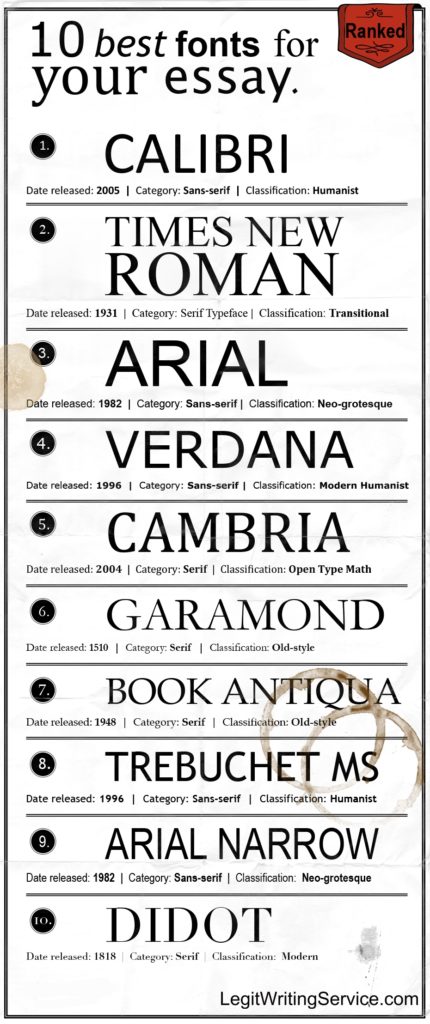
For a combination of modern and classic, Calibri is the font to choose. Calibri has become the new default font for many word processing software. This is because it looks easy on the eye when it is on a computer. If your essay will be submitted online, then this can be a perfect choice of font. It is a clear font that is both straightforward and easy to read.
Another traditional font that is well worth considering, is Georgia. This is another font that looks fantastic on screen, but not so amazing on paper. This font has a classic feel, and was designed to be used on the screen. You can consider using it to make your essays seem more professional and presentable.
Closing Thoughts
Presentation is just as important as the content. Firstly, it is vital to read the instructions of your college essay. Make sure that you fully understand the requirements, and follow the font guidelines if they are given. If there is a choice to be made, you will have a better idea of the best fonts for college essays. These fonts will allow your work to be easily readable, and they will make the best impression.
Leave a Comment Cancel Reply
You must be logged in to post a comment.
Get the Reddit app
Discussion, questions, and news about Google Docs. Unofficial. For Google Workspace content, visit the r/googleworkspace sub.
Whats the biggest font style on google docs?
Ive been doing an essay on google docs but i have to make it fit into more pages without scaling up the font. So i was just messing around and noticed that some font styles like comic sans, take up more space then others like times new roman. So since im lazy and want to do as little work as possible what would be the biggest font style for me to use.
By continuing, you agree to our User Agreement and acknowledge that you understand the Privacy Policy .
Enter the 6-digit code from your authenticator app
You’ve set up two-factor authentication for this account.
Enter a 6-digit backup code
Create your username and password.
Reddit is anonymous, so your username is what you’ll go by here. Choose wisely—because once you get a name, you can’t change it.
Reset your password
Enter your email address or username and we’ll send you a link to reset your password
Check your inbox
An email with a link to reset your password was sent to the email address associated with your account
Choose a Reddit account to continue
- Forums Trending Search forums
- What's new New posts Latest activity
- Members Current visitors
Whats a good font for essays that is big but looks good, (so it dosent look really big)
- Thread starter chiwawa626
- Start date Jun 8, 2001
- OT Discussion Club
- Jun 8, 2001
Whats a good font for essays that is big but looks good, (so it dosent look really big)
Are trying to write less but fill more pages? /me shakes his finger...
Golden Member
Why don't you just browse through them and pick the ones you like Ariel is rewt.
Times New Roman is standard, followed by Arial. For some other fonts that look decent but take up more space, try: Verdana Courier New and my personal favorite, Prestige Elite!
Diamond Member
Lol! Did you try e x t e n d e d lettering?
I need size 12 font, verdana looks to big, what u all think bout Lucida Sans
The way to make essays longer comes not with fontages and extended lettering techniques, nor with the techniques associated with spacing of aforementioned fonts and letterings. Extending an essay requires the dedication associated with writing words that are perspicacious and interminable words and phrases. By extending your vocabulary proficiency and demonstrating the art of such proficient inscription, you can turn a simple notion that would normally consume one sentence or fragment thereof, and convert it into a full-fledged paragraph. Understand?
damn, and i thought u were just a nef...lol i prefer my strongly stated three word sentences
To augment my previous statement, I should also mention that by writing in such a style, you can avoid such blunders, such as giving the impression of being an ignoramus, as would be indicative with using large print styles (a.k.a. fonts) and/or large print sizes (i.e. size).
the standard is times new roman, size 12. changing your font or the size or the margins means you haven't written enough.
lol ur funny....i mean, Laughing out loud, your comical witty nature makes me laugh in a tone of humiliation hows that, im a begginer at that
Courier New. Has wider spacing between the letters. Sister taught me that one freshman year...
Senior member
Many computer-savvy teachers these days will deduct points if you have obviously tried to "pad" your essay by using a large font or overly-ample margins. I suggest that you should alter the content of your essay, not its appearance.
Platinum Member
- Jun 10, 2001
Tahoma is always nice for that large print feel, but not as large as courier new.
VirtualLarry
- Apr 27, 2020
Comic Sans Seriff, font size 72pt. Gets 'em every time.
I'd just hand in a blank thumb drive, and when they say there's nothing on it, I'd say "Fuck if I know. It was on there this morning, and it was the only copy".
Red Squirrel
Trending threads.
- Started by DisEnchantment
- Sep 29, 2022
- Replies: 20K
- Started by TheF34RChannel
- Jun 18, 2017
- Replies: 23K
- Started by Tigerick
- Aug 22, 2022
- Replies: 11K
- Started by Vattila
- Oct 6, 2019
- Replies: 13K
- Started by Eug
- Nov 10, 2020
- Replies: 8K
- Advertising
- Cookies Policies
- Term & Conditions
- This site uses cookies to help personalise content, tailor your experience and to keep you logged in if you register. By continuing to use this site, you are consenting to our use of cookies. Accept Learn more…
Kamala Harris Settles the Biggest Fight in the Democratic Party
Since 2016, the party had been unable to decide on its best course forward.

Produced by ElevenLabs and News Over Audio (NOA) using AI narration.
Sign up for The Decision , a newsletter featuring our 2024 election coverage.
When the electorate is seething, a triumphant political party becomes a vessel for discontent. But in the elections that have followed Donald Trump’s victory in 2016, Democrats have been confused about which groundswell of anti-establishment ire they should channel: the spirit of Occupy Wall Street or that of Black Lives Matter?
Each protest movement suggested a different electoral strategy for countering Trump. By railing against plutocracy, Democrats hoped to win back the working-class white voters in the industrial Midwest, who’d migrated to Trump. By decrying white supremacy and mass deportation, they hoped to harvest the nation’s growing diversity and appeal to college-educated professionals, which my colleague Ronald Brownstein dubbed the “coalition of the ascendant.”
That question—should the Democrats lead with class or identity?—became the subject of tedious books and ugly social-media spats among the party’s intelligentsia, and it has continued at a low boil into the present. Only now Kamala Harris’s campaign has unexpectedly and unceremoniously resolved it.
The conventional view is that Harris’s late arrival into the presidential race has allowed her to run a vacuous campaign, eliding hard strategic choices and inconvenient policy disputes. But that description, which contains elements of truth, obscures an undeniable fact: Her rhetoric, and the rhetoric encasing her campaign, is far more economically populist than that of any other Democratic nominee in recent history.
Read: The populist mantle is Kamala Harris’s for the taking
In part, this is a matter of necessity. The public’s biggest gripe is inflation. As a matter of policy, once inflation is unleashed, a president can’t do much to squash it. In our system, for better or worse, that’s the ambit of the central bank. But the paucity of prescriptions isn’t a useful fact to invoke on the trail, so Harris has blamed high prices on corporate price gouging. She’s offered a portrait of firms and landlords exploiting the coronavirus pandemic, and the resulting price shocks, to fatten their profits at the expense of the consumer. This is a line of argument that surely induces apoplexy in Larry Summers—and it’s a far more combative description of corporations than ever emerged from the mouth of Barack Obama, Bill Clinton, or Joe Biden.
Embracing economic populism is an obvious way for Biden’s heir to leverage Biden’s legacy. His Justice Department aggressively busted trusts, and proposed new rules limiting mergers. He walked a picket line and helped restore the prestige of the American labor movement. He beat the pharmaceutical lobby, winning the power to negotiate drug costs for Medicare.
That record lends itself to a story about taming Big Business. But that’s not the type of story that Biden likes to tell. Aside from the animus he exhibits toward Trump, Biden temperamentally recoils from adversarial politics. He never described the villains he battled as villains. Based on the initial evidence, Harris better understands the political necessity of populating her economic narratives with bad guys.
This understanding has been on display at the convention. Her surrogates have portrayed her as the implacable enemy of corporate greed. Representative Alexandria Ocasio-Cortez described her as a “woman who fights every single day to lift working people out from under the boots of greed trampling on our way of life.” Commerce Secretary Gina Raimondo, a figure associated with the economic center, promised that a Harris administration would continue to break up monopolies.
Whereas Clinton and Obama seemed to choke when paying obligatory obeisance to the labor movement, Harris’s convention has felt like a union hall. In prime time, United Auto Worker President Shawn Fain strutted across the dais in a Trump is a Scab T-shirt. Fist raised in the air, he bellowed, “Which side are you on?” Fain wasn’t an outlier. As Harold Meyerson wrote in The American Prospect, “I’ve been going to Democratic conventions for more than 50 years now, and I’ve never heard anywhere near the number of references (all laudatory) to unions as I heard on Monday night.”
That Raimondo and AOC are in sync isn’t just a matter of disciplined messaging on national television. Economic consensus has shifted in the direction of populism, in response to rising inequality, China’s abusive trade practices, and the lessons of the pandemic. The New York Times’ David Leonhardt has memorably described populism as a “new form of American centrism.” Populism no longer carries the whiff of crankery.
But the emphasis on populism is also a response to the failure of the emerging Democratic majority to, well, emerge. Despite the party’s embrace of criminal-justice reform and its opposition to mass deportation, its share of the Black and Latino vote has diminished. That is, non-college-educated men of all races have converged on a similar set of political instincts, and on a shared loathing for elites. A strategy for winning back working-class Black and Latino men shouldn’t be so different from one tailored to recapture working-class white voters who have strayed from the fold.
Read: Joe Biden’s late goodbye
There are good reasons to view the Democratic embrace of populism as mere rhetoric, just expedient electioneering. Progressives worry that Harris would fire Lina Khan, the crusading head of the Federal Trade Commission, a figure despised in Sun Valley and the Hamptons for bringing cases against Big Tech. Those concerns track with the swell of Silicon Valley execs, veterans of the Obama administration, descending on her campaign to serve as strategists. In some sense, social-media execs and venture capitalists are her tribe, a group that helped nurture her career in San Francisco.
Then again, the very definition of populism, in both its economic and more pernicious cultural manifestations, is to describe politics as a battle between the interests and the people. The vice president’s campaign slogan has long been the words she used to introduce herself as a prosecutor in court: “Kamala Harris, for the People.” Sometimes, a slogan is destiny.
About the Author

More Stories
It’s Sorkin Again in America
Netanyahu’s Folly
- Share full article
Advertisement
Supported by
Guest Essay
Rachel Maddow: What Worries Me Most About Election Night

By Rachel Maddow
Ms. Maddow is the host of “The Rachel Maddow Show” on MSNBC and the MSNBC podcast “Rachel Maddow Presents: Ultra. ”
On Dec. 1, 1960, the far-right preacher and racist demagogue Gerald L.K. Smith sent out a fund-raising appeal, headlined with a shocking claim in red type across the top: “HOLD YOUR BREATH: KENNEDY MAY HAVE LOST.”
The 1960 election had indeed been close, but the Democrat, John F. Kennedy, had prevailed, and his Republican opponent, Richard M. Nixon, had congratulated Kennedy on election night, over shouted protests from his supporters.
Three weeks later, Smith, the leader of what he called the Christian Nationalist Crusade, was telling his followers it was possible to reverse that result.
If Smith’s followers would only send him money, he would continue what he called his “subtle campaign of pressure” to persuade governors in states won by Kennedy that they should refuse to send Kennedy electors to Washington for the Electoral College count.
“This,” Smith promised, “could turn out to be the most shocking and sensational Electoral College vote in history.”
It was not. There were no shenanigans in the Electoral College count. Kennedy received 303 votes to Nixon’s 219, and the transition of power proceeded peacefully.
We are having trouble retrieving the article content.
Please enable JavaScript in your browser settings.
Thank you for your patience while we verify access. If you are in Reader mode please exit and log into your Times account, or subscribe for all of The Times.
Thank you for your patience while we verify access.
Already a subscriber? Log in .
Want all of The Times? Subscribe .
IMAGES
COMMENTS
The best largest fonts for essays are Arial, Century Gothic, and Verdana. These fonts look the part while also providing you with a chance to make them slightly larger. Your essays will end up looking much more complete with these fonts. Arial. Arial is one of the most popular fonts in the world. It was once the original Microsoft Word font ...
Biggest Font For Essays Enhances Readability And Impact. Regarding choosing the biggest font for essays, it is important to consider readability and professionalism. While using a larger font size may seem tempting to make your essay stand out, it is generally recommended to stick with standard fonts such as Times New Roman or Arial in a size ...
The thing to remember is that the longer the base essay, the more they amplify the length. So for instance, if your essay is 10 lines with double spacing, and you change the spacing to 2.1, you get an extra 0.1 of a line for every line you've written, and 0.1×10 = 1. So, for every ten lines you actually write, you get the effect of having ...
Times Newer Roman looks a lot like the go-to academic font, but each character is subtly altered to be 5 to 10 percent wider, making your essays look longer without having to actually make them ...
To make your essay appear longer, try increasing the font size to 12.1, 12.3, or 12.5. See which adjustment makes the biggest difference without being too noticeable. [2] 3. Increase the size of periods and commas. Hold down control+F on your keyboard. This is the find/replace function.
Explore the best fonts for academic papers: tips on readability, style, and the perfect typography choices for essays, theses, and research. Design Resources ... Whether you're crafting an essay or wrestling with a thesis, sticking to this size range is a safe bet. Importance of size for readability and eye strain prevention. It's not just ...
Best Fonts for Academic Papers in Microsoft Word. The best fonts for academic papers are Times New Roman, Baskerville Old Face, and Georgia. There are plenty of good options, but you'll mainly want to stick to serif fonts. They look much neater and more professional while showing that the reader can trust what you say.
Microsoft Word includes several other fonts that can work well for academic essays: Bell MT, Californian FB, Calisto MT, Cambria, Garamond, and Goudy Old Style. Mac OS Fonts. Apple has a well-deserved reputation for design excellence which extends to its font library. But you can't count on any of these Mac OS fonts being on a computer that ...
5.1 Impact. 5.2 Comic Sans. 6 How to Choose the Best Font. 6.1 Consider the Essay Type and Purpose. 6.2 Prioritize Readability. 6.3 Maintain Consistency. 6.4 Seek Teacher's Guidance. 7 Font Size and Spacing. 7.1 Proper Font Size for Readability.
When it comes to standard font size for essays, it's usually 12 or 14. But 12 is usually recommended font size for college papers. New Times Roman, Arial, and Calibri are most often seen in this size. The typefaces you choose should be large enough so that your work can be read without putting undue strain on the eyes of the reader.
A variety of fonts are permitted in APA Style papers. Font options include the following: sans serif fonts such as 11-point Calibri, 11-point Arial, or 10-point Lucida Sans Unicode; serif fonts such as 12-point Times New Roman, 11-point Georgia, or normal (10-point) Computer Modern (the default font for LaTeX); We recommend these fonts because they are legible and widely available and because ...
The Largest Font Size On A Website. The font size on a website can vary depending on the design and coding of the site. Websites typically use pixels (px) as the unit of measurement for font size. The largest font size that can be set using the font-size property in HTML is 72px, which is considered the standard maximum font size for web browsers.
6. Bergen Text - Sans Serif Font. Bergen Text is an elegant, clean and minimalistic font for university and college academic papers. It has been designed specifically in a small 9-pixel size for easy legibility and accessibility reasons.
For years the default font size for an APA Style paper was 12. And not only was APA's preferred font size 12, but also the preferred font style was Times New Roman. Well, the 7th edition of APA Style has changed such preferences, and it's important to understand what has changed and why. In the 7th edition of the Publication Manual, APA ...
APA Style papers should be written in a font that is legible and widely accessible. For example: Times New Roman (12pt.) Arial (11pt.) Calibri (11pt.) Georgia (11pt.) The same font and font size is used throughout the document, including the running head, page numbers, headings, and the reference page. Text in footnotes and figure images may be ...
The last on the list is Nunito Sans. It has seven weight styles available on Google Docs. This font is a well-balanced sans serif typeface. This font's design looks more rounded than the other sans serif fonts, which makes it more appealing. But it's not so round to the point that it makes the style look soft.
Best Font Size for Research Paper. The best font size for a research paper is point 12. This size is the most common ones, especially for New Times Roman, Arial or Calibri fonts. Basically, the size of the fonts should make your work to be readable without straining the audience. We measure size using 'points'.
Curlz MT. This cursive font is very readable, which is an excellent feature when you are writing long essays. Too often teachers and professors have their students submit essays that have been printed off and put into a word document, which defeats the purpose of a cursive font in essay writing. The cursive Curlz MT makes it almost impossible ...
There are plenty of Serif fonts out there. Times New Roman seems to have become a standard, due to its status as the default font on Microsoft Word. However, I have always preferred other Serif fonts such as Georgia for graphic design, they just seem to look nicer.
The first font that you should be aware of is Times New Roman. This is the default font for many college essays, and it is also one that is considered the standard in APA, MLA, Chicago, and other referencing styles. This is the most commonly used font, and it is considered fairly formal. It is a serif typeface font that is hugely popular even ...
Times new Roman, size 12 font, double spaced is basic MLA standards. If you can't write a basic 3 page paper without finding ways to beef up your writing, that's not a good sign for the rest of your college years. Consider seeing the writing center or going over an outline so you know what you need to hit in the essay and where.
So i was just messing around and noticed that some font styles like comic sans, take up more space then others like times new roman. So since im lazy and want to do as little work as possible what would be the biggest font style for me to use. The asset font. Also, the smallest font is the dorsa font.
The way to make essays longer comes not with fontages and extended lettering techniques, nor with the techniques associated with spacing of aforementioned fonts and letterings. Extending an essay requires the dedication associated with writing words that are perspicacious and interminable words and phrases.
Novak Djokovic, a 37-year-old Serb, has done so much in his tennis career: winning 24 Grand Slam singles titles, earning the world No. 1 ranking and raking in over $180 million in prize money.
The public's biggest gripe is inflation. As a matter of policy, once inflation is unleashed, a president can't do much to squash it. In our system, for better or worse, that's the ambit of ...
Ms. Maddow is the host of "The Rachel Maddow Show" on MSNBC and the MSNBC podcast "Rachel Maddow Presents: Ultra." On Dec. 1, 1960, the far-right preacher and racist demagogue Gerald L.K ...