11 Inspiring UX Case Studies That Every Designer Should Study

A UX case study is a sort of detailed overview of a designer's work. They are often part of a UX designer's portfolio and showcase the designer's skill in managing tasks and problems. From a recruiter's perspective, such a UX portfolio shows the skill, insights, knowledge, and talent of the designer.
Therefore, UX case studies play an important role in the recruitment and demand for designers.

What Makes a Powerful Case Study
Building a UX case study includes showing the design process through compelling stories. They will use plain language to demonstrate how they handled key design issues, offering a comprehensive view of their process. Well done case studies often include:
- A problem statement and solutions with real applications.
- Relevant numbers, data, or testimonials to demonstrate the work and efforts.
- A story that directly connects the problem to the solution.
Any competent UX professional will know that creating a stunning UX case study is about the little details.
11 Best UX Case Studies for Designers
The best way to understand what a good case study looks like is to go over other examples. Each of these UX case study examples shows a designer's insights, basic skills, and other designers' lessons learned through their experience.
1. Promo.com web editor

For this video-creation platform , UX designer Sascha was brought on to revamp v2.0, adding new features that could work alongside the existing UX design. The point was to work on interface details that would help create a user friendly platform, and that users could find simple enough to use.
User personas mapped by the UX designer revealed the most common confusion to be the process of inserting particular features into the video, such as subtitles. The designer's goal, therefore, was to create a platform with improved editor controls.
The designer then used a common text-editor layout to include top and side navigation bars that made it easy to access and implement text editing.
Key Learnings from Promo.com
This case study focuses on addressing a particular problem that customers were currently facing. Its main theme is to show a problem, and how the product designer addressed this problem. Its strength points include:
- clearly highlighting the problem (i.e. inaccessible and limited video-text editor options)
- conduction research to understand the nature of the problem and the kind of solutions customers want
- implementing research insights into the redesign to create a platform that actively served customer needs
2. Productivity tracker app
The main concept behind this UX case study is to address a pre-existing problem through the design of the app. Immediately from the start, the study highlights a common pain point among users: that of a lack of productivity due to device usage.
This UX case study example addressed some of the main problems within existing productivity apps included:a poor UI and UX that made navigation difficult
- a poorly-built information architecture
- limited functions on the mobile application
Key Learnings from the Productivity app case study
The case study highlights the simple design process that was then used to build the app. Wireframes were created, a moldboard developed, and finally, individual pages of the app were designed in line with the initial goals.
3. Postmates Unlimited

This case study clearly identifies the improvements made to the Postmates app in a simple overview before jumping into greater detail. The redesign goal, which it achieved, was to improve the experience and other interface details of the app.
The problems identified included:
- usability that led to high support ticket volume.
- technical app infrastructure issues that prevented scalability.
- lack of efficient product management, such as batching orders.
A UX research course can help understand the kind of research needed for a case study. The app redesign involved bringing couriers in and running usability testing on improvements. The final model, therefore, had input from real users on what worked and what caused issues.
Key Learnings from Postmates
The Postmates redesign works as a great UX case study for the simple way it approaches problem-solving. Following an overview of the work, it addresses the problems faced by users of the app. It then establishes research processes and highlights how changes were made to reduce these issues.
4. TV Guide

Addressing the fragmentation of content across channels, this case study sought to redesign how people consume media. The key problems identified included:
- the overabundance of content across various TV and streaming platforms
- the difficulty in discovering and managing content across all platforms
To deliver on the key goals of content personalization, smart recommendations, and offering cross-platform content search, the design process included conducting interviews, surveys, and checking customer reviews.
The design of TV Guide enables users to get custom recommendations sourced from friends' and family's watchlists.
Key Learnings from TV Guide
Like previous UX design case studies, this one tackled the issue head-on. Describing the research process, it goes into detail regarding the approach used by the UX designers to create the app. It takes readers on a journey, from identifying pain points, to testing solutions, and implementing the final version.
5. The FlexBox Inspector

Designer Victoria discusses how she developed the investigator tool for the Mozilla Firefox browser. Surveys into understanding the problems with the existing CSS Flexbox tool revealed a need for a user-friendly design. Interviews with a senior designer and other designers helped developers understand the features design-focused tools ought to have. A feature analysis revealed what most users look for in such tools.
The final result of the development process was a design that incorporated several new features, including:
- a new layout
- color-coded design
- multiple entry points to make workflow management efficient
Key Learnings from the Flexbox
This UX design case study starts with a clear goal, then addresses multiple user needs. It clearly defines the design process behind each feature developed by the time, and the reasoning for including that feature. To give a complete picture, it also discusses why certain features or processes were excluded.
6. The Current State of Checkouts

This Baymard UX design case study looks into the checkout process in over 70 e-commerce websites. Through competitive analysis, it isolates problem points in the UX design, which, if addressed, could improve the customer's checkout process.
The study found at least 31 common issues that were easily preventable. The study was designed and conducted on a large scale, over 12 years, to incorporate changing design patterns into the review.
Recommendations based on findings include:
- prominent guest checkout option
- simple password requirements
- specific delivery period
- price comparison tool for shipping vs store pickup
Key Learnings from Checkout Case Study
Each identified issue is backed up by data and research to highlight its importance. Further research backs up each recommendation made within the case study, with usability testing to support the idea. As far as UX case studies go, this one provides practical insight into an existing, widely used e-commerce feature, and offers practical solutions.
7. New York Times App

Using a creative illustration website, the designers proposed a landing page feature "Timely" that could counter the problems faced by the NYT app . Its major issues included too much irrelevant content, low usage, and undesirable coverage of content.
The goal behind Timely was to improve user incentives, build long-term loyalty, and encourage reading. Design mapping for the app covered:
- identifying the problem
- understanding audience needs
- creating wireframes
- designing and prototyping
The end result was an app that could help readers get notifications regarding news of interest at convenient moments (at breakfast, before bed). This encouraged interaction and improved readability with short-form articles.
Key Learnings from NYT App
The UX case study proposes a problem solution that works with an existing information architecture, instead adding custom graphics to the mobile app. It leads from a simple problem statement to discuss the project that could address these issues without changing was customers already loved.

UX case studies focused on redesign include the FitBit redesign, which started off by understanding personas and what users expect from a fitness tracker. Developing use cases and personas, Guerilla usability testing was employed to assess pain points.
These pain points were then ranked based on their importance to users and to app performance. They were addressed through:
- Highlighting essential parts and features of the app
- Changing easily missed icons to more recognizable icons
- relabelling tracking options to guide users better to its usage
Key Learnings from Fitbit
While the case study maps user experiences and offers solutions, it does not begin with an intensive research-based approach. The prototype is successful in testing, but problem factors are not identified with research-based statistics, meaning key factors could have been ignored.
9. Rating System UX

The designer behind the rating system UX redesign sought to solve issues with the 5-star rating system. Highlighted issues included:
- the lack of subjective accuracy of a 5-point rating system
- the issue of calculating the average of a zero-star rating
- average ratings are misleading
Better alternatives include:
- 5-star emoticon rating that relates the user experience
- Like/dislike buttons that make approval/disapproval simple
The final design incorporated both these styles to make full use of the rating system.
Key Learnings from Rating System UX
The UX case study stemmed from insight into the limitations of the existing rating system. The new design addressed old issues and incorporated better efficiencies.

The Intuit redesign was focused on making content readable, more engaging, and accessible. Looking into product personalization, the content was found to be lacking aesthetic value, as well as being hard to find. The goal was to create content that was easy to find, clear, and consistent.
The implemented solutions included:
- increased readability with increased body text and header spacing
- table of contents on the sidebar for easier navigation
- visible and prominent search bar
- illustrations and designs for pretty visuals
Key Learnings from Intuit
The Intuit case study approaches the problem from a practical point of view. It begins with isolating problems with the interface, in particular with the content. This is an example of a case study that breaks down problems into broader categories, and solves each problem with a practical solution.

This UX case study about a social platform tackles a commonly-faced problem from existing platforms. It addresses the issue of recognizing non-monetary user engagement, to help creators identify their user base.
The case study addresses the problem statement and establishes the design process (building wireframes and prototypes) as well as conducting user testing. The final result is to develop "Discover" pages, engaging layouts, and animated interactions to increase usability.
Key Learnings from Jambb
The study goes into detail regarding problem identification, then moves on to propose solutions that take into account the perspective of all stakeholders involved. It then explains why each design decision was made, and proves its efficacy through testing and prototyping.
Key Takeaways
Developing good UX case studies examples is as much about the details you include as the ones you leave out. Going over UX courses can give you a better understanding of what your case study should look like. A good case study should provide an overview of the problem, include numbers and statistics, and offer practical solutions that directly address the problem. The above-discussed UX case studies provide a good example of the dos and don'ts of a well-structured UX design case study that should be part of every UX portfolio .
Additional Resources
Check out these resources to learn more about UX case studies:
8 UX Case Studies to Read
UX Design Case Study
Frequently Asked Questions
Upskill your design team effectively.
Equip your design team with the best-in-class design training that sticks.
Do you know your design team skill level? Send them this quick test & see where their skills stand among 300K+ designers worldwide.
Level up your design career
Get step-by-step guide how to build or advance your UX design career.
Do you know your design skills level? Take a quick test & see where you stand among 300K+ designers worldwide.
Continue reading
How famous cartoons use colors for storytelling, top 7 resources for ux/ui designers for meaningful design inspiration, how to write a ux case study in 10 steps, cookie settings 🍪.
- Interactive UX learning for all levels
- 20+ UX courses and career paths
- Personalized learning & practice
Design-first companies are training their design teams. Are you?
- Measure & identify team skill gaps
- Tailor learning for your team’s needs
- Unlock extensive learning library
- Visualize team growth over time
- Retain your designers
Amazon Shopping App UX Case Study - An In-Depth Evaluation

Welcome to this UX case study of Amazon’s mobile app.
Amazon is undoubtedly the leading online retailer in the US. Its rise to being a top household e-commerce brand is largely attributed to its high-converting website. Throughout the years, Amazon’s website has gone through multiple changes, and in 2011, it introduced its first mobile app.
Yet, is it equally superior in terms of user experience (UX)? Should you replicate Amazon’s mobile layout for your e-commerce app?
We’re afraid the answer is no. Amazon. In its bid to optimize for conversion, Amazon has sacrificed some basic UX principles that once made it the role model for other e-commerce software development. For example, the cluttered home screen is overwhelming for new buyers.
Amazon is doing great because it is in a dominant position. Buyers are already accustomed to Amazon’s layout and navigational flow. But try replicating Amazon’s layout on a new e-commerce brand, and you wouldn’t get the same results.
Today, UX is a crucial factor in attracting and retaining visitors. An e-commerce interface with a good UX can increase the conversion rate by up to 400%. Therefore, you’ll want to ensure that the right UI/UX design services will be provided for your e-commerce app.
In this article, we’ll take you through a step-by-step UX review of the Amazon shopping app.
In any UX design case study, it’s important to establish the objectives of doing so. Setting the objectives provides a clear direction on how you ought to approach the UX review.
For Amazon, the objective is to determine if new, unregistered users will have a smooth experience when shopping for products on its app. As mentioned above, existing buyers shopping on Amazon for years may not be impacted by the changes as they are gradually introduced on the app.
However, a new user who’s shopping on Amazon for the first time may find the home page overly-cluttered with hundreds of product images and intersected with sponsored listings. There’s also a lack of uniformity in how the various category pages are designed.
For example, the Baby category showcases the top brands, followed by a list of top products and subcategory selection. However, the Computers category features visually appealing images that let you navigate into different devices.
Amazon’s take of UX design is unlikely to be helpful for new e-commerce apps. Here’s the key point. Amazon is already an established brand that’s selling to largely existing users. A new e-commerce business needs to capture new customers, and good UX is crucial.
In this UX case study, we’ll identify pain points on the Amazon shopping app and figure out how they can be improved to provide a better user experience.

Preparation
Before commencing a UX case study, you’ll need to be well prepared for it. In this case, it means surveying competing retailers and checking out the experience of using their mobile apps. By comparing between a few competitors, you could identify similarities and differences between the apps.
In this UX review on Amazon, we turn to competitors like eBay and Alibaba. eBay serves more than 180 million users worldwide, while Alibaba is the largest online retailer in Asia. Both are successful e-commerce giants, and we wanted to know how they compare to Amazon in terms of shopping experience.
So, we downloaded the separate apps and tried them out as any regular customer will do. We noted down the process of browsing through the products, adding them to the cart, and the check-out process. The experience serves as a useful relative comparison in the Amazon UX study.
User Research
A user experience analysis is about determining if a product fulfills the needs of the users. Likewise, an analysis of Amazon’s UX design requires an understanding of its users. It’s important to establish the demographics of users made up of Amazon’s customer base and analyze their experience using the app.
Therefore, you’ll need to set sights on user research and not the other fancy features in the app. If the users are not happy with the app, they are unlikely to buy regardless of the creative efforts in it.
During the user research, we wanted to gain clarity for these questions.
- Who made up most of Amazon app users.?
- How do most users interact with the Amazon app?
- What are the possible pain points faced by the users?
- What’s their experience using competitor’s apps?
- How do the users make their purchasing decision?
- What are the factors that influence the user’s decisions?
In order to answer these questions, we create proto personas as it is the quickest way to envision probably users that are using the Amazon app. If you’re not familiar with proto personas, it is the process of establishing target users of a product based on the researchers’ assumption.

Proto-personas are created based on what we think the users are like. They are not based on statistics or studies, although validation can be carried out later on. Proto-personas is commonly used in user experience analysis.
Here are some proto personas that we’ve created for this study.
- A professional executive who likes to shop spontaneously. This shopper has little time to browse through different products and would like to make quick decisions from the available information.
- A tech-savvy individual who’s no stranger to using an online shopping platform. This shopper takes the time to research a product thoroughly before purchasing. This shopper leverages features on the app and is attentive to details.
- An online marketer on the lookout for the best deals and prefers online shopping to physical stores. Ideally, this shopper prefers quality products and wants to shop in a secure environment.
- A young shopper who’s only using the app for essential goods. This shopper takes time to compare products and is particularly interested in eco-friendly products. This shopper is annoyed by ads during online shopping.
Besides proto personas, we’ve also created customer journey maps for this case study. A customer journey map illustrates every possible point of interaction between the user and the app. It helps provide clarity in the overall customer experience and pinpoint areas with room for improvement.
.jpeg "app ux case study")
Customer journey mapping helps you to identify how different personas interact with the app. It acts as a benchmark between real user experience and their expectations. You can also leverage the customer journey map to introduce personalized features in future products.
.jpeg "app ux case study")
Pain Points
The next part in this UX case study identifies pain points faced by the proto personas when using the Amazon shopping app. To do so, we use a methodology named Heuristic evaluation.
Heuristic Evaluation is a usability testing evaluation system introduced by Jakob Nielsen in 1990. It enables evaluators to determine a product’s usability based on 10 UX principles known as ‘heuristics’.
Usually, a group of 3-5 evaluators is tasked to evaluate a product against the heuristics. This is because it’s more probable for different evaluators to identify more problematic areas than a single evaluator.
The evaluation starts by determining the numbers of heuristics to be used. Depending on the product, you can use all 10 of the heuristics or a smaller number. UX designers have found this evaluation method helpful in identifying UX issues before product release. It is equally valuable when reviewing an existing product’s usability.
Here are the pain points that we’ve uncovered with Heuristic Evaluation.
1. Visibility of System Status
Positive findings.
- Home page.
- The app informs users of potential delays prior to ordering.
- Product page and shopping list.
- Interaction, which helps to understand that the product has added the cart (cart animation + vibration).
- Select Location.
- The application determines the geolocation based on the phone number.
- Cart page.
- User sees the total number of ordered goods, not the number of goods types.
- Includes all the necessary info about the product.
Need To Be Improved
- Search & Result page.
- The number of search results is unclear.
- There are no number of pages in the pagination - no indication of how many flippable pages.
- Several categories of the output of search results confuse users; the user does not understand whether it has displayed all results and on what principle it works.
- Not all the text from the filters fits in the line, it is not possible to see the full text.
- The delivery price is not specified.
- Filters do not display selected options, confusing options change (price).
- Product page & Shopping list.
- Users see the product’s size, but it’s hard to understand which one she/he needs.
- There is a price range for the product, but not the exact price the user has to pay for the product.
- Users will only realize a product is not available only after choosing the color and size.
- There is a check box in the basket with a gift proposal on the cart page, but it isn’t clear which item will be selected as the gift.
.png "app ux case study")
2. Match between system and the real world
Need to be improved.
- Expected more specific filters on a category, on the sizes for example, but it seems like the filter is quite generic.
- Product page & Shopping list.
- Some products’ sizes are shown in numbers, but users may expect them to be shown in more familiar alphabets presented in a table.
3. User control and freedom
- Search & results page.
- User can choose the option that suits him/her from those that the system offers.
- Location selection.
- A prominent message prompting you to change the location if it is not correct.
- Users can't choose the price range that they need (can’t choose a price less than $30).
- Category filter - the user doesn't understand what to choose here.
- "Sport & outdoor" - the name of the filter does not match what can be filtered here.
- Can't get out of filters without applying them and there’s no exit button.
- Unable to locate ‘filter by size’.

4. Consistency and standards
- Clicking the "back" button brings it back to the previous page without closing the open filter. It should close down the filter on the first click, and return to the previous on the second.
- Strange to see sorting inside filters. This is usually a separate feature for that.
- The "& Up" filter for reviews is inconsistent with the regular practice.
- Select location.
- Despite a predetermined location at the beginning, the states reverted to default when placing an order.
- Inconsistency of displaying informationDetails, descriptions, and characteristics of the product are already under the recommendations and related products.
- Non-typical usage of a drop-down for choosing the number of units.
- If you click on the "Details" button, a page opens with back navigation, although there is a top-level back button.
- Quantity selection is implemented differently than on the product page.
- The checkout button is above the items in the cart, which is inconsistent with the outside world. Usually, people read from top to bottom.
- The price for products is shown above them.
- Order page.
- Quantity selection is implemented differently than on the product page and basket.
- Strange order of fields (Country -> name -> street -> city).
.png "app ux case study")
5. Error Prevention
- Search & results page.
- The system returns the right option despite errors when typing the product name in the search bar.
- No prompt for automatic street selection when filling the address (for non-US territories).
- The ‘delete’ button is not highlighted, making it easy to be accidentally clicked on.
- Can’t quickly return a deleted item to the cart.
6. Recognition rather than recall
- The search history is saved.
- Return Possibility Message.
- If you exit the screen and return, the fields will remain filled.
- The system detects a Ukrainian user but shows an American code when entering the default phone number.
- Shows default American fields in address although it has detected a Ukrainian user.
- No dropdown list with autocomplete address field.
7. Flexibility and efficiency of use
- Search & results page
- Search with hints after entering a pair of characters.
- There is a checkbox to "make the address default".
- Very long scrolling of the product page. It is difficult to navigate and search for the necessary information - to navigate to the characteristics and reviews.
- Why is there no social log in.
8. Aesthetic and minimalist design
- Instead of indicating the items are not delivered to a specific country, the system should hide those non-deliverable items from the customer's view.
- Many different font styles (color, size, thickness).
- Small text, not ideal for people with poor eyesight.
- Elements look like a random mess (different contours, fillets, thickness, size)—little space.
9. Help users recognize, diagnose, and recover from errors
- Shows an informational message that allows users to change the address and with accompanying warnings.
- Search results.
User Testing For Pain Points
At this point, we’ve got a list of pain points by evaluating the Amazon shopping app against the selected heuristics. However, they are merely opinions from our team, who are testing the app based on created proto personas.
We need to validate that the problems that we’ve encountered are posing real problems for users. Therefore, it’s important to carry out user testing for those pain points.
User testing provides an opportunity to understand the app from a different point of view. It reduces the risk of us being blindsided in certain areas during the evaluation.
To carry out user testing, we’ve prepared tasks that are to be assigned to 5 users that we’ve selected. The participants are asked to accomplish the tasks using the Amazon shopping app and record problems that occur.
.jpeg "app ux case study")
Here are the results that validated our earlier findings.
- Confused with the search results.
- Can’t add to favorites on the search results page.
- Irrelevant recommendations.
- Confused with purchase screen - need to verify the info multiple times.
- The product page is hard to navigate, has too much info, and is not structured.
- Too many ads.
- Hard to compare items. It takes too long to return to the search screen.
Hypothesis To Test
We’ve identified what’s wrong with the current Amazon shopping app. To complete this UX case study, we’ll need to put together the solutions we perceive to lead to a better user experience.
To do so, we’ve created a list of improvements for all the pain points that we’ve identified and added our thoughts to them. We aim to create a redesign of the app interface and confirm that our hypothesis on the pain points and solutions is correct.
There are, of course, too many pain points to implement in the redesign, and some could be very tedious to do so. To narrow them down, we utilize the impact/effort matrix and selected impactful changes that are easy to implement.
With the choices of changes decided, we moved on to redesigning the Amazon shopping app in the form of a prototype. We’re sticking with Amazon’s original fonts and colors as they represent the online retail’s brand identity.
Based on our hypothesis, the new prototype should result in an improved user experience. We created two different versions to gather better insights in testing.
Check out our redesign here.
.png "app ux case study")
Everything we’ve done in this Amazon UX review will lead to nothing if we’re not testing the prototype with real users. We need to be sure that we’ve uncovered the pain points with the existing app and that our recommendations in solving the problems resonate with real users.
Therefore, we decided to turn to a proven method to validate our assumptions -- usability testing. Again, we invited a few users with different age groups and professions and got them to accomplish a single task on the prototype. They are asked to buy a soccer glove on the prototype with UX fixes.
As the users execute the task, they are asked to note any problems and thoughts with the prototype. When the app review is completed, we consolidate the results by asking questions like:
- How was the experience?
- What was easy/hard to understand/interact in this prototype?
- Is there anything difficult to understand at first glance?
- Which version of the prototype do you prefer?
It’s essential to hold the post-testing interview in a one-on-one session. The participants are more likely to be more open with their thoughts when they can talk in comfort. You’ll also have a better opportunity to understand their mindset and behavior when shopping for an item with the prototype.
Ideally, you’ll want to collect as much data as possible during the prototype testing. This is true whether you’re doing a user experience analysis for a 3rd party product or working on your own app.
The data becomes clear guidance to making UX improvements when revising the app. It removes guesswork and assumption from UX design. As a result, you’ll have a more precise strategy in creating UX that appeals to end-users.
.png "app ux case study")
Amazon could do with a few UX lift-ups in its app, that is, if it intends to appeal to new users. As shown in this UX review, it doesn’t hurt to correct some of the glaring issues with the existing app. Users can get to their desired items with less hassle, leading to increased conversion.
While Amazon could get away with some UX bad practices, budding e-commerce stores will fare differently with the same blunders. It is vital to carry out usability testing to ensure that users have a smooth experience with the app.
Advisory boards aren’t only for executives. Join the LogRocket Content Advisory Board today →
- Product Management
- Solve User-Reported Issues
- Find Issues Faster
- Optimize Conversion and Adoption
21 UX case studies to learn from in 2024

UX case studies are the heart of your design portfolio. They offer a peek into your design process, showcasing how you tackle challenges, your methods, and your results. For recruiters, these case studies serve as a metric for evaluating your skills, problem-solving abilities, and talent.

If you’re considering creating your own UX case study in 2024 but don’t know where to start, you’re in the right place. This article aims to inspire you with 21 carefully hand-picked UX case study examples, each offering valuable lessons.
But before we dive into these examples, let’s address a question that might be lingering: Is a UX case study truly worth the effort?
Is it worth creating a UX case study?
The short answer is yes.
Remember how in math class, showing your workings was even more important than getting the correct answer? UX case studies are like that for designers. They are more than just showcasing the final product (the polished website or app); they detail the steps taken to get there (the research, user testing, and design iterations). By showing your design process, you give potential employers or clients a peek into your thought process and problem-solving skills.
A well-laid-out case study has many benefits, including the following:
Building credibility
As case studies provide evidence of your expertise and past successes, they can build credibility and trust with potential employers or clients.
Educational value
By showing your design process, you provide valuable insights and learnings for other designers and stakeholders.
Differentiation
A compelling case study can leave a lasting impression on potential recruiters and clients, helping you stand out.
Iterative improvement
A case study is like a roadmap of each project, detailing the highs, lows, failures, and successes. This information allows you to identify areas for improvement, learn from mistakes, and refine your approach in subsequent projects.
Now that you know why a stand-out case study is so important, let’s look at 21 examples to help you get creative. The case studies will fall under five categories:
- Language learning app
- Learning app
- Travel agency app
- Intelly healthcare app
- Cox Automotive
- Swiftwash laundry
- Wayfaro trip planner
- New York Times app redesign
- Disney+ app redesign
- Fitbit redesign
- Ryanair app redesign
- Forbes app redesign
- Enhancing virtual teaching with Google Meet
- Airbnb’s global check-in tool
- Spotify home shortcuts
- AI-powered spatial banking for Apple Vision Pro
- Sage Express
In this section, we’ll explore case studies that take us through the complete design journey of creating a digital product from scratch.
1. Language learning app
If you’re a designer looking to get your foot in the door, this is one case study you need to check out. It’s so well detailed that it helped this designer land their first role as a UX designer:

Created by Christina Sa, this case study tackles the all-too-common struggle of learning a new language through a mobile app. It takes us through the process of designing a nontraditional learning app that focuses on building a habit by teaching the Korean language using Korean media such as K-pop, K-drama, and K-webtoon.

Over 200k developers and product managers use LogRocket to create better digital experiences
Key takeaway
This case study shows how a structured design process, user-centered approach, and effective communication can help you stand out. The creator meticulously laid out their design process from the exploratory research phase to the final prototype, even detailing how the case study changed their view on the importance of a design process.
If you’re searching for a comprehensive case study that details every step of the design process, look no further. This one is for you:

This impressive case study by Finna Wang explores the creation of a fan-focused responsive platform for Jambb, an already existing social platform. The creator starts by identifying the problem and then defines the project scope before diving into the design process.
This case study shows us the importance of an iterative problem-solving approach. It identifies a problem (pre-problem statement), creates a solution, tests the solution, and then revises the problem statement based on the new findings.
3. Learning app
If you need a highly visual case study that takes you through every step of the design process in an engaging way, this one is for you:

This case study walks us through the design of a platform where users can find experts to explain complex topics to them in a simple and friendly manner. It starts by defining the scope of work, then progresses through research, user journeys, information architecture, user flow, initial design, and user testing, before presenting the final solution.
This case study demonstrates effective ways to keep readers engaged while taking them through the steps of a design process. By incorporating illustrations and data visualization, the designer communicates complex information in an engaging manner, without boring the readers.
If you’re in search of a case study that details the design process but is also visually appealing, you should give this one a look:

This case study by Orbix Studio takes us through the process of designing GiveHub, a fundraising app that helps users set up campaigns for causes they’re passionate about. It starts with an overview of the design process, then moves on to identifying the challenges and proposing solutions, before showing us how the solutions are brought to life.
This case study illustrates how a visually engaging design and clear organization can make your presentation easy to grasp.
5. Travel agency app
This case study is quite popular on Behance, and it’s easy to see why:

The case study takes us through the process of creating a travel app that lets users compare travel packages from various travel agencies or groups. The creators set out a clear problem statement, propose a solution, and then show us the step-by-step implementation process. The incorporation of data visualization tools makes this case study easy to digest.
This is another case study that shows the importance of using a clearly defined design process. Going by its popularity on Behance, you can tell that the step-by-step process breakdown was well worth the effort.
6. Intelly healthcare app
If you’re looking for a UX case study that explores the design journey for both mobile and desktop versions of an app, this is one you should check out:

This case study explores the process of creating Intelly, an app that transforms patient care with telemedicine, prescription management, and real-time tracking. The case study begins with a clear design goal, followed by a layout of existing problems and design opportunities. The final design is a mobile app for patients and a desktop app for doctors.
This case study highlights the importance of proactive problem-solving and creative thinking in the design process. The creators laid out some key problems, identified design opportunities in them, and effectively leveraged them to create an app.
7. Cox Automotive
If you prefer a results-oriented case study, you’ll love this one:

This case study delves into how Cox Automotive’s Manheim division, used LogRocket to optimize their customers’ digital experience for remote car auctions. It starts by highlighting the three key outcomes before giving us an executive summary of the case study. The rest of the case study takes us through the process of achieving the highlighted outcomes.
A key takeaway from this case study is the significance of using user data and feedback to enhance the digital experience continuously. Cox Automotive used LogRocket to identify and address user-reported issues, gain insights into customer behaviors, and make data-driven decisions to optimize their product.
These case studies are more focused on the visual aspects of the design process, teaching us a thing or two about presentation and delivery.
If you love a case study that scores high on aesthetics with vivid colors, cool illustrations, and fun animations, you need to check this one out:

This case study takes us on a visual journey of creating Rebank, a digital product aimed at revolutionizing the baking industry. It starts with the research process, moves on to branding and style, and then takes us through the different screens, explaining what each one offers.
This case study illustrates the value of thinking outside the box. Breaking away from the conventional design style of financial products makes it a stand-out case study.
9. Swiftwash Laundry
If you’re looking for a case study that prioritizes aesthetics and visual appeal, you should check this one out:

This case study by Orbix Studio gives us a peek into how they created Swiftwash, a laundry service app. It takes us through the steps involved in creating an intuitive, user-friendly, and visually appealing interface.
If there’s one thing to take away from this case study, it’s the value of presenting information in a straightforward manner. Besides being easy on the eye, this case study is also easy to digest. The creators lay out the problem and detail the steps taken to achieve a solution, in an easy-to-follow way, while maintaining a high visual appeal.
10. Wayfaro trip planner
If you’re looking for a concise case study with clean visuals, you should definitely check this one out:

This Behance case study takes us through the design of Wayfaro, a trip planner app that allows users to plan their itineraries for upcoming journeys. The creators dive straight into the visual design process, showing us aspects such as branding and user flow, and explaining the various features on each screen.
This case study shows us the power of an attractive presentation. Not only is the mobile app design visually appealing, but the design process is presented in a sleek and stylish manner.
App redesign
These case studies delve into the redesign of existing apps, offering valuable insights into presentation techniques and problem-solving approaches.
11. New York Times app redesign
If you’re looking for an app redesign case study that’s impactful yet concise, this one is for you:

This study details the creation of “Timely,” a design feature to address issues with the NYT app such as irrelevant content, low usage, and undesirable coverage. It takes us through the process of identifying the problem, understanding audience needs, creating wireframes, and prototyping.
This case study shows us that you don’t always need to overhaul the existing app when redesigning. It suggests a solution that fits into the current information setup, adding custom graphics to the mobile app. Starting with a simple problem statement, it proposes a solution to address the app’s issues without changing what customers already enjoy.
12. Disney+ app redesign
If you’re looking for an engaging case study that’s light on information, you should check out this one:

This case study by Andre Carioca dives right into giving the user interface a little facelift to make it more fun and engaging. By employing compelling storytelling and appealing visuals, the creator crafts a narrative that’s a delight to read.
Given how popular this case study is on Behance, you can tell that the designer did something right. It shows how injecting a little playfulness can elevate your case study and make it more delightful.
13. Fitbit redesign
If you want an in-depth case study that doesn’t bore you to sleep, this one is for you:

This case study by Stacey Wang takes us through the process of redesigning Fitbit, a wearable fitness tracker. The creator starts by understanding personas and what users expect from a fitness tracker.
Next was the development of use cases and personas. Through a series of guerrilla tests, they were able to identify user pain points. The redesign was centered around addressing these pain points.
This case study highlights the importance of clear organization and strong visual communication. The creator goes in-depth into the intricacies of redesigning the Fitbit app, highlighting every step, without boring the readers.
14. Ryanair app redesign
If you’re bored of the usual static case studies and need something more interactive, this app redesign is what you’re looking for:

This case study takes us through the process of giving the Ryanair app a fresh look. Besides the clean aesthetics and straightforward presentation, the incorporation of playful language and interactive elements makes this case study captivating.
This case study shows how adding a bit of interactivity to your presentation can elevate your work.
15. Forbes app redesign

This case study starts by explaining why the redesign was needed and dives deep into analyzing the current app. The creator then takes us through the research and ideation phases and shares their proposed solution. After testing the solution, they made iterations based on the results.
When it comes to redesigning an existing product, it’s a good idea to make a strong case for why the redesign was needed in the first place.
UX research
These case studies are centered around UX research, highlighting key research insights to enhance your design process.
16. Enhancing virtual teaching with Google Meet
This case study by Amanda Rosenburg, Head of User Experience Research, Google Classroom shows us how listening to user feedback can help make our products more useful and inclusive to users.

To improve the virtual teaching experience on Google Meet, the team spent a lot of time getting feedback from teachers. They then incorporated this feedback into the product design, resulting in new functionality like attendance taking, hand raising, waiting rooms, and polls. Not only did these new features improve the user experience for teachers and students, but they also created a better user experience for all Google Meet users.
When there isn’t room for extensive user research and you need to make quick improvements to the user experience, it’s best to go straight to your users for feedback.
17. Airbnb’s global check-in tool
This case study by Vibha Bamba, Design Lead on Airbnb’s Host Success team, shows us how observing user behaviors inspired the creation of a global check-in tool:

By observing interactions between guests and hosts, the Airbnb team discovered a design opportunity. This led to the creation of visual check-in guides for Airbnb guests, which they can access both offline and online.
There’s a lot to be learned from observing user behavior. Don’t limit yourself to insights obtained from periodic research. Instead, observe how people interact with your product in their daily lives. The insights obtained from such observations can help unlock ingenious design opportunities.
18. Spotify Home Shortcuts
This case study by Nhi Ngo, a Senior User Researcher at Spotify shows us the importance of a human perspective in a data-driven world:

When the Spotify team set out to develop and launch the ML-powered Shortcuts feature on the home tab, they hit a brick wall with the naming. A/B tests came back inconclusive. In the end, they had to go with the product designer’s suggestion of giving the feature a name that would create a more human and personal experience for users.
This led to the creation of a humanistic product feature that evoked joy in Spotify’s users and led to the incorporation of more time-based features in the model, making the content more time-sensitive for users.
Although data-driven research is powerful, it doesn’t hold all the answers. So in your quest to uncover answers through research, never lose sight of the all-important human perspective.
Artificial intelligence
The following case studies are centered around the design of AI-powered products.
19. AI-powered spatial banking for Apple Vision Pro
If you want to be wowed by a futuristic case study that merges artificial intelligence with spatial banking, you should check this out:

In this revolutionary case study, UXDA designers offer a sneak peek into the future with a banking experience powered by AI. They unveil their vision of AI-powered spatial banking on the visionOS platform, showcasing its features and their AI use cases.
This case study shows us the importance of pushing boundaries to create innovative experiences that cater to user needs and preferences.
20. Sage Express
If what you need is an AI case study that isn’t information-dense, this one is for you:

This case study by Arounda takes us through the design of Sage Express, an AI-powered data discovery tool that automatically extracts patterns, tendencies, and insights from data. It outlines the challenge, proposes a solution, and details the journey of bringing the proposed solution to life. But it doesn’t stop there: it also shows the actual results of the design using tangible metrics.
This case study underscores the importance of showing your outcomes in tangible form. You’ve worked hard on a project, but what were the actual results?
If you’re looking for a clean and well-structured AI case study, this will be helpful:

This case study takes us through the process of creating Delfi, an AI-driven banking financial report system. It details the entire design process from onboarding to prototype creation.
If there’s one thing to learn from this case study, it’s how a well-structured presentation can simplify complex information. Although the case study is heavy on financial data, the organized layout not only enhances visual appeal but also aids comprehension.
This article has shown you 21 powerful case study examples across various niches, each providing valuable insights into the design process. These case studies demonstrate the importance of showcasing the design journey, not just the final polished product.
When creating your own case study, remember to walk your users through the design process, the challenges you faced, and your solutions. This gives potential recruiters and clients a glimpse of your creativity and problem-solving skills.
And finally, don’t forget to add that human touch. Let your personality shine through and don’t be afraid to inject a little playfulness and storytelling where appropriate. By doing so, you can craft a case study that leaves a lasting impression on your audience.
Header image source: IconScout
LogRocket : Analytics that give you UX insights without the need for interviews
LogRocket lets you replay users' product experiences to visualize struggle, see issues affecting adoption, and combine qualitative and quantitative data so you can create amazing digital experiences.
See how design choices, interactions, and issues affect your users — get a demo of LogRocket today .
Share this:
- Click to share on Twitter (Opens in new window)
- Click to share on Reddit (Opens in new window)
- Click to share on LinkedIn (Opens in new window)
- Click to share on Facebook (Opens in new window)

Stop guessing about your digital experience with LogRocket
Recent posts:.

Leveraging the primacy effect in UX design
The first interaction sets the tone for the entire experience — get it right, and you’ve hooked your users from the start. So as a UX designer, you need to know how to put the primacy effect of UX design to good use.

Using an analogous color scheme in UX design
Analogous color schemes offer a powerful way to guide user emotions and behavior. This guide shows you how to make colors do the good work of improving UX.

Trie data structures: A guide for UX designers
Knowing about trie data structures can help UX designers create quicker and more intuitive search experiences and improve overall usability.

Human-centered design: Principles and applications
The need for human centered design will only grow as technology evolves. Embracing these principles now will set you up to not meet but exceed the expectations of your users.

Leave a Reply Cancel reply
A rapid desktop prototyping tool

Top 22 Stunning UX Case Studies You Should Know in 2022
Table of contents, what is a ux case study.
- 22 Best UX case study examp
How do you create a UX case study?

An immersive yet well-structured UX case study helps UX professionals show off their design talents in portfolio websites, and let them communicate better with employers, designers and others easily.
However, as a UX designer , how can you write a perfect UX case study to easily get hired or communicate with others better?
Mockplus has handpicked 22 of the best UX design case study examples in 2022 to help you get inspiration, improve your portfolios and make your own things with ease. A step-by-step guideline about how to create a UX case study is also followed.
A UX case study tells the story of how you create a great website or app and, in particular, what you do to improve the UX of the site. UX designers—newbies and experts alike—will often share a case study on a portfolio website as a great way to get hired. Just like sending a resumé.
So, it is a lot more than just a copy of everything you've done while designing the project. To really showcase your design talent and the breadth of your abilities, you need to make sure the following are all included:
- A full description of your role in the project;
- The biggest challenges you've faced;
- The solutions you've chosen, how you chose them and why;
- How you communicate and collaborate with others; and
- The outcomes and the lessons you’ve learned.
To this, you should feel free to add any further information that you think would help you stand out from the crowd.

It is also worth remembering that UX case studies are a good resource for UX design beginners to learn more practical design skills and to gain from the real experience of others in dealing deal with difficult or urgent problems.
22 Best UX case study examp le s you should learn
Whatever stage you’re at and whatever you are writing your case study for, these 22 top examples are bound to inspire you.
1. Perfect Recipe -UX design for cooking and shopping

Designer s : Marina Yalanska and Vlad Taran
Case Study : Perfect Recipe
This is a mobile application that enables users to search for food recipes and to buy what they need to cook different dishes.
Why d id we choose this one?
This case study illustrates the entire UX design process is very simple, plain language. Many aspects of the process are included, along with some really inspirational ideas, such as product personalization, challenges and solutions, animated interactions, and other interface details.
Extra tips :
This example is from the Tubikstudio blog, which is very popular among designers. It regularly shares different branding, UI, and UX case studies. We would strongly recommend that you follow this blog to keep yourself up to date with the latest and most creative case studies.
View details
2. GnO Well Being - Branding, Web Desing & UX

Designer : Marina Yalanska and Olga Zakharyan
Case Study : GnO Well Being
This is a creative illustration website that presents and sells a weighted designer blanket that helps you get a good night’s sleep, the first step to good health and a better life.
Why d id we choose this ?
This example is so much more than a great UX case study. In addition to the UX design , it gives you insight into many more key design issues, such as the logo, custom graphics, website pages, interactions and so on. There are many ideas here that you could copy for your own projects.
3. Splitwiser - UI/UX case redesign

Designer : Chethan KVS (a Product designer at Unacademy)
Case Study : Splitwise
This is a concept mobile app that enables users to track and split expenses with friends. The designer has also given it another name, "Splitwise."
Why do we choose this ?
This case study shares the designer's insights into key design decisions, such as why he chose this product, why he decided to redesign the logo, how to improve the onboarding and other pages, how to optimize the user flow, how to balance all pages and functions, how to enhance UX through bottom bars, interactions, gestures, view modes, and more.
Everything is explained using intuitive images, earning it thousands of “likes”. This is a great example that is bound to help you write a stunning case study on redesigning UX.
This comes from a popular media channel called "UX Planet" that regularly posts examples of the best and latest UX case studies from around the world. Another great place to keep you up to speed with the latest UX designs.
4. Deeplyapp.com - UX & visual improvements

Designer : Sladana Kozar
Case Study : Deeplyapp
This is a health and self-care website app that helps users maintain mental well-being with meditations and exercises. This case study talks you through the design process of creating a user-friendly mobile app.
This case study focuses on improvements to the UX and visual features of this mobile app. Many aspects are included to help you understand it better, such as the design background, what to build, UI flow diagram, discoverability design, visual balance, and much more. A full set of app interfaces are presented for you to study as well.
You can also check out its Part 1 post for more details.
5. Talent Envoy - improving the recruitment process

Designer : Enes Aktaş (Experienced UX designer)
Case Study : Talent Envoy
Talent Envoy is an intelligent job assistant that helps users find their ideal job and get to all the way to signing a contract faster and more easily.
This case study firstly points out the biggest challenges and problems faced by job-seekers—the shortage of US recruitment markets. It then talks to you through the detail of how the designers optimized the recruitment process. You will also find information on the user research process, the UI flowchart design, the related wireframe and Sketch designs, the main page design, and more.
All the details have clear explanations and they offer a great example of how to use user research to solve problems and improve UI interfaces.
This one comes from another hot media channel called "Muzli" which shares the latest ideas, designs, and interactions about websites or website apps from all over the world. Don’t miss out on this site if you want to stay ahead of the curve.
6. My Car Parking - UI/UX case study

Designer : Johny Vino (Experienced UX and interaction designer)
Case Study : My Car Parking
This is a mobile app that can help people get parking slots easily even when they travel beyond their normal routes.
This is a masterclass in how to write a case study that is simple, well-structured, and easy to understand. Many intuitive lists and images are used to explain the design ideas and processes.
It has received “claps” from over seven and a half thousand people and is a perfect example of how to write a well-structured and easy-to-understand case study.
7. Parking Finder App - UI/UX case study

Designer : Soumitro Sobuj
Case Study : Parking Finder App
This is another concept mobile app that makes it easy for users to find parking slots even in big or overcrowded cities.
This case study is beautifully presented and gives a good presentation of the whole design process. It covers nearly all the issues that a textbook UX case study should have, such as problems and solutions, user-centered design, design strategy, user flow, information architecture , interface wireframes and visual designs, and much more besides.
It is one of the best examples we have found of a case study that really teaches you how to write the perfect UX case study.
8. Pasion Del Cielo - coffee ordering experience

Designer : Jonathan Montalvo (Senior Designer, Branding, UXUI )
Case Study : Pasión del Cielo
This is a concept project about a real local coffee shop in Miami.
This case study demonstrates effective ways to engage users with the Pasión brand and how a site can make it as easy as possible to turn page views into coffee sales.
There is a lot of analysis included to explain the entire design process, such as analyzing the competition, feature analysis, brand and interface improvements, and much more. Most important of all, many user personas have been created to evaluate and enhance the UX.
This is a good example to check for anyone looking to improve their own UX case study. Above all, it shows what can be done with rich images, bright colors, clear layouts, and well-crafted personas.
9. Workaway App - UX redesign

Designer : Rocket Pix (UXUI, web designer )
Case Study : Workaway App
This is a mobile app that provides international hospitality services; it helps users to contact each other to organize homestays and cultural exchanges.
This UX design case study explains how the designer redesigned the Workaway App to make it easier for users. Many intuitive charts (pie charts, flow charts, line charts), cards, and images are used to illustrate the ideas.
It is simple and easy to follow, and also a good example of how to create an intuitive case study with charts and cards.
10. Receipe App - UI/UX design process

Designer : Dorothea Niederee (UX, UI designer )
Case Study : Recipe App
This is a food app design offering inspirational recipes for anyone who wants to eat healthier.
This case study gives a clear demonstration of the entire UI/UX design process. Three user personas are defined to present different users' needs. Some colors, typography, and UI elements are also shared.
This is a good example of how to define a detailed user persona in your UX case study.
11. Hobbfyy - a social and discovery app UX design

Designer : Mustafa Aljaburi (UX, UI designer )
Case Study : Hobbfyy
This is a social and discovery app that makes it quick and easy to get everything you need for your hobbies.
This case study aims to show how to develop a site that will provide its users with solutions, in this case to get what they need for their hobbies. Beautiful images, a storytelling style, and special layouts are used to explain everything.
12. Bee Better - habit tracker app UX case study

Designer : Anastasiia Mysliuk (UX, UI designer )
Case Study : Bee Better
This is a habit tracker app that makes it easy for you to develop new useful habits.
This case study aims to solve problems associated with how we form and develop habits. It helps users find solutions and make habit formation more interesting; it motivates them to maintain their useful new habits. Many aspects of design, such as problems, solutions, the design process, discovery and research, user journey map, prototypes, and much more are illustrated and explained in simple language.
This would be a good example to follow if you are looking to create an easy-to-understand UX case study.
13.Sit My Pet - pet sitting app UX case study

Designer : Aiman Fakia (UX, UI, visual designer )
Case Study : Sit My Pet
This is a pet-setting app that provides pet owners with a digital service that helps them connect with pet sitters.
This UX case study describes a site that aims to make pet sitting more easily accessible for pet owners. It analyzes both its users and its competitors very well. The way solutions are evaluated, the user stories, and other related aspects are followed in detail to give you a better understanding of the project as a whole.
This is a good example of how to develop a UX design based on user needs.
14. Groad - food ordering system UX case study

Designer : Phap (UI designer )
Case Study : Groad
This is a food ordering app offering food delivery services from stores, restaurants, cafés, fast food bars, and others.
This UX case study uses beautiful illustrations and colors to explain the entire design process. As well as the usual parts of the design process—UI flow chart, UI showcasing—the related logo and icon designs, typography, and other aspects are included. This is a good example if you are looking to learn how to create an immersive case study with beautiful illustrations and colors.
15. iOS VS Android UI/UX Case Study

Designer : Johanna Rüthers
Case Study : Econsy
Here is another concept app that helps people live more sustainably by using a scanning process to give them information about the ecological and social impact of products they are thinking of buying.
This case study explains the differences in the mobile app’s appearance when it is applied on the Human Interface Guidelines (IOS) and Material Design Guidelines (Android). This will help you to create an app that works well on both Mac and Android devices.
More UI/UX case studies & designs:
16.Timo Bank - UI/UX Case Study

Timo Bank is a mobile banking app project produced by Leo Nguyen, a freelance designer and creative director. This case study aims to provide more intuitive transfer, payment, and money management solutions for mobile users.
This is a great example to consider if you are hoping to create a better banking app.
17. Endoberry Health App Design

Endoberry Health App Design provides useful solutions for women suffering from endometriosis. In turn, this gives doctors a better understanding of individual cases. The design challenges, solutions, and UI details are displayed and explained to illustrate the design project.
18. Job Portal App

Job Portal App has been specially made for designers and freelancers. This case study uses cute illustrations, simple words, and clear storytelling to explain how the designer worked out the ideal job hunting solutions for users.
19. Cafe Website - UI/UX Case Study

Café Website gives its users a great experience by making it quick and easy to order a coffee online. Many elegant page details are displayed.
20. Ping - the matchmaker app case study

Ping is a dating app that offers users a unique and effective way to find their perfect match. As you can see, its mascot is really cute and this case study will show you how a cute mascot can enhance the UX.
21. Hubba Mobile App - UI/UX Case Study

Hubba Mobile App is a B2B online marketplace where retailers can find and purchase unique products for their stores or shops. This case study aims to explain the process of creating a special mobile app for this online marketplace. It offers a beautiful and clear presentation of the entire UI/UX design process.
22. Music App - music for children

Music App shares the fancy UI and colors from a music app made for children. It is a good example that is sure to inspire you to create a distinctive children's app.
If you are still not entirely sure how to go about creating a distinctive UX case study, here are a few simple steps to walk you through the entire process from start to finish:
Step 1. Figure out your purpose
The final outcome will depend on what it is you are trying to achieve. So, before you start writing a UX design case, you should first figure out in detail what its purpose is. Ask yourself some basic questions:
- Is it for a job interview?
- Is it for improving your personal portfolio?
- Is it designed to show off your design talents on social media?
- Is it just created to practice your design skills?
- Is it made to share design experiences with other designers?
In short, figuring out your purpose and setting a goal can make the entire design process so much easier.
Step 2. Plan or outline your case study
Whatever you want to do, it is always a good idea to start with a plan. When it comes to writing a UX case study, you should also outline your entire UX case study and decide on what sections you want to include.
For example, nowadays, a good UX design case study often covers:
- Overview : Start with a short paragraph that introduces your project.
- Challenges and goals : Explain the project background and point out the biggest challenges or problems you've encountered. Explain the goals you want to achieve and how you will overcome the challenges you have identified.
- Roles and responsibilities : Tell readers what role you play in the project and the specific features of your role that will help create a better product.
- Design process : Introduce the entire design process in detail so that readers can see clearly what you have done to make life easier for users. Many employers check this part very carefully to see whether you have the basic skills and abilities they are looking for. So, never underestimate the importance of this section.
- Solutions and outcomes : No matter what problems you have faced, the solutions and the final outcomes achieved are what really matters. So, always use this section to showcase your skills and achievements.
You might also want to add further sections:
- User research : Some full-stack designers also include this to give a more comprehensive view of their design skills.
- UI designs : Some experienced designers also display their relevant UIs, and UI flow, along with low- and high-fidelity prototypes to enrich the content.
Of course, if you are a newbie, and you still have questions, why not go online and search for UX case study templates that you can study and follow.
Step 3. Explain the design process clearly
As we've explained above, the design process is always one of the most important parts of a good UX case study. You should always introduce clearly as many of the relevant parts of the process as possible. For example: show how you and your team communicate and collaborate effectively; demonstrate how you have developed ideas to address user problems; explain how you and your team have dealt with emergencies or mishaps.

You can also introduce the UX design tools that you have chosen to simplify the entire design process. Mockplus, is an online product design platform, enabled us to adapt quickly and effectively to working from home during the recent Coronavirus lockdown. Prototyping our designs, sharing ideas, working together in an effective team, taking the process from design to handoff, it all works smoothly with this single tool.
Step 4. Improve readability and visual appeal
The content should be the main focus of your case study—but not the only focus. To make the case study as good as possible, you also need to think about its readability and visual appeal. Here are some suggestions to follow:
- Explain everything as clearly as possible.
- Add images, illustrations, charts, cards, icons, and other visuals.
- Create a clear storytelling structure or layout.
- Choose an immersive color scheme.
- Add eye-catching animations and interactions.
- Use vivid video, audio, and other multimedia resources.
The final visual effect can be make-or-break for whether your UX case study is going to stand out from the crowd. You should always take it seriously.
Step 5. Summarize
Every UX case study can be a good chance to practice and improve your design skills. So, in your conclusion, don’t forget to analyze the entire process and summarize the outcomes. Always take a minute to figure out what lessons you should take away from the process, what tips should be remembered, what should be improved, and—most important—what your next steps are going to be.
UX case studies are one of the most essential parts of a UX designer's portfolio. The ability to write a well-structured UX case study is also one of the basic skills that a competent UX professional should have. So, UX case studies play a very important role in UX designer's life.
We hope our picks of the best UX design case studies along with our step-by-step guide will help you create a stunning UX case study.
Share it on:

A free prototyping tool to create wireframes or interactive prototypes in minutes.

A free UI design tool to design, animate, collaborate and handoff right in the browser.
Related articles View all blog posts
The ultimate guide of ux design process that you must know.
Recently I noticed many new UX designers are asking how to do user experience design in the major social platform. I collected some useful information to help you complete a perfect user experience de...
25 Best UX Podcasts for UX Designers: Inspiration for 2020
Competition is everywhere. A product with a poor user experience, will always struggle in the market. Similarly, a designer who doesn’t know how to please customers with great UX design will fin...
40 Best UX Designer Portfolio Examples for Your Inspiration
A portfolio that shows off your best projects and designs in a creative way can be a real asset when applying for a good UX job. It could get you one one step closer to your dream position.However, wh...

© 2014-2024 Mockplus Technology Co., Ltd. All rights reserved.
New Case Study
How to Craft Onboarding Surveys Users Love: 5 Do’s and Don’ts

Case studies

Grammarly Onboarding

The "almost" perfect trial conversion

How small UI delighters have a huge impact on UX
Been onboarding

One simple way Apple could improve your sleep habits
Apple sleep notification

How to avoid (and repair) these 3 critical design blunders
Design Blunders

Social Proof: Why people's behaviors affect our actions
Social Proof

Adobe: The growing issue with “Free” trials UX
Adobe Trial UX

Letterboxd: How to nail product market fit with clear Jobs‑To‑Be‑Done
Jobs-To-Be-Done

Spotify Wrapped: 6 psychology principles that make it go viral every year
Spotify Wrapped

The psychology of Temu’s casino‑like shopping UX
Temu Onboarding

GoDaddy: How to improve checkout flows ethically
GoDaddy Checkout UX

Framing Effect: Why context affects decisions
Framing effect

The psychology behind highly effective landing pages
Landing page conversion

Apple vs Meta Threads: The Illusion of Privacy
Apple privacy policy

Beehiiv subscription: 5 small UX mistakes that make a BIG difference
Newsletter subscription

Quiz: Find 4 psychology principles used in Shortform's offboarding
Offboarding Quiz

The Search War: Bing AI Chat vs. Google

The Psychology Behind Loom's Explosive Growth
Loom onboarding

Episode 1: Can Bing's new AI search challenge Google?
Bing onboarding

Mental Models: Why expectations drive user behaviors
Mental Models

Zeigarnik Effect: Why it's hard to leave things incomplete
Zeigarnik Effect

Typeform: How to offboard users the right way
Typeform offboarding

How to increase signup confirmation rates with Sniper Links
Email confirmation UX

Labor Perception Bias: Why faster isn't always better
Labor perception bias

Tech ethics: If cookie consent prompts were honest…
Cookie consent

Amber Alert Redesign: 5 UX Improvements That Could Save Lives
Amber alerts UX

Google: How to increase feature adoption the right way
Google feature adoption

How Linkedin Increased Notification Opt-in Rates by 500%
Linkedin notifications

The Psychology of Advertising: Why this ad made me stop scrolling
Advertising psychology

The Ugly Truth About Net Promoter Score Surveys
Net promoter surveys

The Psychology Behind Amazon's Purchase Experience
Amazon purchase UX

One Simple Psychology Framework To Improve Your Onboarding
Blinkist onboarding

How Blinkist Increased Trial Conversions by 23% (Ethically)
Trial paywall optimization

YouTube’s Attempt To Solve The Paradox of Choice
Youtube retention

Adobe: The Psychology of User Offboarding
Adobe offboarding

Signal: How To Ethically Boost Your Revenues
Signal monetization

Chrome vs Brave: How To Use Ethical Design To Win Customers
Brave onboarding

The Psychology of Clubhouse’s User Retention (...and churn)
Clubhouse retention

The Scary Future Of Instagram
Instagram monetization

The Psychology of Misinformation on Facebook
Facebook misinformation

The Psychology Behind TikTok's Addictive Feed
Tiktok feed psychology

How To Properly Apply Jobs-To-Be-Done To User Onboarding
Headspace onboarding

How To Notify Users Without Being Spammy
Lifecycle emails

User Onboarding: Is HEY Email Worth It?
Hey onboarding

7 Product Team Pitfalls You Should Avoid
Product team pitfalls

How Tinder Converts 8% Of Singles Into Customers In Less Than 15min.
Tinder monetization

Coronavirus Dashboard UX: How Design Impacts Your Perception
COVID dashboard UX

How Morning Brew Grew To 1.5 Million Subs In 5 Years
Morning Brew retention

Uber Eats: How To Ethically Use Scarcity To Increase Sales
Uber Eats retention

Airbnb: How To Reduce Churn With Personalization
Airbnb personalization

6 Ways Mario Kart Tour Triggers You Into Gambling Your Money
Mario Kart monetization

Strava: 7 Strategies To Convert More Freemium Users
Strava monetization

Tesla: How To Grow Through Word-of-Mouth
Tesla charging UX

How Hopper Perfectly Nails Permission Requests UX
Hopper onboarding

9 Ways To Boost SaaS Revenues With A Better Upgrade UX
Zapier monetization

Superhuman's Secret 1-on-1 Onboarding Revealed
Superhuman onboarding

Trello User Onboarding: 7 Tactics To Inspire You
Trello onboarding

5 Deadly Onboarding Mistakes You Should Avoid
Sleepzy onboarding

Duolingo's User Retention: 8 Tactics Tested On 300 Million Users
Duolingo retention

Calm Referral Strategy: Drive Viral Growth With Simple Rewards
Calm referrals

Spotify vs Apple: How Spotify is betting $230M on podcasts to win over Apple users (Ep. 2)
Spotify onboarding

Spotify vs Apple: How Spotify is betting $230M on podcasts to win over Apple users (Ep. 1)
Spotify vs Apple
The Complete Guide to UX Case Studies
Updated: July 18, 2024
Published: August 21, 2023
Writing a UX case study can be overwhelming with the proper guidance. Designing for the user experience and writing about it in a case study is much more than writing content for a webpage. You may ask, “If my design speaks for itself, should I include a UX case study in my portfolio?”

Yes, you should include UX case studies in your portfolio. And here’s why.

You need to make your portfolio stand out among the crowd. A UX case study is a great way to do that. Let’s take a minute to define what a UX case study is and look at some examples.
Table of Contents
What is a UX case study?
The benefits of ux case studies, examples of ux case studies, tips for creating a ux case study.
UX portfolios are essential to showcasing UX designer skills and abilities. Every UX designer knows better designs bring better results. Sometimes, it’s easy to let the design speak for itself — after all, it is meant to engage the audience.
But, in doing that, you, as the designer, leave many things unsaid. For example, the initial problem, the need for the design in the first place, and your process for arriving at the design you created.
This is why you need to include UX case studies in your portfolio.
UX case studies tell a curated story or journey of your design. It explains the “who, what, when, where, and how” of your design. The text should be short and sweet but also walk the reader through the thinking behind the design and the outcome of it.
[Video: Creating a UX Case Study: Right and Wrong Way to Approach It]
There are many benefits to including UX case studies in your portfolio. Think of your UX portfolio as a well-decorated cake. The designs are the cake, and UX case studies are the icing on the cake— they will catch your audience's eye and seal the deal.
Take a look at the benefits of adding UX case studies to your portfolio.

Don't forget to share this post!
Related articles.

66 ChatGPT Prompts for UX Design to Try in 2024
![How to Become a UX Designer, a Step-By-Step Guide for 2024 [+Expert Tips]](https://knowledge.hubspot.com/hubfs/become-a-ux-designer-1-20240731-321437.webp "app ux case study")
How to Become a UX Designer, a Step-By-Step Guide for 2024 [+Expert Tips]

11 Top UX Research Methods and the Perfect Times to Use Them

I Found 18 Excellent UX Tools. Here's How They Can Enhance User Experience.

Competitor Analysis UX Research: How I Stay Ahead of My Competitors
![Website Navigation: The Ultimate Guide [Types & Top Examples]](https://knowledge.hubspot.com/hubfs/ft-nav-bar.webp "app ux case study")
Website Navigation: The Ultimate Guide [Types & Top Examples]
![What Is End-User Experience Monitoring? [+Tips For Implementing It]](https://www.hubspot.com/hubfs/end-user-experience-monitoring.png "app ux case study")
What Is End-User Experience Monitoring? [+Tips For Implementing It]

What Is GUI? Graphical User Interfaces, Explained

Horizontal Scrolling in Web Design: How to Do It Well

UX Accessibility: Everything You Need to Know
3 templates for conducting user tests, summarizing UX research, and presenting findings.
CMS Hub is flexible for marketers, powerful for developers, and gives customers a personalized, secure experience
- Portfolio Tips
- Career Tips
- Portfolio Examples
- Get UXfolio!
The Ultimate UX Case Study Template

Having a template to follow is the biggest help in UX case study writing. Even more so, if you’re a junior who doesn’t have much experience with portfolios. A template can help you plan, organize your thoughts while showing you the light at the end of the tunnel.
The UXfolio team reads hundreds of case studies every month. What we’ve found is that successful UX case studies have a similar structure. In this article, we’ve distilled this formula into a flexible UX case study template and some practical tips that you can use to polish your case studies!
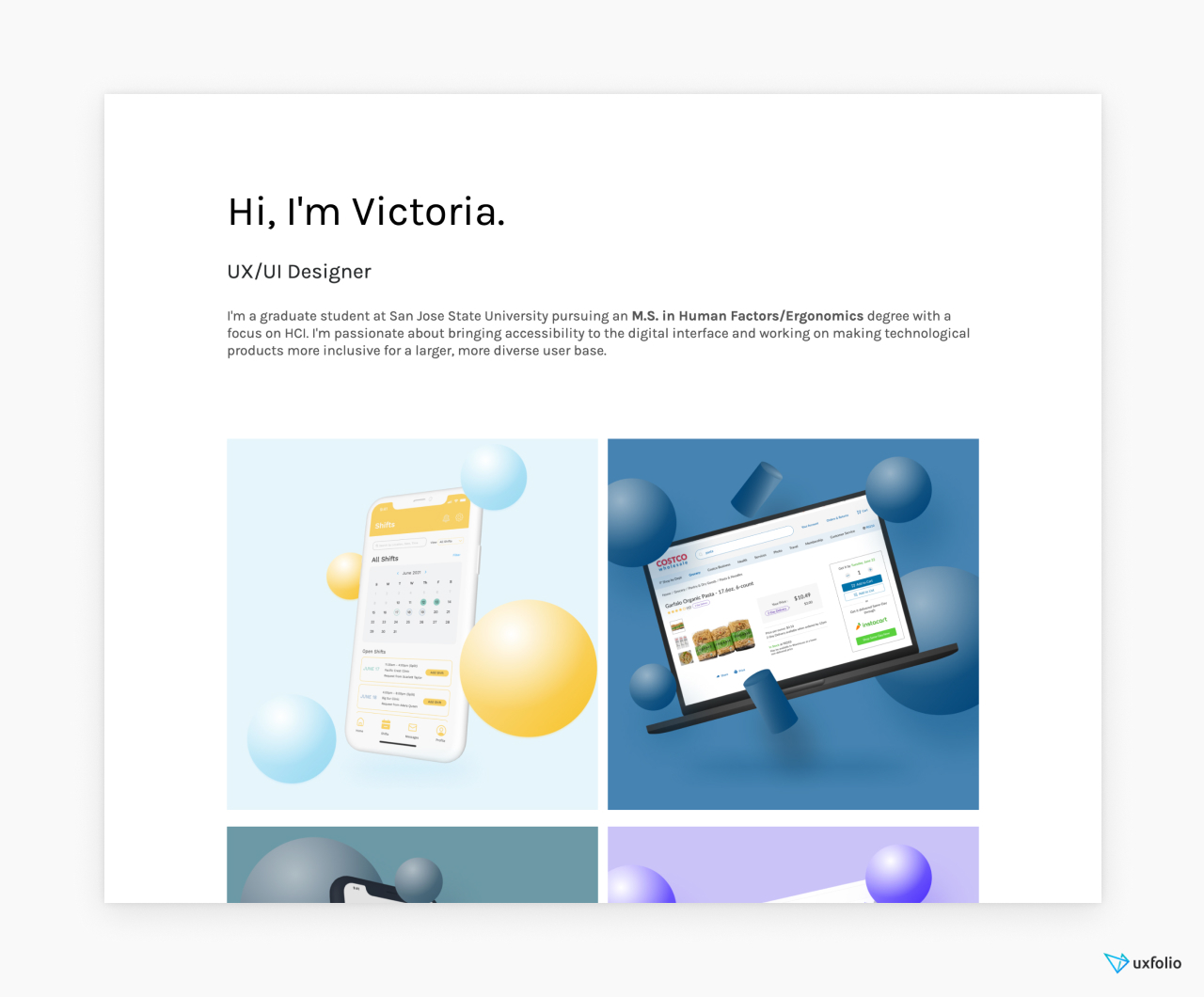
About UX case studies in general:
Before you get to work, we need to clarify a few important details. Doing so will help you understand the expectations and the purpose of UX case studies:
What are UX case studies?
UX case studies are a form of professional content that mixes text and visuals to present the design process of products or product features. They make up UX portfolios, alongside optional pages such as ‘About Me’ or ‘Contact’.
How are they different from UX portfolios?
UX portfolios are made of UX case studies. Think of your portfolio as a folder that holds together your case studies. Back in the day, these used to be printed, book-like documents. Nowadays the industry prefers websites and other digital formats .
How are they different from resumés?
Your resumé lists your skills and work experience. Meanwhile, your portfolio uses case studies to showcase how you apply those skills and experience . Ultimately, you’ll need both to land a job.
How many case studies should be in a portfolio?
If you’re a junior UX designer , you should include 2-3 case studies in your portfolio. These could describe UX bootcamp assignments, re-design concepts, UX challenges , internship projects , or even fictional products. If you’re a medior or senior UX designer, write up 4-5 of your most impressive projects into case studies. Your goal should be to feature as many of your skills as possible. And remember: quality over quantity.
What to feature in your UX case studies?
Since your career depends on your UX portfolio, there’s a lot of pressure that comes with putting one together. Usually, it’s this pressure that numbs designers and leads to procrastination. But just setting straight what lays ahead will help ease your mind:
The story of your design
Design decisions, visuals with explanations.
This might sound very esoteric, but it’s really not. For every design, there was at least one problem that required a solution. You were the person who explored the problem and found the solution/solutions. There might have been moments when the whole thing went off-rails, or when you needed to go back to the drawing board. Those are all part of your design story.
Now, imagine that a friend, peer, or colleague asks you about a project. How would you talk about it? That’s almost exactly what you should put in your case studies. Just polish it a bit, leave out the curse words, add visuals and you have a case study.
Throughout the design process, you keep making decisions. Choosing a UX method to apply is a decision too, and there’s a reason why you chose it. Your UX case studies need to highlight these decisions and their contribution to the design.
The biggest mistake in UX case studie s is when UXers go on defining instead of explaining:
- Definition ➡️ “I proceeded to do an in-depth competitive analysis to find out more about competing apps in the same category.”
- Explanation ➡️ “I proceeded to do an in-depth competitive analysis to make a list of features that were missing from our products, check out how others solved the XY flow, and find out how could we improve on it in our solution.”
Then you’ll move on to explain what you’ve found and as your case study progresses, you reference those findings.
You need to be heavy-handed with your visuals when you’re creating UX case studies. Using images alongside your text will help your readers’ comprehension. So, as a first step, collect everything you can: photos, sketches, whiteboard grabs, graphs, personas, screenshots, wireframes, user flows, prototypes, mood boards, notes, and so on.
We’ve seen some creative UXers use screenshots of calls (with blurred-out faces), group photos, and prototypes of all fidelity. Such visuals help us understand what we’re reading about. But they also build an image in our heads of the designer behind the screen, which can be very powerful and memorable.
Some designers are already in the habit of keeping every scrap of paper with a scribble on it because they know that when it comes to writing a case study, you can’t have enough visuals. Follow their example to make your easier – your future self will thank you.
But it’s not enough to just throw some images into a case study. Here’s how you can make them impactful:
- Always give context ➡️ if you put that stunning photo of the wall with post-its into your case study, make sure that you place it in a section where you explain what’s happening on it (see design decisions) or give it a caption that explains it. The important thing is that visuals will only work if they are strategically placed or they come with an explanation.
- Strive for visual consistency ➡️ even if it requires some extra work, you should make sure that your visuals match each other. Yes, a persona and the user flow might not be close to each other on your layout, but they’re still in the same document so they need to have consistent styling. Believe me, this is a common criticism from design leads and HR folk as well.

How long should be a case study?
If you check a site like Behance, you’ll find that most UX projects there are rather short. Usually, they focus on the visual aspects of design, aka UI. That is a fantastic starting point for a case study. But for UX design, you will need to add some content for context.
The good news is that you don’t need to write essays for case studies. All it takes is around 500 words and some well-optimized visuals. You should never stretch your words because it’ll reflect poorly on your presentation skills.
Also, treat this number with flexibility: If the project at hand justifies it, feel free to go above or below that. Usually, when a case study is very long, it’s because the project itself was more complicated.
What’s the point of UX case studies?
1. applied designer skills.
It’s one thing to learn a skill and it’s another to use it in a way that can help drive numbers for a business. A great UX case study will prove that you are capable of applying your skills and delivering a solution even with all the distractions and obstacles that come with real-life scenarios.
2. Presentation skills
Many UXers forget about the skills that are required beyond UX. Just read a few UX designer job descriptions , and you’ll find that advocating for design best practices is one of the most common requirements.
As a designer, you’ll have many stakeholder meetings and you’ll need to present your or your team’s ideas. And the fate of those ideas might depend on the way they’re presented. Therefore, the way you articulate your thoughts is important. A great UX case study will show that you are great at structuring your thoughts and articulating complex concepts.
3. The impact of your design
You can see in our UX case study template that there’s a separate section for showcasing your impact. If you can prove that your design can drive numbers, you’re set. This is the single most powerful tool that you can use in a case study: before-and-after analytics, such as an increase in checkouts, increase in finished flows, better CTRs, user feedback, etc. Use whatever number you have to show that your design contributed to the business. It’ll convince even the UX-doubters.
Obviously, as an aspiring/junior designer , this might be impossible, so you need to be a bit more creative. We advise you to show what impact the project had on you: what you’ve learned and how you’ve improved as a designer.
4. Navigating in a team
Almost every product is a collaborative effort between professionals from various disciplines: researchers, designers, developers, marketers, etc. Therefore, navigating in a collaborative environment is an important trait. A case study should show how the team influenced the design, how you’ve collaborated with other designers, the sacrifices that had to be made, and so on.
You don’t need an elaborate plan for this. First and foremost, make sure that you introduce the team in your case study. Second, ask for quotes/recommendations and include them in a neat quotes section. Yes, tooting your own horn can be a bit uncomfortable, but unfortunately, it’s part of the game.
5. Showcase of your taste
Yes, it’s UX, but the reality is that most people don’t care: if what you present doesn’t appeal to them, it’s unlikely that you’ll get the job. Make sure that your UX case studies are visually consistent. If you want to cast a wider net, strive for sleek, minimalist solutions and harmonizing colors.

A simple yet effective UX case study template
This is a tried-and-true UX case study template that can provide a structure to your thoughts. There are 6 chapters that are standard for almost any UX case study. However, the content of these chapters is highly dependent on the project you’re writing about. But don’t worry, this doesn’t mean that we’ll leave you on your own: for each chapter, we’ll give you various options and ideas to help you get going.
UX case study template/skeleton:
- Hero section
- Project overview
- Exploration/Discovery
- UX design process
- Final design
1. Hero section
All case studies should begin with a title & subtitle. You can use various formulas for your title, but we’ve found that this is the one that works the best:
- App name + project scope + project/case study = Netflix Checkout Redesign Project
Your subtitle can provide a glimpse into the project, for which you have various options:
- What’s the product about? (An app that helps you keep your plants alive.)
- What was the project about? (6-week UX design and research project)
If you want to include something visual in your hero section go hard or go home: use spoilers, aka show screens of the final design. You don’t have to fit everything there, just the parts you’re most proud of as an appetizer. Later in the case study, you’ll have enough space to showcase everything you’ve worked on.
- 2 sentences (titles), and
- 1 optional cover image.
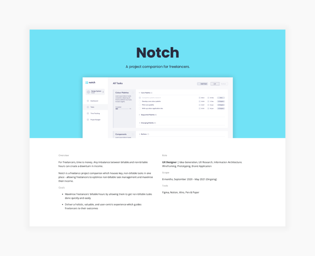
2. Project overview
Make sure that your readers are prepared for what’s to come. Remember: they know nothing about this project, so you need to cover the bases:
- Product description,
- Team members,
- Project length,
- Methods used, and
- 3-4 sentences for the overview, and
- 4-5 bulletpoints for the small details.

3. Exploration/discovery
Now that we have all the background information, we can move on to how you’ve approached the issue you were presented with. This part usually includes:
- Competitive analysis,
- Interviews, and
Make sure that for everything you mention you answer at least these three questions:
- Why did you choose to do it?
- What did you find out?
- How did that influence your next move?
You can end this chapter with a wrap-up to create a smooth transition to the next chapter.
- At least 3-4 sentences for each method you’ve used,
- Visualize as much information as you can.

4. UX design process
Now that we understand the scope of the project, we’re eager to see how you went on to design a solution. You can achieve a great structure here if you start from more abstract ideas and move towards the final design:
- Wireframes,
- Prototypes,
- Iteration, and
- Validation.
Again, you need to answer a few questions for every step you made:
- What did you want to achieve by doing this?
- How did this step contribute to the final design?
- At least 3-5 sentences for every method you mention.
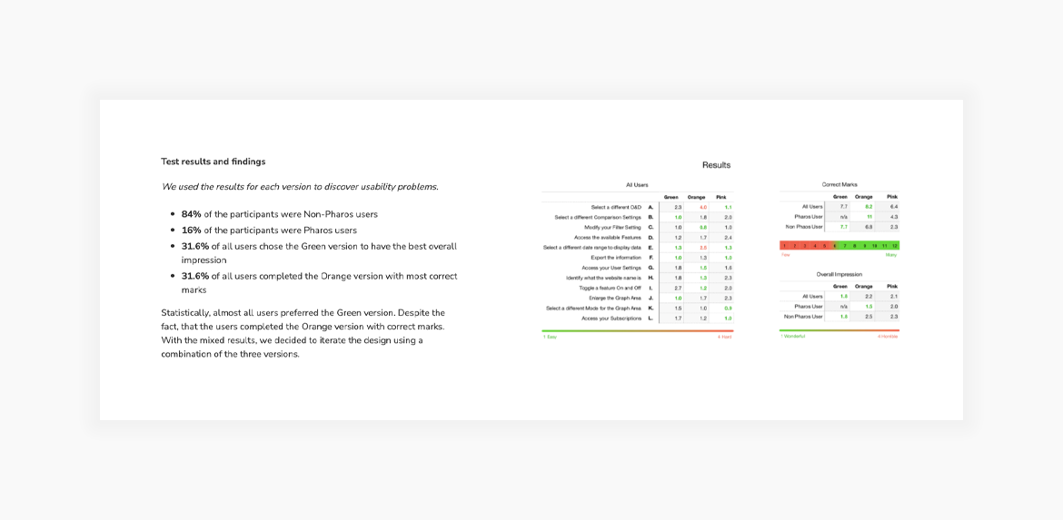
5. Final design
Probably the most exciting part of every UX case study is the reveal of the final design. In this section, you should explain
- Why did you choose this solution?
- What other solutions were in the run?
- Before-and-after screenshots (if relevant to the project).
There are two great options to present your final designs. The first is to use galleries. You can go with a nice carousel or a grid that follows a logical order. The second is to embed your Figma prototype. This has the added benefit of making your case study interactive, which makes for a more memorable experience. (Or you can combine the two for an even better showing.)
- 2-3 short paragraphs.

If you have numbers or analytics that show how your design contributed to business goals, you need to showcase them. This will make your case study even more impactful. You don’t need graphs and piecharts (unless you have the time to create some); it’s enough to make a list with the quantifiable data. If you don’t have access to such data , you can also include testimonials and user quotes to underline impact. If you can include both, that’s a winning combination.
- At least 1 sentence for each achievement.
- In a bulleted list or short paragraph.
6. Learnings
There’s something to learn even from the most boring project you’ve ever done. At least, you should strive to find something positive that can contribute to your growth as a designer. This can be a soft skill, a new tool, a new method, or a different way of cooperation. Try to think of things that were new to you in this project and share the takeaways with your readers. Alternative closures include:
- What would I do differently?
- Jobs to be done
- This chapter can be as long as you please, but
- At least 3-4 sentences.
Alternate UX case study templates
We’ve provided a classic UX case study template that has been proven to be working. Now, we’ll show you how you can alter this template for different flows:
UI focused case study template
If you’re strong in UI, you should not wait to reveal your final design until the end of your case study. You needn’t worry about spoiling the surprise as a case study is not a fiction novel or Netflix show. A beautiful design will pull in your readers. What’s more, if the company doesn’t really know the difference between UI and UX, this approach will make your case study even more impactful as it’ll start with the ‘beautiful stuff’.
Here’s how that template would go:
- Project Overview
- Transition to the next section by letting your reader know that you’ll explain how you’ve arrived at this solution.
- Exploration/discovery
- (Optional: Showcase even more of your final designs)
Impact driven case study template
Every product has a business behind it. And what you can do for that business is what matters to stakeholders. We can all conclude that a screen is pretty, but if it doesn’t contribute to business goals or KPIs, it’s just that, a pretty screen. So, if you have some numbers to share, don’t be afraid to put them right after your intro section. Then go on and showcase how you’ve achieved it:
- Share numbers then follow up by showcasing the design which contributed them:
Build your UX case studies with UXfolio!
UXfolio is a portfolio and case study builder made with UX designers in mind. It offers stunning, customizable templates as well as a case study generator with text and image ideas. What’s more, UXfolio comes with built-in device mockups, easy prototype embedding, and password protection on the portfolio or the case study level. Ready to work on your portfolio? Try UXfolio for free!
How to Craft an Outstanding Case Study for Your UX Portfolio
Writing case studies for your UX portfolio can feel opaque and overwhelming. There are so many examples out there, and often the ones that make the rounds are the stunning portfolios of top visual designers. It can be inspiring to see the most beautiful work, but don’t let that distract you from the straightforward format of a good UX case study.
At the core, a UX case study relies on excellent storytelling with a clear, understandable structure . This article breaks down the anatomy of a UX case study to help you tell a simple and effective story that shows off your skills. We’ll start with some general guidelines and structure, then break it down one piece at a time:
UX portfolio overview
What is a ux case study, general guidelines, how to structure a case study, how to fill in the details, defining the problem, understanding your users, early or alternate ideation, final design solution, next steps and learnings.
- Final thoughts
1. Before we get started
Before we dive into all the art and science of the case study, here’s a quick refresher on what a job-winning UX portfolio looks like. In this video, pro designer Dee analyses various design portfolios to pick out what works—and what doesn’t:
Simply put, a case study is the story of a design project you’ve worked on. The goal, of course, is to showcase the skills you used on the project and help potential employers envision how you’d use those skills if you worked for them.
A case study is typically written like a highly visual article, with text walking readers through a curated set of images. Curated is an important word here, because it should be short and sweet. It’s a chance to share what you want potential employers to know about your work on this project.
With that in mind, case studies are really a UX designer’s secret weapon in two ways. First, they get you in the door by showing more about your work than a resume and a top UX cover letter ever could. Another benefit is that they’re really handy in job interviews. If someone asks about a past project, you can walk them through the case study you’ve already created (this is sometimes a requirement anyway).
I mentioned that UX case studies are about storytelling. I’d actually say they’re about stories-telling, since they need to tell two intertwined stories .
The first is the story of your project. This answers questions like what problem you solved, who your users were, what solutions you explored, and what impact they had.
The second story is about you as a designer and your process. This is more about which methods you chose to use and why, how you worked within constraints, and how you worked as a member of a team (or without one).
So what are the steps for an effective case study? Well, like most things in design (and life), it depends. Every case study will be different, depending on what stories you’re telling. The six-part outline below, though, should guide you through an effective format for any UX project story. Here’s the outline (we’ll dive into each component in just a minute):
- Defining the Problem
- Understanding your Users
- Final solution
It’s worth it to add a few general notes before we dive into each of the list items above. For each section, include 1-2 short paragraphs and an image of a deliverable that visually tells the story your paragraphs explain. A reader should be able to either just read or just look at the images and roughly get what this moment in the story is communicating.
When choosing images to include, focus on quality over quantity. Choose your best deliverables for each stage and briefly relate them back to the larger narrative. It can be tempting to overload the page with everything you created along the way, but these extra details should stay in your back pocket for interviews.
Lastly, make sure your case study is scannable . In the best of circumstances, people don’t read word for word on the web. Make sure your text is reasonably concise, use headers and strong visual hierarchy, and use bullet points and lists when possible. If you need a refresher on how to achieve this, check out our guide to the principles of visual hierarchy .
Ok, let’s take a look at each step in a bit more detail.
2. Anatomy of a UX case study
Like any story, the introduction sets the stage and gives much of the necessary context readers will need to understand your project. This is one section where people actually might take some extra time to read carefully as they try to discern what this case study is about. Make sure they have all the details they need.
Some key questions to answer are:
- What is your company and/or product?
- What user problem did you try to solve?
- What was your role?
- What tools and methods did you use?
- What are the major insights, impacts, or metrics related to the project
After introducing the project, dive more deeply into the problem you tackled. You touched upon this in the introduction, but this section is an opportunity to make a strong case for why this project exists. Did a competitor analysis or market research demand a new product? Was there past user research in your company that suggests a needed redesign of the product?
Remember that you’ll want to create a through line in the narrative, so try to lay out the problem in a way that frames your design work as a solution.
Deliverables that work really well for this section would be:
- Analytics or usage data
- Market research of internal business metrics
- Survey results or interview highlights
After explaining the problem, show how it impacts your users and their interaction with your product. If you did original user research or you’re seeking user research-oriented jobs, sharing interview scripts, affinity maps , and spreadsheets can be useful in showing your process.
However, this section shouldn’t be only about your process. A key goal of this section is articulating who your users are and what their needs are. These findings should set up your design work that follows, so try to set up that connection.
A few types of the deliverables you might share here are:
- User personas
- Mental models
- Journey maps or customer experience maps
Keep in mind you want to communicate users’ key motivations and challenges, as well as any more specific user groups you identified.
This section can really scale up or down depending on what you have to show. Research shows that hiring managers don’t just want the final product , so it’s clear that showing some of your process is helpful. Especially for students or designers without a fully built product to show, this can be a moment for you to shine.
Don’t worry about the low fidelity of these documents, but the rougher they are, the more you’ll need to guide readers through them. Everything you show here should teach the reader something new about your process and/or your users.
Artifacts you might include are:
- Pen and paper or low fidelity digital wireframes
If you did early testing or faced constraints that determined your future design work, be sure to include them here, too.
This section should include the most final work you did on the project (e.g. wireframe flows or color mockups) and any final product it led to (if you have it). Be clear, though, about which work is yours and which isn’t.
Explain any key decisions or constraints that changed the design from the earlier stages. If you incorporated findings from usability testing, that’s great. If not, try to call out some best practices to help you explain your decisions. Referring to Material Design, WCAG, or Human Interface Guidelines can show the why behind your design.
If you’re able to show the impact of your work, this can take a good case study and make it outstanding. If your project has already been built and made available to users, have a look at any analytics, satisfaction data, or other metrics. See what you could highlight in your case study to show how your design improved the user experience or achieved business goals. Ideally, you can refer back to your original problem statement and business goals from the introduction.
If you don’t have any way of showing the impact of your project, lay out how you would measure the impact. Showing you know how to measure success demonstrates you could do this on future projects.
Lastly, conclude your case study by sharing either your next design steps and/or some key insights you learned from the project. This isn’t just fluff! No project is perfect or final. Showing next steps is a great way to demonstrate your thinking iterative approach (without having to do the work!).
Also, many companies do (or should do) retrospectives after each project to identify challenges and improve future processes. Use this process and the insights you gain from it to inform your case study. Letting employers know you’re capable of reflection shows humility, self-awareness, and the value you can bring to a team.
3. Final thoughts
Since each case study is a unique story you’re telling about your project, it’s a little art and a little science. But starting with the structure laid out in this article will show who you are as a designer and how you solved a problem. And those are two stories companies want to hear!
If you’d like to learn more about how to craft a great UX portfolio, check out these articles:
- 5 Golden rules to build a job-winning UX portfolio
- The best UX design portfolio examples from around the web
- The best free UX/UI portfolio websites to use
- Salary negotiation for UX designers
- mindful design
- student success
- product design
- ui/ux design
- watch me work
- design careers
- design inspiration
7 Best UX Case Study Generators (and how to use them)
If you're looking for UX case study ideas, topics or challenges, these UX case study generators can help you create portfolio pieces and improve your UX/UI skills. Here are some of the best ones and the pros and cons of using them.
What is a case study generator?
A UX Case Study Generator is a tool that serves up hypothetical UX design project ideas, problems, challenges or exercises that you can complete on your own to practice your UX skills or use to create UX Case studies and projects for UX/UI portfolio.

UX Case Study Generators
1. UX Challenge
UX challenge provides prompts and exercises that allows you to practice your problem-solving skills and create one-off projects for your portfolio. The Challenges presented here have been created by UX Designer Yachin and are based on real-world problems.
You can browse through a few different industries or categories on the homepage and then view the details of the project brief.

With more than 15 millions prompts available, there are lots of UX/Product Design prompts to choose from. To start, click on 'Product/UX' and then Click ‘New Challenge’. If you like certain elements of the brief you can lock those in place and then click New Challenge again to regenerate the unlocked parts until you find something you like.

3. Designercize
This fun arcade game-like interface lets you choose the level of difficulty and gives you a timer so that you can test your speed. While this tool doesn’t allow you to select a specific category, you can regenerate exercises until you find one that appeals to you.

4. UX Tools Challenges
If you need practice creating specific UX deliverables or applying certain user research methods this is a great option. You can browse through a number of UX prompt cards and click on a UX challenge to view a hypothetical scenario, instructions and tutorials on how to approach the challenges.

5. Uplabs Challenges
Uplabs hosts open design challenges that you can enter for prizes. They have deadlines in place and submissions are reviewed via voting. Check out their active listings to see on-going challenges and see the submission details and requirements. You can also view past challenges and try using them as practice on your for use as UX case study ideas.

6. 100Daysofproductdesign
100 Days of Product is a series of design challenges that help you learn to tackle specific problems that arise in UX and product design roles (such as running a design sprint) and prompts you to create deliverables around them. There is also a separate set of whiteboarding challenges that you can take in preparation for interviews.

7. DesignerUp
Our Product Design course is home to one the best UX and Product Design case study creators you can find...yourself! You get to ideate on original concepts yourself from scratch, is completely unique, perfectly suited to who you are as a designer, shows your process and ensures you stand out from the crowd. You also get free access to our portfolio builder for Notion that has helped our students easily create product design case studies and land their dream roles!

UX Case Study Usage
There are 4 main ways we recommend applying these generator prompts and challenges based on your goals:
Option 1: Self-Practice - Use these as practice for yourself to develop your problem-solving skills, thinking on your toes, learning to manage your time and refining your workflow. You don’t need to show it in your portfolio but you can share it on social media and other places to get some feedback and get into the hang of doing projects and getting to know your own timing and process.
Option 2: UX Case Study Creation - Use these for your UX portfolio to create UX case studies . Give yourself a deadline, deliberately choose a project and document the process as you go. Be mindful of the projects you choose and make sure that they align with your own unique positioning as a designer and with the opportunities you want to attract.
Option 3: Whiteboard Challenge - Work on the prompts in 45 min sessions using a whiteboard like Figjam to show and tell your process. Record your screen so that you can replay it and share it with others for critique. This video could even be an incredible addition to your portfolio to showcase how you think and solve problems on the fly.
Option 4: Take-home Exercise - To simulate an interview take-home challenge or test, you can tackle a prompt or brief over the course of 8-10 hours.
Pros and Cons of Using UX Case Study Generators
There a few pros and cons about using case study generators that you should know about:
If you can do them, so can everyone else
Firstly, remember that if you have access to these design challenges and briefs so do all the other designers. That means that there is a good chance your work might end up looking similar to their work if you’re not careful. If you want to stand out, try customizing the prompts and challenges and adding your own unique spin.
Treat them as real UX projects
If you plan to feature these UX case studies in your portfolio, make sure to treat them as real UX projects; not just hypothetical exercises. Conduct actual research, analyze your findings and document your process. This will go a long way in helping you differentiate yourself from those that simply complete the challenge at face value.
Not consider real-world experience
Keep in mind that these generated UX case study projects and prompts are not considered 'real-world or ‘real- work experience’ by employers, but rather self-directed projects. They are a good first step for new UX designers to start practicing their problem solving skills on their own and refining their UX design process, but you'll have to go the extra mile if you want to use them in your portfolio to impress during interviews.
Choose the right one
If you are looking to use these ideas as UX Case studies in your portfolio, I reccomend reading this article on how to choose which case studies you should do and how to Create a Magnetic UX Case Study that will actually get you noticed and hired.
Move into doing real projects
These projects are also no substitute for doing real-world projects such as things you design and build yourself, freelance jobs, client work or open-source projects. Generated prompts and challenges cannot introduce the ambiguity of business requirements, changing stakeholder needs and team dynamics that are most sought after in a hirable UX designer. So think of these as a stepping to help you jump into the real thing as soon as possible. Here are some examples of stellar UX/UI and Product Design portfolios that we love!
The best design resources, in your inbox
Tips, tricks, articles and freebies. It's all happening in the DesignerUp Newsletter. View the archives →
We'll only send the occasional email and promise not to spam.
© Copyright 2022 DesignerUp. All Rights Reserved.
- Skip to primary navigation
- Skip to main content
Usability Geek
Usability & User Experience (UX) Blog

UX Case Study: Calm Mobile App
By Sean McGowan

Welcome to the first UX case study of 2018! Codal hopes you have had a fantastic start to the new year. For those who have followed along with our long-running UX Case Study series , welcome back, and to new readers, welcome aboard.
For those who are just joining us: UX Case Study is a regular series written by UX design agency Codal , where we conduct in-depth examinations of different mobile apps. An exercise in scrutiny, we place apps under a microscope and critically examine them through a user experience lens, acknowledging both their successes and failures.
The ultimate goal is to view UX holistically and examine how different design techniques coalesce to work as a whole in a functioning application. To kick off the new year, we have decided to study the 2017 winner of Apple’s “App Of The Year” award: Calm .
Calm is a mindfulness and mental health app that offers free exercises and programs that help users do everything from meditating and improving sleep to reducing stress and increasing focus. Offering a range of ASMR-like readings, ambient music, and relaxing nature sounds, Calm aims to help their users become more mindful through daily sessions and regular practice.
As always, I will be conducting my analysis using an iPhone 7 with the latest iOS release, and the most updated version of Calm as well.
Before I even open Calm, its icon sets the stage for the app’s aesthetic motifs and visual language. Set against a soft, azure gradient, the app’s name is written in a spindly, naturalistic typeface that evokes tranquillity and serenity.
When I tap the icon, Calm’s splash screen appears, though “splash” seems too strong a word. It is more of a single drop of water-the words “take a deep breath” imposed upon the same soothing blue gradient used for the app’s icon. I oblige, though I hope it is not to prepare me for what is going to be a lengthy and tedious onboarding process.

Expecting the standard “sign up / login” screen, I am instead greeted with a display that asks me to choose my top goals. Here, Calm shows off the benefits of using its programs, offering everything from “Build Self-Esteem” to “Increase Happiness”.
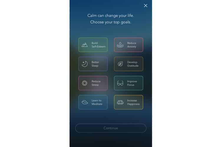
This is both an excellent marketing strategy and a savvy UX move-the app is offering the user value upfront, providing a reason why I should sign up for Calm. Moreover, it does it not by listing features or functions, but by end results. It does not say “over 100+ programs and exercises”. It promises the resulting benefits: better sleep, less anxiety, reduced stress.
Assigning each goal a distinct colour and icon is an aesthetically pleasing choice as well. I tap a few goals and select “Continue”.
I am brought to the sign-up/login screen. Calm uses a standard template for this standard display, offering sign-up functions with both email and Facebook. The most striking design feature of the screen is easily the picturesque background. We see that omnipresent gradient as the sky, coupled with a mountain terrain and a tranquil body of water.
I select sign up via email and am brought to another conventional screen in the onboarding process. There is not much to mention here, other than the fact Calm once again demonstrates value by offering a reason why the user should create a profile-to track and save progress.
After creating an account, Calm serves up two interstitials between account creation and the home screen. The first: an offer to unlock the full version of Calm with a seven-day trial period, and the laundry list of features that accompany it.
The feature list is not much help to me for now- I am not familiar with in-app jargon like ‘Sleep Stories’ or ‘Daily Calm’ – and I do not know if I will even enjoy the app yet. However, to be fair, they are offering a free trial, so I am sure it does convert some users that want to begin with the full app experience.
The second interstitial is a classic prompt to enable Calm to send notifications. Long-time readers will know of my personal pet peeve with these untimely interruptions, especially when they do not reveal what I will be notified or why I should enable them.
Home Screen / Tutorial
With the onboarding process complete, I am brought to Calm’s home screen, a modest, unadorned page with the same picturesque backdrop as the login. In the upper corners of the screen are two icons, one which appears to be the “my profile” page, and the other which I am unsure of.
The app’s primary navigation lies across the screen’s bottom, and is only three options: Music, Meditate and Sleep. The meditate option is given priority, as evidenced by its larger size and placement in the centre. An overlay appears above it that reads “Start your journey” here.
In-app tutorials are a hotly debated topic in mobile app design, with some designers claiming that if your app needs one, you have already failed. While that is an admirable ideal for a UX designer to hold, I personally do not subscribe to it (though I am sure some of Codal’s UXers would disagree with me).
As it stands, Calm’s in-app tutorial is relatively painless, essentially guiding me along the platform’s fundamental user journey, rather than taking the time to illustrate and explain every feature and function. Displayed below, the tutorial takes me the beginner’s meditation program, “7 Days of Calm”.
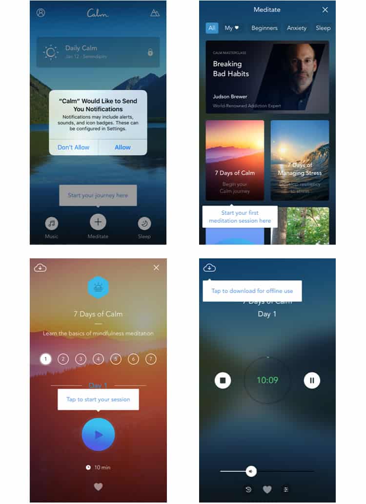
All-in-all, it is only four overlays, and it works well in efficiently immersing me in Calm’s first program. Some UX designers may disagree with me here, but I think Calm’s in-app tutorial is a strong design choice.
As indicated by the navigation bar, Calm offers three primary features for mindfulness: Meditate, Music, and Sleep. While all three contain different programs for different goals, they also all rely on the same playback functionality, making this interface the perfect closer to our UX case study . Another reason Calm’s playback feature deserves scrutiny: it is unlike any standard player you have probably ever used.
The most striking feature is its lack of features. Subscribing to a minimalist strategy, Calm’s player has only two main buttons: play/pause and stop. There is a necessary volume control, and a “favourite” function too, but other than that, there is not much else to write.
There is a jarring lack of a fast-forward function (Calm does not want you skipping through its programs), and even the reverse feature can only be used in fifteen-second intervals. This lack of granularity is rare for playback mechanics, but for Calm it makes sense.
Calm’s player is a rare example of taking distinct features away to improve the user’s experience. The user should not be able to fast-forward or rewind incessantly-this is a meditation app.
Final Verdict
I only used Calm for about three or four days (I guess meditation is not really my thing), but overall I was pleased with the user experience. Its content well-produced and the app’s commitment to a card-based design keeps it well-organised and easy to traverse.
While I did not notice it during my initial use when I plugged in my headphones the app began to play nature sounds while I was interfacing with it, which was a nice touch as well.
Overall, it is easy to see why Calm was named Apple’s 2017 App of the Year. Their calming, meditative feel extends from their programs and content to envelop the entire user experience. Traversing Calm feels seamless as if you are floating in the lake that adorns the app’s home screen.
More from the UX Case Study Series
- UX Case Study : Google Maps vs. Waze Mobile Apps
- UX Case Study : Spotify Vs. Apple Music Mobile Apps
- UX Case Study : Acorns Mobile App
- UX Case Study : Lumosity Mobile App
- UX Case Study : Talkspace Mobile App
- UX Case Study : Zocdoc Mobile App
- UX Case Study : Calm Mobile App ? You are currently reading this
- UX Case Study : Overcast Mobile App
- UX Case Study : SoundCloud’s Mobile App
- UX Case Study : HBO GO App
- UX Case Study : Venmo
- UX Case Study : CNN’s Mobile App
- UX Case Study : ESPN’s Fantasy App
- UX Case Study : Duolingo
- UX Case Study : Bumble
Want to learn more?
If you’re interested in mobile UX, then taking the course on Mobile User Experience , which includes templates you can use in your own projects. If, on the other hand, you’d like to…
- learn all the details of Usability Testing
- get easy-to-use templates
- learn how to properly quantify the usability of a system/service/product/app/etc
- learn how to communicate the result to your management
… then consider to take the online course Conducting Usability Testing .
Lastly, if you want to brush up on the basics of UX and Usability, the online course on User Experience could provide you with the necessary knowledge. Good luck on your learning journey!
(Lead image: Depositphotos – affiliate link . All other photos in this article are screenshots taken during usage of the Calm app.)

About Sean McGowan
Sean is a technical researcher & writer at Codal , authoring blog posts on topics ranging from UX design to the Internet of Things. Working alongside developers, designers, and marketers, Sean helps support the writing team to ensure Codal produces engaging web content of the highest quality. When not writing about the latest innovations in app design, Sean can be found cooking, watching old movies, or complaining about the shortcomings of his favorite Philadelphia sports teams.
Get Started
Popular topics.
- Usability Guidelines
- Usability Testing
- User Experience
- Design Tools & Software
- Interface & Navigation
- Mobile & Tablet
- Writing For The Web
SOCIAL MEDIA CHANNELS
© Copyright 2011-2021 UsabilityGeek · Privacy Notice · Terms and Conditions ·
Privacy Overview
Necessary cookies are absolutely essential for the website to function properly. This category only includes cookies that ensures basic functionalities and security features of the website. These cookies do not store any personal information.
Product Design (UX/UI) Bundle and save
User Research New
Content Design
UX Design Fundamentals
Software and Coding Fundamentals for UX
- UX training for teams
- Hire our alumni
- Student Stories
- State of UX Hiring Report 2024
- Our mission
- Advisory Council
Education for every phase of your UX career
Professional Diploma
Learn the full user experience (UX) process from research to interaction design to prototyping.
Combine the UX Diploma with the UI Certificate to pursue a career as a product designer.
Professional Certificates
Learn how to plan, execute, analyse and communicate user research effectively.
Master content design and UX writing principles, from tone and style to writing for interfaces.
Understand the fundamentals of UI elements and design systems, as well as the role of UI in UX.
Short Courses
Gain a solid foundation in the philosophy, principles and methods of user experience design.
Learn the essentials of software development so you can work more effectively with developers.
Give your team the skills, knowledge and mindset to create great digital products.
Join our hiring programme and access our list of certified professionals.
Learn about our mission to set the global standard in UX education.
Meet our leadership team with UX and education expertise.
Members of the council connect us to the wider UX industry.
Our team are available to answer any of your questions.
Fresh insights from experts, alumni and the wider design community.
Success stories from our course alumni building thriving careers.
Discover a wealth of UX expertise on our YouTube channel.
Latest industry insights. A practical guide to landing a job in UX.
3 real-world UX research case studies from Airbnb, Google, and Spotify—and what we can learn from them
All successful products have at least one thing in common: they’re driven by thorough and ongoing UX research. Learn how the biggest brands conduct user research with these real-world case studies from Airbnb, Google, and Spotify.

Free course: Introduction to UX Design
What is UX? Why has it become so important? Could it be a career for you? Learn the answers, and more, with a free 7-lesson video course.

User research is the foundation of good design. Any successful product you can think of is driven by user insights. And, while all UX designers tap into the same pool of tools and techniques, you’ll find that every team has their own unique approach to user research.
Are you curious about how some of the biggest brands conduct UX research? Then keep reading. In this post, we take a deep dive into three real-world UX research case studies:
- Airbnb: The power of observing behaviour to uncover design opportunities
- Google for Education: The importance of user feedback for rapid product adaptation
- Spotify: The value of human perspectives in a data-driven world
Each of these case studies teaches us a valuable lesson about UX research—lessons you can apply to your own design projects. So let’s jump in!
[GET CERTIFIED IN USER RESEARCH]
UX research case study #1: Airbnb and the power of observing user behaviour to uncover design opportunities
Oftentimes, user research is planned in advance and conducted within a controlled setting—think user interviews , or analysing how people interact with your website over a specific period of time.
But sometimes, user research occurs organically—like an accidental light shining on a major design opportunity. That’s exactly what happened at Airbnb, leading to the design and launch of a new global check-in tool.
Vibha Bamba, Design Lead on Airbnb’s Host Success Team, writes:
“The decision to design the tool was informed by an intriguing host behaviour. We noticed that about 1.5 million photo messages were being sent from host to guest each week—the majority of them to explain location and entry details. Photos of the home were juxtaposed with maps, lockbox locations were described, and landmarks were called out.”
Observing these behaviours over time, the Airbnb team realised that there was a huge opportunity to make the exchange between hosts and guests much more seamless and consistent. This kicked off a year-long project to design a global check-in tool for the Airbnb platform.
The result? An integrated check-in tool that enables hosts to create visual check-in guides for their guests. They can upload photos and instructions which the tool will translate depending on the guests’ preferred language, and the guides can be accessed both on and offline.
And, after launching the tool, the team continued to observe how hosts used it. They were able to flag issues and further design opportunities, adapting and evolving the check-in tool to better meet hosts’ needs. That’s the power of observing user behaviour!
The takeaway
User behaviour provides us with incredibly rich insights. Don’t rely solely on planned or periodic user research—continuously observe how people interact with your product in the wild, too. You don’t know what you don’t know, and this approach will help you to uncover design opportunities you may not have even thought to look for otherwise.
Read the full UX research case study here: Leveraging Creative Hacks: How the Airbnb Community Inspired a Global Check-in Tool .
[GET CERTIFIED IN UX]
UX research case study #2: Google for Education and the importance of user feedback for rapid product adaptation
When the Covid-19 pandemic hit, our lives changed almost overnight. Many of us were suddenly working from home, navigating new challenges of communicating and collaborating remotely.
Teachers were no exception. They had to quickly adapt to teaching online, relying on tools like Google Meet to conduct lessons virtually. But Google Meet was originally designed as a conferencing tool for businesses, so the user experience for teachers and students wasn’t ideal.
In the words of one tech admin speaking to the Google Meet team:
“Students are using the tools in a way that makes it hard for teachers to do their job. Teachers can’t mute students, or put them in groups, they can’t ask questions easily to take the temperature of the class. Students are also jumping on the video without supervision—and that’s an issue. I wish there was more control.”
The Google Meet team needed to act fast to figure out how the software could better meet teachers’ needs. To do this, they went straight to the source, gathering user feedback directly from teachers.
Based on this feedback, they added a range of new features such as attendance taking, hand raising, waiting rooms, and polls.
The result? A rapidly improved user experience for teachers and students which ultimately benefited all Google Meet users.
Sometimes, UX designers must think and act fast; there’s not always time for lengthy user research and cautious feature rollouts. When you need to adapt and evolve a product to quickly improve the user experience, it pays to go straight to your users for their feedback.
Read the full UX research case study here: Adapting Products to Meet Teachers’ Changing Needs .
UX research case study #3: Spotify and the value of human perspectives in a data-driven world
Data is a powerful research tool. It enables you to gather and analyse broad and vast user insights, to make evidence-backed decisions, and to track and measure important UX KPIs .
But, as Nhi Ngo, Insights Manager, User Research & Data Science at Spotify will tell you, it’s important not to become over-reliant on data when conducting UX research. Sometimes, making the best design decision boils down to a human perspective.
Nhi Ngo came to this realisation when developing and launching a feature called “Shortcuts” on the Spotify Home tab. Powered by machine learning, Shortcuts is a dedicated space that showcases the user’s current favourites, as deduced by Spotify’s algorithms.
The feature was developed based on data collected through a variety of research methods, including longitudinal user studies and A/B testing .
So far, so good. But when it came to deciding on a name for the feature, A/B tests came back inconclusive.
In the end, the name was decided based on the product designer’s instinct to go with the name that would create the most human and personal experience. Nhi Ngo explains:
“A few candidates that were tested were ‘Listen Now’ (the objective that the model optimizes for), ‘Shortcuts’ (the user-facing functionality), ‘Quick Access’ (a UX goal of this space), and last but not least, a daypart greeting, ‘Good morning’ (that would change with the time of day to ‘Good afternoon’ or ‘Good evening’). We were counting on the AB test to help us make this important decision. The test returned neutral. Our designer recommended we go with the daypart name, much to my reservations.
Indeed, participants were most often positively surprised in our interview sessions whenever they opened their phone and saw the greetings. Convinced by our designer’s humanistic approach and recognising the intangible benefits of providing users with this joy of being ‘greeted by Spotify’, we decided to go with our perspective-taking as humans to humans, and chose the daypart name.”
The result? A new product feature that evoked delight in Spotify’s users and led to further improvements, such as incorporating more time-based features in the model so that the recommendations changed depending on the time of day (for example, showing sleep music playlists at night).
Data-driven research is an extremely powerful tool, but it may not always give you the full picture or a conclusive answer. Whenever you conduct and interpret research data, it’s important not to lose sight of your human perspective.
In the words of Nhi Ngo: “When data can’t give you a definitive answer, it is OK to be human and make a human decision. Prioritise user joy; treat them as you would any human in your life.”
Read the full UX research case study here: It’s OK to be Human in a Machine-Learned World .
Learn more about UX research
All of these ux research case studies emphasise the importance of user research in UX design . If you’d like to learn more about UX research, check out the 9 best UX research tools , read about a day in the life of a UX research manager with Google’s Dr. Stephen Hassard , and master the art of analysing your UX research and pulling out useful insights in this guide .
- ux research
Subscribe to our newsletter
Get the best UX insights and career advice direct to your inbox each month.
Thanks for subscribing to our newsletter
You'll now get the best career advice, industry insights and UX community content, direct to your inbox every month.
Upcoming courses
Professional diploma in ux design.
Learn the full UX process, from research to design to prototyping.
Professional Certificate in UI Design
Master key concepts and techniques of UI design.
Certificate in Software and Coding Fundamentals for UX
Collaborate effectively with software developers.
Certificate in UX Design Fundamentals
Get a comprehensive introduction to UX design.
Professional Certificate in Content Design
Learn the skills you need to start a career in content design.
Professional Certificate in User Research
Master the research skills that make UX professionals so valuable.
Upcoming course
Build your UX career with a globally-recognised, industry-approved certification. Get the mindset, the skills and the confidence of UX designers.
You may also like
Build your UX career with a globally recognised, industry-approved qualification. Get the mindset, the confidence and the skills that make UX designers so valuable.
8 October 2024
IMAGES
COMMENTS
420 6.1k. Travel App Ui/Ux Case Study ( TripZen) Hasan Habib Hira. 82 336. Fintech Mobile App. Multiple Owners. 91 129. Upgrade to Behance Pro today: Get advanced analytics, a custom portfolio website, and more features to grow your creative career. Start your 7 day free trial.
Learn from UX case studies that showcase how designers solve problems, conduct research, and improve user experience. Explore 11 examples of UX design for web, app, and video platforms.
The next part in this UX case study identifies pain points faced by the proto personas when using the Amazon shopping app. To do so, we use a methodology named Heuristic evaluation. Heuristic Evaluation is a usability testing evaluation system introduced by Jakob Nielsen in 1990. It enables evaluators to determine a product's usability based ...
Home Rental Marketplace App. PAD is a mobile app that allows users to find a flatmate or a room. It matches tenants and landlords based on the geolocation and personal preferences. View the full case study here. Design by Purrweb UX Team. Design by Purrweb UX Team. Naim Music App. View the full case study here.
Explore UX case studies from different domains, such as apps, websites, typography, branding, and more. Learn from the insights and methods of UX designers who share their process and outcomes.
This article showcases 21 UX case studies from various categories, such as design language, UI design, UX research, and artificial intelligence. Each case study details the design process, challenges, solutions, and outcomes of a digital product or service.
Learn from the best UX design case study examples in 2022 and get inspired by the design process, challenges, solutions, and outcomes. This blog post also provides a step-by-step guideline on how to create a UX case study and a list of useful resources to follow.
Learn from 15 compelling stories of UX design projects that showcase the skills, process, and results of creative professionals. Explore different types of websites, platforms, and apps with detailed case studies that include screenshots, prototypes, and insights.
Learn from 62 UX case studies that show how companies like Tinder, Airbnb, Spotify and more design products that people love. Discover the psychology principles behind user behavior, retention, monetization, ethics and more.
Learn how to write a UX case study to showcase your skills, explain your thinking, and highlight user issues in your portfolio. See real-world examples of UX case studies from Spotify, Colors Over Calories, Routr, and Splitwise.
The New York Times app loses the love of users, due to a myriad of reasons. Along with the competition and cost, the following factors are the reasons for the difficulties. 1. Coverage (Users are unhappy about something they read) 2. Life-changing event (moving). 3. Lack of usage.
Learn how to write effective UX case studies with a flexible template and practical tips. Find out what to include, how to structure, and why UX case studies matter for your portfolio.
1.1k 12.6k. "100" - Minimalist Finance App Case Study. Amirreza Taghavi. 688 10.5k. Food App Case-Study UI UX Design. Multiple Owners. 70 968. Food App - Ui Design. 𝗖𝗿𝗮𝗳𝘁𝘆 𝗖𝗿𝗲𝗮𝘁𝗶𝘃𝗲.
In this article, we'll guide you through the process of creating an effective UX/UI case study that leaves a lasting impression. 1. Choose a Project. The first step in creating a compelling UX/UI case study is to select the right project. Choose a project that not only showcases your design skills but also aligns with your interests and passions.
Learn the anatomy of a UX case study and how to tell a simple and effective story that showcases your skills. Follow the six-part outline and see examples of deliverables for each stage of the design process.
While the UX case study described in this article is about a particular application, it will hopefully inspire you on how to conduct a UX case study on any app, website or interface of your choice.
Find out how to use UX case study generators to practice your UX skills, create portfolio pieces and prepare for interviews. Learn about 7 tools that provide prompts, exercises and briefs for different categories and levels of difficulty.
Traverse: an Efficient and Engaging urban commute app- A UX case study. ... your individual journey and growth. 🔸 It's better to fail fast than to get mentally blocked. 🔸 Design your app with user experience in mind, not as if you're coding it. 🔸 Avoid over-prototyping to simulate a real app, ...
Welcome to the first UX case study of 2018!Codal hopes you have had a fantastic start to the new year. For those who have followed along with our long-running UX Case Study series, welcome back, and to new readers, welcome aboard.. For those who are just joining us: UX Case Study is a regular series written by UX design agency Codal, where we conduct in-depth examinations of different mobile apps.
Mar 16, 2023. 143. Securing your first job in UX design can be challenging, but there was one case study in particular that helped me differentiate myself from other candidates. With the coaching of my mentor from Designlab, I designed a non-traditional learning app that teaches the Korean language using Korean media such as K-pop, K-drama, and ...
Recipe App UX Case Study. Building a mobile app from scratch-a case study to demonstrate the UX/UI design process from start to finish. Colors Over Calories is a recipe inspiration app for anyone who wants to add healthy, plant-based food into their lives in a playful way. 473. 15.2k.
Learn how the biggest brands conduct user research with these real-world case studies. Discover the lessons and insights from Airbnb, Google, and Spotify on observing behaviour, gathering feedback, and valuing human perspectives.
In parallel, as we were improving the User Experience, we worked on refining the visual design of the app. We developed a rule-based system to support branding, typography, icons, and colors in order to achieve visual consistency with the styling of the app. The system served as a base for the entire user interface used on iOS, iPad, Android ...
A design file that covers UX research processes and methods for creating and organizing case studies. It includes components for problem statement, user persona, task mapping, screens, and more.