
Presentation Drawing
The importance of presentation drawing.
Presentation drawing, also known as a rendering, is a crucial aspect of the design process. It's a means of visually communicating ideas to clients, colleagues, and contractors. Presentation drawings can take many forms, from quick sketches to highly detailed, realistic illustrations. Regardless of the format, the goal of presentation drawing is to convey the essence of a design in a visually compelling way.
The Types of Presentation Drawing
There are several types of presentation drawing, each with its own unique strengths and weaknesses. Here are four of the most common types of presentation drawing:
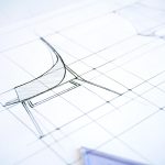
Sketches are quick, informal drawings that are used to explore ideas and communicate concepts. They are typically done by hand using pencil or pen and paper. Sketches are valuable because they allow designers to express their ideas quickly and without the need for expensive tools or software. That said, sketches are generally less polished than other forms of presentation drawing, so they may not be suitable for more formal presentations.
Concept Drawings
Concept drawings are more detailed than sketches and are intended to convey a more developed idea. They are still relatively informal, but they often incorporate color and shading to give the drawing depth and texture. Concept drawings can be done by hand or using digital tools like Photoshop or SketchUp.
Renderings are highly detailed, realistic illustrations of a design. They are typically created using 3D modeling software and are intended to give clients and colleagues a sense of what a finished project will look like. Renderings are often used in marketing materials and presentations because they are visually impressive and highly detailed.
Construction Documents
Construction documents are highly technical drawings that are used to communicate specific details about a project to contractors and builders. They include things like floor plans, elevations, and sections, and they are typically created using a combination of hand drawing and computer software.
Tips for Effective Presentation Drawing
Regardless of the type of presentation drawing you are creating, there are a few tips that can help ensure that your drawing is effective and communicates your ideas clearly.
Focus on Legibility
One of the most important aspects of presentation drawing is legibility. Your drawing should be easy to read and understand, even when viewed from a distance. Make sure that you use a font size and style that is easy to read, and avoid cluttering your drawing with unnecessary details that can distract from the main ideas you are trying to convey.
Choose the Right Format
Different types of presentation drawing are better suited to different formats. Sketches, for example, are best presented on paper or on a whiteboard. Renderings, on the other hand, are best viewed on a large screen or printed out at a high resolution. Make sure that you choose the right format for your drawing to ensure that it is presented in the most effective way possible.
Use Color Wisely
Color can be a powerful tool in presentation drawing, but it must be used wisely. Too much color can be distracting, while too little color can make your drawing look flat and lifeless. Use color to highlight important details and to create depth and texture in your drawing, but be sure to use it sparingly.
Be Consistent
Consistency is key in presentation drawing. Make sure that your drawing is consistent in terms of scale, proportion, and style. This will ensure that it is easy to read and that your ideas are communicated clearly.
Practice, Practice, Practice
Finally, the best way to improve your presentation drawing skills is to practice. Take the time to practice drawing different types of illustrations, and experiment with different tools and techniques to find what works best for you. The more you practice, the better you will become at conveying your ideas visually.
The Bottom Line
Presentation drawing is an essential aspect of the design process. It allows designers to communicate their ideas in a clear and compelling way and is crucial for getting buy-in from clients, colleagues, and contractors. Whether you're creating quick sketches or detailed renderings, there are a few key principles to keep in mind that can help ensure that your presentation drawing is effective and communicates your ideas clearly.
Leave a Reply Cancel reply
Your email address will not be published. Required fields are marked *
Save my name, email, and website in this browser for the next time I comment.
Exploring the most sophisticated spatial concepts from across the globe. Discover innovative building techniques and materials available, worldwide.
What Are Presentation Drawings In Architecture
Making a building look amazing is not something that should be taken lightly. And for that reason, architects have to make use of something called presentation drawings. This form of drawing has been used for centuries, and it still holds a very important place in the profession today. But what exactly are presentation drawings, and why are they so important?
These drawings are important because they serve as a way for the architect to demonstrate to the client what they have in mind. They allow the client to get a feel for the building and to get a better understanding of the design process. For architects, presentation drawings are also an opportunity to showcase their creative abilities and to show off their skills. The more effective the drawings are, the more likely it is that the client will be impressed.
At the same time, presentation drawings should also be aesthetically pleasing. By using colors and styles that are pleasing to the eye, the architect can help boost the credibility of their project and make it more attractive to potential customers. It is also important to make sure that the drawings accurately reflect the architect’s vision for the project, as it will give potential customers a better understanding of what the project is all about.
Documentation
Presentation drawings are also important for documentation purposes. Architects must keep records of their projects so that they can refer back to them if needed. The drawings serve as a record of what was done and make it easier to review the project in the future. In addition, the drawings can also be used to prove that certain regulations were followed and to determine if certain elements of the design were successful.
Presentation drawings also provide evidence that the architect has done their job properly. They demonstrate the level of detail and care that went into the project and show that the architect took all the necessary steps to ensure that the project was done right. In addition, they can be used in court to prove that the architect was responsible for any mistakes or issues that may have occurred during the construction process.
Time and Money Saving
Presentation drawings can be a great way to save time and money on projects. By providing clients with detailed and accurate drawings, architects can avoid costly mistakes in the construction process and ensure that the project is completed on time and on budget. By providing clients with a realistic representation of what their project will ultimately look like, architects can help to ensure that the project goes as smoothly as possible.
Presentation drawings can also help architects to identify potential problems with the project before they occur. By analyzing the presentation drawings, architects can spot potential problems with the project and address them before they become costly issues. This can help to save time and money during the construction process, as any issues can be dealt with more quickly and efficiently.
Technological Advancement
In addition, the use of 3D printing has revolutionized the presentation drawing process. By using 3D printers, architects can quickly and accurately produce presentations that are as close to the actual project as possible. This can be especially helpful when creating drawings of complex structures that would otherwise be difficult to accurately depict.
Presentation Drawing Generators
In addition to the advances in technology, there are also many tools available to help architects create presentation drawings. In particular, presentation drawing generators are a great way to quickly and easily create drawings that are higher in quality than traditional drawing methods. These generators can help cut out a lot of the time and effort associated with producing high-quality presentation drawings.
Impact on the Overall Project
Presentation drawings are one of the most important tools available to an architect, and they can have a huge impact on the success of a project. From allowing the client to get a better understanding of the project to helping to identify potential problems in the construction process, presentation drawings can make a huge difference in the overall outcome of the project.
For this reason, it is important for architects to take their time and effort in creating presentation drawings that accurately reflect their vision. Not only will this ensure that the drawings are effective and appealing, but it will also help the project be completed to the highest standard possible.
Anita Johnson
Leave a comment cancel reply.
Architecture Search by Google
Architectural presentation and rendering, architectural presentation and rendering: learning the creative methods of rendering and presenting..
Architectural Presentation and Rendering! In this comprehensive course, you'll explore a variety of creative methods for presenting and rendering architectural designs. We'll start by covering the importance of visual communication skills and the fundamentals of architectural presentation. From there, we'll dive into topics such as digital rendering techniques, 3D modeling, and the use of software tools like Autodesk 3ds Max, Autodesk Maya, and Blender. Throughout the course, you'll learn how to effectively communicate your design ideas through compelling visual presentations, mastering techniques such as shading, texture mapping, and composition. By the end of the course, you'll have the skills and knowledge to create stunning architectural presentations that will impress clients and colleagues alike.
Course Overview: Architectural Presentation and Rendering
- Importance of visual communication skills
- Fundamentals of architectural presentation
- Digital rendering techniques
- 3D modeling software: Autodesk 3ds Max, Autodesk Maya, Blender
- Shading, texture mapping, and composition techniques
Importance of Visual Communication Skills
Your skills as an architect in producing graphic documents or visual communication are crucial for effectively presenting architectural designs to clients.
Architectural Presentation & Rendering Curriculum Essentials
This course covers all essentials about visual communication and architectural presentation skills expected of new architects.
This course will be sufficient to teach all the essentials about visual communication and architectural presentation skills expected of new architects. The architectural presentation is a required course within the architectural education architectural education curriculum.
Goals of the Course
The primary goal is to develop visual communication skills required to present architectural projects effectively.
The most important goal of the course is develop, through extensive practice, the visual communication skills required to effectively present a graphic model of a final project or to highlight specific details of a project. Architectural presentation is also important as a way of studying architectural problems in order to produce solutions.
Architectural Presentation & Rendering Focus Areas
Emphasis is on digital presentation tools like 3D rendering, alongside the importance of freehand lettering.
The focus of this course is not on the use of monochrome media such as pencils, pens, and ink; instead, the focus is on digital architectural presentation tools such as 3D presentation. However, you should study and understand the importance of neat and legible freehand lettering before focusing on the development of 2-D and 3-D sketching skills.
Learning Objectives
Understanding drawing types.
Differentiate between Architectural/Engineering Presentation Drawings and Working Drawings.
Planning and Sketching
Learn the importance of planning, organizing, and sketching before starting computer-aided drafting.
By the time you finish studying this course, you should be able to:
- Explain the difference between Architectural/Engineering Presentation Drawings and Architectural/Engineering Working Drawings.
- Understand the importance of planning, organizing, and sketching, prior to starting a computer aided drafting data input.
Digital Presentation Skills
Produce digital drawings that effectively communicate dimensions, materials, and textures.
- Produce architectural digital presentation drawings that effectively communicate the depth or 3rd dimension of an object, as well as material finishes and textures.
Architectural Presentation & Rendering Techniques and Methods
Master shading, stippling, cross-hatching, and other methods to enhance object form and project impressions.
- Use the techniques of shading, stippling, and cross-hatching, as well as being able to provide value, tone and contrast, as well as shade and shadow to enhance the geometric form of an object and the overall sense or impression of a project.
Drawing Generation
Generate 2-D orthographic views and 3-D pictorial views of architectural structures.
- Generate the 2-D orthographic views such as floor plans, elevations, and cross sections, and generate 3-D pictorial views such as perspective, axonometric and oblique of a straightforward and simple architectural structure.
- Describe how and where to effectively place the representation of trees (and other vegetation), people and vehicles, and explain their role or value within an architectural presentation drawing.
Composition and Layout
Understand the importance of composition and consistency in architectural drawings.
- Describe the importance of composition within a drawing and the consistency and continuity of composition within a set of drawings.
Final Presentation
Produce a complete set of Architectural Presentation Drawings for a structure.
- Generate a final set of Architectural Presentation Drawings for a structure including floor plan with landscaping, elevations, and a 3-D view.
Graphical Concepts
Exploring tone and value.
Understanding and applying tone and value in architectural rendering.
The following graphical concepts will be explained mostly through extensive practice of 3D presentation and architectural rendering:
- Tone and value:
Architectural Entourage
- Incorporating scale figures, vehicles, vegetation, and other elements to enhance architectural presentations.
Shade, Shadow, Texture, and Material
Mastering representation techniques for shade, shadow, texture, and materials in architectural rendering.
- Shade and shadow
- Texture and material representations
Software Usage
Architectural rendering software:, autodesk 3ds max:.
Autodesk 3ds Max is a powerful 3D modeling, animation, and rendering software widely used in the architecture industry. It offers a comprehensive set of tools for creating photorealistic architectural renderings, including advanced lighting, materials, and texture mapping features. Architects use 3ds Max to visualize and communicate their design concepts effectively.
Autodesk Maya:
Autodesk Maya is another popular 3D modeling and animation software commonly used in architectural rendering. It offers a wide range of tools for creating detailed 3D models, animations, and visual effects. Architects utilize Maya's advanced features to produce high-quality architectural renderings and walkthrough animations.
Blender is a free and open-source 3D creation suite that includes modeling, animation, rendering, and compositing capabilities. While initially developed for animation and filmmaking, Blender has gained popularity in the architecture industry due to its robust feature set and accessibility. Architects use Blender to create architectural models, renderings, and visualizations, leveraging its powerful tools and community-driven support.
Presentation Software:
Autodesk revit:.
Autodesk Revit is a Building Information Modeling (BIM) software widely used by architects for design, documentation, and collaboration. In addition to its modeling and drafting capabilities, Revit offers presentation tools for creating architectural drawings, diagrams, and visualizations. Architects use Revit to produce professional-looking presentation documents and project documentation.
SketchUp is a user-friendly 3D modeling software commonly used by architects for conceptual design and visualization. It offers intuitive tools for creating 3D models, including buildings, landscapes, and interior spaces. Architects use SketchUp to generate quick, sketch-like renderings and presentations, allowing them to communicate design ideas effectively to clients and stakeholders.
Adobe Creative Suite:
Adobe Creative Suite, including software such as Photoshop, Illustrator, and InDesign, is widely used by architects for graphic design and presentation purposes. Architects utilize Adobe software to enhance architectural renderings, create presentation boards, and produce marketing materials. With its extensive range of tools and capabilities, Adobe Creative Suite allows architects to create visually stunning presentations that showcase their design concepts effectively.
Course Conclusion
Upon completion of this course, students will possess a deeper understanding of architectural presentation requirements and software usage, better preparing them for the demands of the architecture industry. By exploring and utilizing software tools such as Autodesk 3ds Max, Autodesk Maya, Blender, Autodesk Revit, SketchUp, and Adobe Creative Suite, students will gain valuable skills for creating compelling architectural renderings and presentations. With this knowledge and expertise, students will be equipped to communicate their design ideas effectively and excel in their professional careers as architects.
Mastering 3D Architectural Rendering: The Ultimate Checklist for Stunning Results!
Mastering the art of 3D architectural rendering is essential for architects looking to showcase their designs in the most compelling and visually stunning way possible. Whether you're presenting to clients, collaborating with colleagues, or showcasing your portfolio, following a comprehensive checklist can ensure that your 3D renderings leave a lasting impression. Let's explore the ultimate checklist for achieving jaw-dropping 3D architectural rendering results:
Clear Design Brief : Begin by understanding the project requirements and objectives. Clarify the scope, style preferences, and desired outcomes with your clients or stakeholders to ensure alignment from the outset.
High-Quality 3D Models : Invest time in creating or obtaining high-quality 3D models of the architectural design. Pay attention to detail, accuracy, and scale to achieve realistic and lifelike renderings.
Optimized Geometry : Ensure that your 3D models have optimized geometry for efficient rendering. Minimize unnecessary complexity and polygon counts to improve rendering performance and reduce file sizes.
Texture Mapping : Apply high-resolution textures and materials to your 3D models to enhance realism and visual appeal. Use texture mapping techniques such as UV mapping and procedural textures to achieve realistic surface finishes.
Lighting Setup : Experiment with different lighting setups to achieve the desired mood and ambiance in your renderings. Consider natural lighting, artificial lighting, and environmental effects to create dynamic and immersive scenes.
Camera Composition : Pay attention to camera composition and framing to create visually engaging renderings. Experiment with different camera angles, perspectives, and focal lengths to highlight key design features and evoke emotion.
Attention to Detail : Add intricate details and embellishments to your 3D models to enrich the visual storytelling. Incorporate elements such as furniture, fixtures, landscaping, and decor to bring your renderings to life.
Realistic Materials : Use physically accurate materials and shaders to achieve realistic material effects in your renderings. Experiment with reflective surfaces, roughness values, and transparency settings to mimic real-world materials accurately.
Post-Processing Effects : Apply post-processing effects such as depth of field, motion blur, and color correction to enhance the final look of your renderings. Experiment with different effects to achieve the desired aesthetic and mood.
Feedback and Iteration : Seek feedback from colleagues, peers, or clients throughout the rendering process. Iterate on your renderings based on feedback to refine and improve the final results.
By following this comprehensive checklist, architects can ensure that their 3D architectural renderings stand out for their realism, visual impact, and ability to communicate design intent effectively. Whether you're aiming to impress clients, win competitions, or simply showcase your design prowess, mastering the art of 3D rendering is key to achieving jaw-dropping results.
Architectural Presentation and Rendering Questions and Answers
What is meant by architectural rendering.
Architectural rendering refers to the process of creating visual representations of architectural designs using computer software or traditional rendering techniques. These renderings are used to communicate the design intent and aesthetic qualities of a building or space to clients, stakeholders, and other interested parties. Architectural renderings can range from simple sketches to photorealistic images or animations, depending on the level of detail required and the intended purpose of the presentation.
Architectural rendering plays a crucial role in the design process by allowing architects to visualize and communicate their ideas effectively. It helps clients and stakeholders better understand the proposed design, enabling them to provide feedback and make informed decisions. Additionally, architectural renderings can be used for marketing and promotional purposes, helping to attract potential clients and investors.
What is architectural presentation?
Architectural presentation refers to the act of presenting architectural designs, concepts, and ideas to clients, stakeholders, or the public. It involves communicating the vision, functionality, and aesthetic qualities of a building or space through various means, such as drawings, renderings, models, and verbal explanations. Architectural presentations aim to convey the design intent, highlight key features, and address any concerns or questions raised by the audience.
Architectural presentations can take place at different stages of the design process, from initial concept presentations to final design reviews. They may be delivered in formal settings such as meetings or presentations, or informally through informal discussions or walkthroughs. Regardless of the format, effective architectural presentations require clear communication, visual clarity, and engaging storytelling to captivate the audience and convey the design vision effectively.
What do you say in an architectural presentation?
In an architectural presentation, it is essential to convey key information about the design, including its purpose, functionality, aesthetic qualities, and any unique features or innovations. Here are some key points to cover:
Introduction: Begin by introducing yourself, your role in the project, and the purpose of the presentation.
Project Overview: Provide a brief overview of the project, including its location, client, and scope.
Design Concept: Explain the underlying design concept or vision behind the project and how it addresses the client's needs and objectives.
Design Features: Highlight key design features, such as the building's form, layout, materials, and sustainability initiatives.
Visualization: Use architectural renderings, drawings, or models to illustrate the design concept and showcase the proposed building or space from different perspectives.
Functionality: Discuss how the design meets functional requirements, such as space planning, circulation, accessibility, and environmental comfort.
Innovation: If applicable, discuss any innovative or unique aspects of the design, such as new construction methods, sustainable technologies, or cultural considerations.
Conclusion: Summarize the key points of the presentation and invite feedback or questions from the audience.
How do you structure an architecture presentation?
Structuring an architectural presentation involves organizing the content in a logical and engaging manner to effectively communicate the design vision. Here's a suggested structure:
Introduction:
- Introduce yourself and your role in the project.
- Briefly explain the purpose and objectives of the presentation.
Project Overview:
- Provide background information about the project, including its location, client, and scope.
- Highlight any key challenges or constraints that influenced the design.
Design Concept:
- Explain the overarching design concept or vision behind the project.
- Discuss how the design concept addresses the client's needs, site context, and project goals.
Design Features:
- Present the key design features of the project, such as the building's form, materials, and spatial organization.
- Use visual aids such as renderings, drawings, or models to illustrate the design features.
Functionality:
- Discuss how the design meets functional requirements, such as programmatic needs, circulation, and accessibility.
- Highlight any innovative solutions or sustainable design strategies incorporated into the project.
Visualization:
- Showcase architectural renderings, drawings, or models to provide a visual representation of the proposed design.
- Use a combination of floor plans, elevations, sections, and perspectives to illustrate different aspects of the design.
Conclusion:
- Summarize the key points of the presentation.
- Invite feedback, questions, and discussion from the audience.
- Thank the audience for their time and participation.
How do you incorporate client feedback into an architectural presentation?
Incorporating client feedback into an architectural presentation is crucial for ensuring that the final design meets the client's expectations and requirements. Here's how you can do it:
Active Listening : Start by actively listening to the client's feedback during meetings, presentations, or design reviews. Take notes and ask clarifying questions to ensure that you fully understand their concerns and preferences.
Identify Key Points : Identify the key points of feedback raised by the client, focusing on both positive aspects of the design that they appreciate and areas that require improvement or revision.
Address Concerns : Address each of the client's concerns or suggestions in the presentation. Clearly explain how you have addressed or incorporated their feedback into the design, whether it's through revisions to the floor plan, material selection, or design details.
Visual Demonstrations : Use visual aids such as renderings, drawings, or models to demonstrate how specific changes or modifications will impact the design. Visual representations can help clients better understand proposed solutions and make informed decisions.
Provide Options : Present alternative design options or solutions based on the client's feedback, if applicable. Discuss the pros and cons of each option and guide the client in making informed decisions that align with their vision and project goals.
Iterative Process : Approach client feedback as part of an iterative design process. Be open to revising and refining the design based on ongoing feedback and collaboration with the client, ensuring that their needs and preferences are fully addressed.
Document Changes : Document any changes or revisions made to the design based on client feedback. Clearly communicate the rationale behind each change and ensure that the client is kept informed throughout the process.
By incorporating client feedback into the architectural presentation in a proactive and collaborative manner, you can build trust, foster positive relationships, and ultimately deliver a design solution that meets the client's expectations and exceeds their aspirations.
What role does storytelling play in an architecture presentation?
Storytelling plays a vital role in an architecture presentation as it helps to engage the audience, convey the design narrative, and create an emotional connection with the project. Here's how storytelling contributes to an architecture presentation:
Contextualization : Storytelling provides context for the project by explaining its background, inspirations, and objectives. It helps the audience understand the project's significance within its broader social, cultural, and environmental context.
Engagement : A well-crafted story captures the audience's attention and keeps them engaged throughout the presentation. By weaving together narrative elements such as anecdotes, personal experiences, or historical references, you can create a compelling narrative that resonates with the audience.
Emotional Connection : Storytelling creates an emotional connection with the audience by appealing to their emotions, values, and aspirations. By highlighting the human aspect of the project and its impact on people's lives, you can evoke empathy, curiosity, and excitement among the audience.
Visualization : Storytelling helps the audience visualize the design concept and imagine themselves experiencing the space. By describing the project in vivid detail and painting a picture with words, you can bring the design to life in the minds of the audience.
Memorability : A well-told story is memorable and leaves a lasting impression on the audience. By crafting a narrative that resonates with the audience's values and interests, you can ensure that the project is remembered long after the presentation is over.
In summary, storytelling is a powerful tool in an architecture presentation, helping to engage the audience, convey the design narrative, and create an emotional connection that enhances the overall impact and effectiveness of the presentation.
How do you ensure clarity and coherence in an architectural presentation?
Ensuring clarity and coherence in an architectural presentation is essential for effectively communicating the design vision and engaging the audience. Here are some strategies to achieve this:
Clear Structure : Organize the presentation in a logical and coherent manner, with clear sections and transitions between topics. Clearly define the purpose and objectives of the presentation at the outset.
Consistent Visual Language : Maintain a consistent visual language throughout the presentation, including fonts, colors, and graphic styles. This helps to create a cohesive and professional-looking presentation that is easy to follow.
Visual Hierarchy : Use visual hierarchy to prioritize information and guide the audience's attention to key points. Highlight important information using visual cues such as bold text, color accents, or larger font sizes.
Succinct Messaging : Keep your messaging clear, concise, and to the point. Avoid jargon or technical language that may confuse or alienate the audience. Use plain language that is accessible to a non-expert audience.
Engaging Visuals : Use high-quality visuals such as renderings, drawings, or photographs to illustrate key points and concepts. Ensure that visuals are relevant, impactful, and support the narrative of the presentation.
Practice Delivery : Rehearse your presentation multiple times to ensure smooth delivery and confident communication. Practice pacing, tone of voice, and body language to engage the audience and maintain their interest throughout the presentation.
Feedback and Iteration : Seek feedback from colleagues or peers to identify areas for improvement and refine your presentation. Be open to constructive criticism and willing to make adjustments to enhance clarity and coherence.
By following these strategies, you can create an architectural presentation that is clear, coherent, and effectively communicates the design vision to the audience.
What are some common pitfalls to avoid in architectural presentations?
While conducting architectural presentations, several common pitfalls should be avoided to ensure their success:
Overcomplicated Language : Avoid using overly technical or complex language that may confuse or alienate the audience. Use clear and concise language that is accessible to all participants.
Lack of Preparation : Failure to adequately prepare for the presentation can lead to disorganization, stumbling over key points, or missing important details. Prepare thoroughly and rehearse your presentation multiple times to ensure smooth delivery.
Poor Visuals : Low-quality or irrelevant visuals can detract from the presentation and fail to effectively convey the design concept. Use high-quality visuals that are relevant, impactful, and support the narrative of the presentation.
Ignoring Time Constraints : Going over the allotted time for the presentation can lead to frustration among the audience and may result in important points being rushed or overlooked. Practice pacing and time management to ensure that your presentation fits within the allocated time frame.
Lack of Audience Engagement : Failure to engage the audience can result in disinterest or distraction during the presentation. Use storytelling, interactive elements, and opportunities for audience participation to keep the audience engaged and invested in the presentation.
Ignoring Feedback : Disregarding feedback from clients, stakeholders, or colleagues can lead to missed opportunities for improvement and may result in misunderstandings or misaligned expectations. Actively listen to feedback and be willing to make adjustments to enhance the presentation.
Failure to Follow Up : Neglecting to follow up with the audience after the presentation can result in missed opportunities for further discussion, clarification, or action. Follow up with attendees to address any lingering questions or concerns and to reinforce key points from the presentation.
By avoiding these common pitfalls and implementing best practices, you can deliver an effective and engaging architectural presentation that effectively communicates the design vision and resonates with the audience.
Explore Further
Learn more about architecture with these additional topics:
3D Architecture Presentation Techniques
Utilizing 3D architecture presentation techniques enhances the visual communication of architectural designs. By employing 3D modeling software, architects can create immersive and realistic representations of their projects. These techniques allow for dynamic visualization of spatial relationships, material finishes, and lighting effects, providing clients and stakeholders with a clearer understanding of the proposed design.
Architectural Rendering Examples
Architectural rendering examples showcase the application of rendering techniques to depict architectural designs. These examples encompass a variety of styles, from photorealistic renderings to conceptual sketches. By studying architectural rendering examples, architects can gain inspiration and insight into different rendering approaches and styles. Analyzing these examples also helps architects understand how to effectively convey design concepts and narratives through visual representation.
Architectural Rendering Drawing
Architectural rendering drawing involves the creation of detailed illustrations or visualizations of architectural designs. These drawings can range from hand-drawn sketches to digital renderings produced using specialized software. Architectural rendering drawings serve as valuable tools for communicating design intent, capturing spatial qualities, and conveying the aesthetic vision of a project. Architects use rendering drawings to present their ideas to clients, collaborators, and regulatory authorities, facilitating discussions and decision-making throughout the design process.
Architectural Rendering Services
Architectural rendering services offer specialized expertise in creating high-quality renderings for architectural projects. These services may include 3D modeling, rendering, animation, and visualization capabilities. Architects often collaborate with rendering services to produce photorealistic renderings and visualizations that effectively communicate design concepts to clients and stakeholders. Rendering services employ advanced software and rendering techniques to create compelling visual representations of architectural designs, helping architects bring their ideas to life.
Early Renaissance Architecture
Early Renaissance architecture refers to the architectural style that emerged in Italy during the 15th century. Characterized by a revival of classical elements and a focus on symmetry, proportion, and harmony, early Renaissance architecture marked a departure from the Gothic style that preceded it. Architects such as Filippo Brunelleschi and Leon Battista Alberti played key roles in shaping the early Renaissance architectural aesthetic, which laid the foundation for the Renaissance architecture that followed.
History of Islamic Architecture
The history of Islamic architecture spans centuries and encompasses a diverse range of architectural styles and traditions. Influenced by Islamic principles and cultural practices, Islamic architecture is characterized by elements such as geometric patterns, arabesques, and ornate decoration. From the grand mosques of Andalusia to the intricate palaces of Persia, Islamic architecture reflects the rich cultural heritage and architectural achievements of Islamic civilizations throughout history.
Gothic vs Renaissance Architecture
Gothic and Renaissance architecture represent two distinct architectural styles that emerged during different periods in history. Gothic architecture, which flourished in Europe during the Middle Ages, is characterized by its pointed arches, ribbed vaults, and soaring cathedrals. In contrast, Renaissance architecture, which emerged in Italy during the 15th century, is characterized by a return to classical forms and a focus on symmetry, proportion, and humanism. While Gothic architecture evokes a sense of grandeur and verticality, Renaissance architecture embodies ideals of balance, harmony, and classical beauty.
- Subscriber Services
- For Authors
- Publications
- Archaeology
- Art & Architecture
- Bilingual dictionaries
- Classical studies
- Encyclopedias
- English Dictionaries and Thesauri
- Language reference
- Linguistics
- Media studies
- Medicine and health
- Names studies
- Performing arts
- Science and technology
- Social sciences
- Society and culture
- Overview Pages
- Subject Reference
- English Dictionaries
- Bilingual Dictionaries
Recently viewed (0)
- Save Search
- Share This Facebook LinkedIn Twitter
Related Content
Related overviews.
Michelangelo (1475—1564)
Lorenzo Monaco (c. 1370—1425)
Leonardo da Vinci (1452—1519)
Giorgio Vasari (1511—1574) Italian painter, architect, and biographer
See all related overviews in Oxford Reference »
More Like This
Show all results sharing this subject:
presentation drawing
Quick reference.
A term coined in the 20th century by the Hungarian art historian Johannes Wilde to describe certain drawings made by Michelangelo, for example those he gave as presents to various aristocratic young men. Presentation drawings were finished, non-utilitarian works of art, as opposed to preparatory drawings for a work in another medium. The earliest known presentation drawings dating from the Italian Renaissance are two drawings of the 1420s by Lorenzo Monaco.
From: presentation drawing in The Concise Oxford Dictionary of Art Terms »
Subjects: Art & Architecture
Related content in Oxford Reference
Reference entries.
View all related items in Oxford Reference »
Search for: 'presentation drawing' in Oxford Reference »
- Oxford University Press
PRINTED FROM OXFORD REFERENCE (www.oxfordreference.com). (c) Copyright Oxford University Press, 2023. All Rights Reserved. Under the terms of the licence agreement, an individual user may print out a PDF of a single entry from a reference work in OR for personal use (for details see Privacy Policy and Legal Notice ).
date: 03 September 2024
- Cookie Policy
- Privacy Policy
- Legal Notice
- Accessibility
- [185.66.14.236]
- 185.66.14.236
Character limit 500 /500
Types of Construction Drawings
by Editorial Staff October 5, 2018, 5:07 am
In the construction field, drawings generally use as idea generation, design & presentation medium, and a guide for the construction process. Architectural and engineering drawings are the two main types used. Construction drawings (often called working drawings) visually communicate the design and the information required to bring it into reality to everyone who is involved in the building process.
Designers use many different types of drawings to generate and bring to reality their creative ideas. Drawings serve as the prime means of communication for constructing buildings, interior spaces, cabinets, furniture, and other objects. Construction drawings are scaled, detailed, and accurate representations of how an object looks and how it is constructed, as well as the materials used.
Construction drawings are generally categorized according to their intended purpose. Types commonly used in construction may be divided into five main categories based on function they intend to serve.
- Preliminary drawings
- Presentation drawings
Working drawings
- Shop/assembly drawing
- Specialized and Miscellaneous drawings
Preliminary – Design and Concept Drawings
The architect or designer often prepares preliminary sketches, which are essential schematic design/concept-development drawings at the initial stages of a project. These provide a convenient and practical basis for communication between the designer and the owner in the idea formulation stage. During the design phase, these drawings go through many alterations, helping the client to determine the most aesthetically attractive and function design. These drawings are not meant for construction but rather for exploratory purposes, providing an overall concept that reflects the client’s needs, as well as functional studies, materials to be used, preliminary cost estimates and budget, preliminary construction approvals, etc. preliminary drawings are also typically used to explore with other consultants concepts relating to the mechanical, plumbing, and electrical systems to be provided. These are followed by formal design-devlopment drawings prior to the working-drawing or construction-document stage.
Presentation Drawings
The purpose of presentation drawings is to present the proposed building or facility in an attractive setting at the proposed site for promotional purposes. They usually consist of perspective views complete with colors and shading, although they may also contain nicely drawn elevation views with shadows and landscaping. Presentation drawings are therefore essentially selling tools, a means to sell the building or project before it reaches the working-drawing stage, and sre used in brochures and other outlets. This phase is also where the schematic design us developed, finalized, and approved by the client.
Also called project and constructions drawings, working drawings include all the drawings required by the various trades to complete a project. These drawings are technical and are intended to furnish all the necessary information required by a contractor to erect a structure. Working drawings show the size, quantity, location, and relationship of the building components. They are typically prepared in considerable detail by the architect or engineer, and the amount of time and effort expended on them comprises a major portion of the consultant’s design services.

Shop and Assembly Drawings
Shop and assembly drawings are technical drawings prepared by various contractors, subcontractors, and suppliers participating in the construction process to show how their product is to be made. Since many products contain more than one components, shop and assembly drawings (also called fabrication drawings) identify each component and show how they all fit together. Those drawing should contain all the necessary information the size, shape, material, and provisions for connections and attachments for each member, including details, schedules, diagrams, and other related data to illustrate a material, product, or system for some portion of the work prepared by the construction contractor, subcontractor, manufacture, distributor, or supplier. Product data includes items such a brochures, illustrations, performance charts, and other information by which the work can be evaluated. The information provided must be in sufficient detail to permit ordering the material for the product concerned and its fabrication in the shop in the shop or yard. In practice the consultant often has to rely on these specialists to furnish precise information about their components.
Specialized and Miscellaneous Drawing Types
There are numerous other types of drawings used by architects and engineers in the construction industry. Freehand sketches are drawings made without the aid of any type of drawing instruments. Sketches can be an extremely valuable tool for architects, designers, builders, and contractors.
Bill of Quantities Advantages and Disadvantages – BOQ
10 best construction software for builders.
10 Benefits Of Live Drawing For Presentations- No Artistic Skills Required
Hrideep barot.
- Presentation

Drawing for presentations is more than just doodles on a page—it’s the art of transforming ideas into visuals that captivate and communicate. As Picasso once said, “Every child is an artist; the problem is staying an artist when you grow up.” So, let’s unleash our inner Picasso and master the art of presentation drawing!
What Is Live Drawing for Presentations?
Live drawing in presentations, also known as real-time or interactive drawing, is a dynamic and engaging technique where an artist or presenter creates visuals on a digital or physical canvas during a live event.
This approach adds an element of excitement and interactivity to presentations, making them more memorable and impactful. It can involve sketching, diagramming, or illustrating ideas on the spot, helping to clarify complex concepts and capture the audience’s attention in real-time.
Live drawing can be a powerful tool for educators, speakers, and businesses looking to enhance their communication and storytelling abilities.
What Is The Art Of Presentation Skills?
The art of presentation skills is a multifaceted craft that involves the ability to communicate, captivate, and persuade an audience effectively. It’s not just about conveying information; it’s about creating an experience that leaves a lasting impact. Effective presenters master the art of connecting with their audience, conveying their message clearly, and engaging their listeners on both intellectual and emotional levels.
Presentations, whether they’re in a business, educational, or public speaking context, require a delicate balance of several key elements. These elements include content organization, body language, vocal tone, and the use of visual aids. Presentation skills encompass the art of storytelling, the power of persuasion, and the ability to adapt to the needs and preferences of your audience.
Now, let’s introduce Drawing as one of the essential skills within the Art of Presentation:
Drawing, as an integral part of presentation skills , brings a unique dimension to the craft. It allows presenters to visually illustrate their ideas, clarify complex concepts, and create a stronger connection with the audience. Whether it’s through live drawing during the presentation or integrating pre-made visuals, drawing adds a creative and engaging element that can leave a lasting impression.
Drawing can be used to create diagrams, charts, and illustrations that simplify complex data, making it more accessible and relatable to the audience. Visual metaphors, sketches, and illustrations can be powerful tools to reinforce your message, evoke emotions, and enhance the overall storytelling experience.
Moreover, drawing doesn’t require advanced artistic skills. Even simple sketches can effectively convey ideas and make your presentation more engaging. Whether you’re presenting in a boardroom, classroom, or on a stage, the ability to incorporate drawing into your presentation skills toolkit can set you apart as a more dynamic and compelling communicator.
In the art of presentation skills, drawing is a creative tool that transforms presentations into Visual stories , making them more memorable and impactful. It’s a skill that, when mastered, can take your presentations to a whole new level, making your messages not only heard but also seen and felt by your audience.
10 Benefits Of Live Drawing For Presentations
Live drawing in presentations is not just about putting pen to paper; it’s a dynamic and captivating technique that can transform your communication. Let us explore ten compelling benefits of incorporating live drawing into your presentations:
1. Drawing Improves Memory and Recall
Drawing engages both the visual and motor cortex of the brain, which enhances memory retention. When you draw during a presentation, you create a visual memory for yourself and your audience, making the information more memorable.
A study published in the “Quarterly Journal of Experimental Psychology” found that drawing information led to significantly better recall compared to writing or visualizing alone.
2. Greater Understanding and Clarity:
Live drawing helps in breaking down complex concepts into simple, visually digestible elements. Visual representations can make abstract or intricate ideas more accessible, reducing cognitive load for the audience and increasing comprehension and clarity. This simplification aids in greater understanding and clarity, making it easier for the audience to grasp the content.
“When information is presented pictorially, it is often easier to understand and recall than when it is presented verbally.” – Barbara Tversky, Professor of Psychology at Stanford University.
3. Picturization of Content:
By translating information into visual form, live drawing allows you to represent data and ideas as images, making them more relatable. It allows you to transform abstract ideas and data into tangible images. This approach aligns with the brain’s preference for processing information visually, with up to 90% of the information transmitted to the brain being visual. This makes the content more relatable and accessible for the audience, as they can connect with the visuals on a deeper level.
The brain processes visual information 60,000 times faster than text, and 90 percent of information transmitted to the brain is visual.
4. Enhanced Engagement and Interactivity:
Live drawing is inherently engaging as the audience witnesses the creation of visuals in real-time. It adds an element of interactivity, as viewers can ask questions or provide input, fostering a more dynamic and participative environment.
A study in “The Journal of Educational Psychology” showed that interactive learning methods, like live drawing, can lead to significantly improved learning outcomes and engagement.
5. Storytelling Amplification:
Visuals created through live drawing enhance storytelling by adding depth and emotional resonance to the narrative. Visual metaphors and illustrations can convey complex emotions and ideas more effectively. This is supported by research indicating that stories are far more memorable than facts alone, and visuals enhance the emotional impact of a narrative.
“Stories are remembered up to 22 times more than facts alone.” – Jennifer Aaker, Professor of Marketing at Stanford Graduate School of Business.
6. Customization for Specific Audiences:
Live drawing enables presenters to adapt their visuals in real-time, catering to the specific needs and preferences of the audience. This customization fosters a more personalized and impactful presentation.
“Audience engagement increases by 18% when content is personalized.” – Demand Metric Research Corporation.
7. Improved Information Processing:
The combination of spoken words and live visuals creates dual coding, reinforcing the message in the audience’s memory. This leads to higher information processing rates.
The Cognitive Load Theory suggests that the use of visual aids, such as live drawing, can significantly reduce cognitive load, making it easier for the brain to process and retain information.
8. Overcoming Language Barriers:
Live drawing transcends language barriers, making it an effective tool for international or diverse audiences. Visuals can convey universal concepts, ensuring a broader reach and understanding.
“Visual language is a global medium for communication.” – Keith Williams, Professor of Visual Communication at Yale University.
9. Demonstration of Creative Thinking:
Live drawing showcases creativity and problem-solving skills, which can enhance the presenter’s credibility and engage the audience on a deeper level.
Studies have shown that creative demonstrations can lead to increased trust and positive perception of the presenter.
10. Enhanced Emotional Connection:
Visuals created through live drawing have the power to evoke emotions and create a stronger connection between the audience and the content, leaving a lasting impact.
“The more emotional the content, the more likely it is to be shared and remembered.” – Jonah Berger, Professor at the Wharton School of the University of Pennsylvania.
Incorporating live drawing into presentations can yield numerous cognitive, emotional, and practical benefits, enhancing the overall impact and effectiveness of your communication.
How Drawing Helps You To Think Better?
Drawing is a powerful tool that can enhance your thinking processes, fostering creativity, problem-solving, and communication. This TEDxTalk offers valuable insights into how drawing can contribute to improved thinking. Let’s explore each of the five points that are mentioned:
1. Intuition
Drawing can help tap into your intuition by allowing you to express ideas, feelings, and concepts that might be difficult to articulate with words alone. Through the act of drawing, you can access your inner thoughts and emotions, enabling a more intuitive understanding of complex issues.
In the video, the speaker discusses how drawing can help individuals connect with their inner selves and harness their intuition as a valuable source of insight.
Drawing, whether it’s creating art or diagrams, can elevate the aesthetics of your thoughts and ideas. Visualizing concepts in a visually appealing way can make them more attractive and engaging, enhancing the overall quality of your thinking.
The video emphasizes the importance of incorporating aesthetics into your work and how visual beauty can be a driving force in creative thinking.
3. Reflection:
Drawing provides an opportunity for reflection. When you put your thoughts on paper or canvas, it becomes easier to evaluate, analyze, and refine your ideas. You can step back and critically assess your work, facilitating deeper thinking and self-reflection.
The video highlights the role of drawing as a tool for self-reflection, helping individuals gain clarity and insight into their thoughts and emotions.
4. Imagination:
Drawing is a medium that encourages imagination and creativity. It allows you to explore possibilities, experiment with ideas, and push the boundaries of your thinking. By sketching and visualizing your imagination, you can discover new perspectives and solutions.
The video underscores the role of drawing in unlocking one’s imagination, enabling a free flow of creative ideas and solutions to problems.
5. Communication:
Drawing is a universal language that transcends barriers. It enables effective communication by simplifying complex concepts and making them accessible to a wide audience. Whether you’re explaining a complex scientific theory or a new product design, visuals created through drawing can convey your message with clarity.
The video emphasizes the role of drawing as a means of communication, highlighting its power in connecting with and compellingly engaging others.
In summary, drawing can be a transformative tool for thinking. It engages intuition, enhances beauty, promotes reflection, fuels imagination, and facilitates effective communication. The video offers further insights and inspiration on how drawing can be harnessed to improve your thinking processes.
What Are The Requirements Of Presentation Drawing?
Creating effective presentation drawings requires a combination of skills, tools, and considerations to ensure that your visuals are engaging and communicate your message effectively. Here are the 7 key requirements for presentation drawing:
1. Clear Message and Objective:
The foundation of a successful presentation drawing is a well-defined message and objective. Your drawing should align with the core message you want to convey. Before you begin drawing, clarify what you want your audience to take away from your visual.
2. Understanding Your Audience:
Understanding your audience is crucial to creating effective presentation drawings. Consider their knowledge level, interests, and preferences. Tailor your visuals to resonate with your specific audience, making the content more relatable and engaging for them.
3. Storyboard or Plan:
Planning your drawing in advance is essential. Create a rough outline or storyboard to map out the structure and sequence of your drawing. This helps ensure a logical flow and consistency in your visuals, allowing for a smooth and coherent narrative.
4. Basic Drawing Skills:
While you don’t need to be an expert artist, having basic drawing skills is important. This includes the ability to create simple shapes, lines, and symbols that effectively convey your ideas. Practice and hone your skills to become more confident in your drawing abilities.
5. Visual Hierarchy and Consistency:
Establish a visual hierarchy to emphasize key points in your drawing. This can be achieved through the size, color, or positioning of elements. Consistency in style and formatting across all your drawings within a presentation is crucial for creating a cohesive look and maintaining audience engagement.
6. Simplicity and Relevance:
Keep your drawings simple and relevant. Avoid clutter and unnecessary details that could distract from your message. Each element in your drawing should directly relate to the content you’re presenting. Simplicity enhances clarity and helps the audience focus on what’s important.
7. Choice of Medium:
Your choice of drawing medium, whether traditional or digital, depends on your comfort and available resources. Traditional tools, like markers and paper, offer a tactile experience, while digital tools provide flexibility and ease of editing. Choose the medium that suits your style and resources.
A. Drawing In PowerPoint Presentation
PowerPoint allows for in-slide drawing, which is particularly useful for digital presentations. It offers basic drawing tools, shapes, and the ability to annotate slides directly. It’s an excellent option for enhancing visuals during virtual or in-person presentations.
Drawing in PowerPoint is effective for real-time, digital presentations. You can highlight key points, underline text, add arrows, or create simple illustrations on your slides. It’s a versatile tool that integrates seamlessly with your presentation, making it interactive and engaging.
Basic Guide:
– Open your PowerPoint presentation.
– Select the slide where you want to add a drawing.
– Go to the “Insert” tab and choose “Shapes” or “Scribble” from the “Illustrations” group.
– Use the drawing tools to create your visual elements.
– Customize colors, line thickness, and style.
– Annotate your slides as needed.
B. Drawing In Canva
Canva is a graphic design tool known for its user-friendly interface and extensive library of templates and elements. It offers a wide range of drawing and illustration options, making it ideal for creating visually stunning graphics, infographics, and presentations.
Canva’s design features are highly effective for creating professional and aesthetically pleasing visuals. You can choose from a wide variety of templates, graphics, and drawing tools to make your presentations visually compelling. Canva’s collaborative features also make it a great choice for team projects.
Basic Guide:
– Sign in to your Canva account or create one.
– Start a new presentation project or select an existing one.
– Use the “Elements” tab to access various drawing tools and shapes.
– Drag and drop elements onto your canvas.
– Customize colors, size, and position.
– Save your work and download it for use in your presentation.
C. Live Drawing On Board
Live drawing on a board, whether physical or digital, provides a dynamic and engaging experience during presentations. It allows presenters to illustrate concepts in real time, fostering a direct connection with the audience.
Live drawing on a board is highly effective for face-to-face presentations or virtual events with a shared whiteboard. It enables real-time interaction, allowing presenters to respond to audience questions and ideas immediately. This technique adds a personal touch and can make complex concepts more accessible.
D. White Chart Paper
Using white chart paper is a traditional, low-tech method for drawing and presenting. It’s often used in classrooms and brainstorming sessions. It’s unique for its simplicity and accessibility.
White chart paper is effective for interactive group discussions and brainstorming sessions. It allows participants to collaborate and visualize their ideas collectively. It’s particularly useful in settings where technology is limited or when a tactile, hands-on approach is desired.
In summary, the choice of drawing tools and methods depends on the context and your specific presentation needs. PowerPoint and Canva offer digital options with various features and templates, while live drawing on a board and using white chart paper provide a more hands-on, interactive approach. Choose the method that best suits your presentation style and objectives.
Do I Need To Be Good At Drawing To Add It To My Presentations?
No, you don’t need to be exceptionally skilled at drawing to incorporate it into your presentations effectively. While having advanced drawing skills can be an asset, there are various ways to add drawing elements to your presentations, even if you consider yourself a novice artist.

Let me give you an example, I very well remember some memories of my dad drawing funny figures on paper as he narrated captivating tales. It was all about the sheer joy of the moment, not the perfection of the artwork. I mean, the dog hardly ever resembled a real dog, and the human figure was nothing more than a basic stick figure, but those drawings added a touch of whimsy that made the stories unforgettable and incredibly engaging.
Drawing in presentations can be a lot like that. You don’t need to be a professional artist. Here’s why:
1. Expression over Perfection:
Presentations are about conveying ideas and engaging your audience, not showcasing your artistic skills. Simple drawings or sketches can effectively express your message, and sometimes, the authenticity of a less-than-perfect drawing can be endearing and relatable.
2. Digital Tools:
With modern presentation software and graphic design tools, you can leverage pre-made shapes, icons, and templates. These tools make it easy to create professional-looking visuals without needing advanced drawing skills.
3. Concept Clarity:
The primary goal of adding drawings to your presentation is to enhance conceptual clarity. Even basic illustrations can serve this purpose by simplifying complex ideas, making them more understandable to your audience.
4. Audience Engagement:
Drawing can enhance audience engagement. It adds a personal touch to your presentation and can spark curiosity. When your audience sees that you’ve put effort into creating visuals, it can leave a positive impression.
5. Practice and Improvement:
If you’re interested in enhancing your drawing skills, presentations are a perfect platform to practice. As you use drawing more frequently, you’ll likely see improvement over time.
6. Uniqueness:
Hand-drawn visuals can set your presentations apart. They give your content a distinct, human touch that can make it more memorable and relatable.
In a nutshell, the key is not your artistic prowess but the effectiveness of your visuals in conveying your message. Simple drawings and graphics can work wonders in making your presentations engaging and memorable. So, go ahead and have some fun with your drawings in your presentations. Who knows, just like those funny stories stuck in my head that my dad used to tell, your presentation drawings might become unforgettable for your audience!
In conclusion, drawing for presentations is a versatile and powerful tool that doesn’t require advanced artistic skills. Whether you’re using basic shapes, templates, or digital tools, the goal is to enhance the clarity and impact of your message. The authenticity and simplicity of drawings often resonate with audiences, making your content more engaging and memorable.
With a bit of practice and the right tools, you can unleash the creative potential of drawing and take your presentations to a whole new level. So, don’t hesitate to add a personal touch to your presentations through the art of drawing!
To Know more about Presentation Skills and Communication you can reach out to us here.

Enroll in our transformative 1:1 Coaching Program
Schedule a call with our expert communication coach to know if this program would be the right fit for you

How to Brag Like a Pro as a Speaker

Less is More! Tips to Avoid Overwhelming Your Audience

What does it mean to Resonate with the Audience- Agreement, Acceptance, Approval
- [email protected]
- +91 98203 57888
Get our latest tips and tricks in your inbox always
Copyright © 2023 Frantically Speaking All rights reserved
Free Site Analysis Checklist
Every design project begins with site analysis … start it with confidence for free!
How to Create a Successful Architecture Presentation Board
- Updated: December 31, 2023
Architecture is as much about effective communication as it is about innovative design. At the heart of this communicative process lies the architecture presentation board, a tool quintessential for architects to convey their vision, ideas, and concepts.
These boards are more than mere visual aids; they are the narrative bridge between an architect’s imaginative conception and the practical world where these ideas may take shape. They are not just a requirement for academic submissions or professional proposals but are a fundamental aspect of the architectural design process.
They serve as a canvas where ideas are visualized, concepts are explained, and designs are brought to life for various audiences, be it clients, peers, competition judges, or the general public.
Understanding how to effectively create and present these boards is crucial, as a well-crafted presentation not only showcases a finished scheme but also reflects the thought process, attention to detail, and the authors ability to communicate complex ideas succinctly and visually.
What are architecture presentation boards used for?
Architecture presentation boards serve several different purposes:
- Students use them to present work to their professors and peers.
- Professionals use them to present designs to clients, committees, shareholders, and exhibitions.
- They may be a means to win a commission, or they may help to take a project into the next stage.
What is the purpose of an architecture presentation board?
Architecture presentation boards are a tool to showcase your work. They are a way to draw your viewers into your design process and methods, providing an overall summary and vision for the project. You are communicating your design and showcasing your artistic skills, and your sense as a designer.
Every successful project has a central concept, a “big picture” theme that gives it purpose. When you look at your project, what is that big idea?
As it is central to your whole project, this will guide you as you prioritize your work and determine the flow of your ideas. The primary purpose of your project is to communicate this central concept in the best way possible.

AutoCAD Template Kit
Format your drawings with the correct set of tools. This CAD template enables you as a designer to spend your time on what matters – the design!

Stop searching for CAD blocks!
How do you layout an architecture presentation board, 01 – structure/order.
Before you begin laying out your presentation board, think about the main points you want to convey. From there, determine what images and graphics will best represent those ideas. Gather all of the information you will need, making a note of what graphics and text you will need to communicate your ideas.
Remember, you are essentially telling a story, so pay close attention to the flow of the narrative as you arrange your elements. Consider the beginning, middle, and end of the story you want to tell.
Depending on the guidelines you are given, you may present your boards side-by-side, as separate boards presented in a sequence, or as one big poster. If no strict parameters are in place, figure out what structure and layout will tell your story the best. While a series of boards will logically convey your story, one big board is often the easiest option.

02 – Orientation
Will your presentation board be oriented in portrait or landscape? Sometimes you will get to make that call, but many times it will be determined for you by your director, client, or professor. Make sure you know beforehand what the parameters are.
If you get to choose, give it some careful thought. Which orientation will give your graphics the room they need to be the most impactful? Which orientation gives your whole project a natural flow for your narrative?
03 – Size
Much like orientation, you may or may not get to decide what size your presentation boards will be. You will often have restrictions that limit you to a specific board size and a certain number of boards.
Make sure you know your limitations before you start working on your layout. Your boards should all be the same size to achieve continuity.
You can use a combination of different sizes to produce a board of equivalent size. For example, a combination of two A1 boards will add up to an A0 board.

04 – Layout
The most common way to organize your layout is by using a grid. Using a grid will help keep the boards in your project consistent.
If you are using InDesign , you can achieve this uniformity by creating a master page that acts as a template for your whole project.
Templates are useful because they can save you a great deal of time, and they ensure uniformity throughout your project. Your grid should include spaces for titles, numbering, your name, and any other information that will repeat on each board.
Before you start laying out your actual boards, sketch out various configurations so you can determine what will work best. You can do a small-scale sketch to get the basic idea of the flow of each board. This allows you to change the arrangement of the elements before you commit to anything on your boards.
You can do this initial phase using software or sketching it out on paper.
After you have determined what type of layout you want to use, estimate how much space you will need for each element on the page. Each graphic needs to be large enough to have an impact. Determine how much space you would like to leave in between each graphic.
Use equal spacing throughout your project to create continuity. Here is an excellent tutorial on planning your layout using Indesign:
The layout of each board should show the relationship between all of the elements. It should be clear to read and follow a logical left-to-right and top-to-bottom progression.
Imagine a viewer looking at your presentation. What do you want them to see first? What is the best way to make them understand your project? Does your layout achieve this?
You should also pay attention to the relationship between each board. Is there a logical progression from one board to the next? Does the sequence make sense? If you will not display the boards in a configuration that makes them all visible at once, make sure you number them, so your viewers follow the correct sequence.
Don’t feel the need to fill every square inch of your presentation board. Leave enough space so that it doesn’t look too busy or cluttered. On the other hand, don’t leave too much space either, or it will look like you didn’t finish the board, didn’t have enough material for the board, or that you didn’t work very hard.
05 – Visual Hierarchy
Some of your images need to garner more attention than others. Consider all of the graphics and text you will be using. Which images are central to your main idea?
The images that are essential for communicating your vision should take up more space in the grid. You should have an image that people can see from a distance and other images that they can see from up close. This creates a visual hierarchy.
What is the most important aspect of your project? Make that the element people can see from a distance. There are ways to accomplish this in addition to making it the largest element on the board. For example, you can use color to draw the viewer’s eye to a particular graphic, especially if the rest of the board is monochromatic.

06 – Background
The background of your presentation board should be simple. This allows the viewer to see all of the elements without the distraction of a busy background. You don’t want anything to detract from the critical details of the board. Your graphics and text should be the primary focus; don’t use bold colors or textures that will detract from that.
A white, or even light gray, background will make your graphics and text stand out. It will give your presentation a professional look that isn’t too busy. You can use other colors if they help convey your central concept; just make sure the background is plain enough that the viewer focuses on the design, not the background.
Be very selective when using a black background, as it may make the text harder to read, and your graphics may not stand out as much as you would like them to.
Whatever color you choose for your background, use it to your advantage. Effective use of negative space can make your design look clean and professional.

07 – Color Scheme
Many professionals and students stick with black, white, and gray for presentation boards. While this can give your boards a professional look, don’t be afraid to add a pop of color. While sticking with greyscale may seem like a safe choice, there is a risk of blacks and greys making your design seem cold and lifeless.
Think about ways you can use color to bring life to your design. You may opt to add just one color, such as green for landscaping, to provide contrast to an otherwise monochromatic presentation. You could also bring in an additional color to represent a particular building material (brick, glass, wood, etc.).
You can also choose a brighter, more eye-catching color, such as yellow or orange, as a feature in your diagrams . Whatever you choose, use the same color across all of your boards to maintain a consistent flow.
If color is one of the main focuses of your project, or if there are details that you cannot adequately represent in greyscale, then you should feel free to delve deeper into the world of color. Don’t limit yourself to merely an accent color in this case, but don’t take it too far and make the mistake of overusing color to the point where it is a distraction.
08 – Font
All of the text throughout your project should be in one font. Don’t use font style as an avenue for creativity; it is more important to make sure the font style and size produce a readable, consistent product.
Sans serif fonts, such as Helvetica or Futura, will give your presentation a clean, minimalist look.
Avoid script or handwriting fonts, as they will not give your boards a clean, professional look. Keep the color of your font dark (black or dark grey work well) to provide contrast to a light background.
Whichever font you select, make sure the style and size are readable for your viewers before you finalize your boards. The best way to do this is to print out your text on an A3 paper, pin it up somewhere, and stand back to see how it will look when it is displayed.

A full breakdown, list, and description of the most popular fonts for architecture can be found here .
09 – Title
The most common placement for a title bar is the top left since your board will most likely follow a left-to-right and top-to-bottom progression. Many successful and professional-looking boards have titles at the top right, at the bottom, or somewhere in the middle.
Choose the position that makes the most sense for your project. As with other design decisions, make sure it does not distract the viewer from seeing the big picture.
Make sure the title placement is consistent from board to board. This consistency will be both visually appealing and professional.
10 – Text
Keep your explanations concise. People are not going to spend much time reading lengthy descriptions, so only include relevant information and keep it short. Remember that your text boxes are part of your visual hierarchy, so utilize the size and alignment to complement your graphics. Consider the various ways you can align the text within the text box. What flows best? What is pleasing to the eye?
Aside from your title, do not use all capitals in your text. Your work will look more professional and be easier to read if you stick with the standard rules of capitalization.
Whenever possible, use a graphic or a sketch, rather than an explanation, to portray an idea. Since this is a graphic presentation, you want your graphics to tell the story, not your text. Include a concise statement that highlights the features of your design. This is basically your sales pitch; lengthy explanations will make you lose your audience.
11 – Image Selection
The selection of images is a critical part of putting your presentation board together. The graphics you choose can make or break your entire design presentation.
You want to select the images that best convey the important details of your project. If you use too many images, your presentation may appear cluttered and confusing. If you use too few images, it may look like you did not put much effort into your presentation.
Over the course of your project, you have generated countless sketches, renderings, models, and drawings. Resist the temptation to include everything just to show how hard you worked. Keep your big picture in mind and determine which images will directly show or best support that idea.

12 – Models
On occasion, a physical model, or even several models showing different aspects of your design, may be required for your presentation board. This is an additional means of communicating your vision to your viewers.
There are several materials you can choose for your model. Card and cardboard are inexpensive and come in various weights, finishes, and colors.
Foam board is also available in various widths and thicknesses. It is generally white, but it also comes in other colors. It is very lightweight and sturdy, making it an ideal material for your presentation board.
Balsawood is another good option. It is easy to work with and comes in varying weights. The material you choose will depend on the look you are trying to achieve as well as how much weight you can adhere to your presentation board.
Your model pieces can be cut by hand with tools such as an X-Acto knife or a scalpel. If you have access to a laser cutter, it will save you some time and give you more precision.

13 – Time Constraints
Give yourself enough time to produce a well-thought-out, effective, visually appealing presentation. You spent a considerable amount of time on your design; it would be a shame to rush through your presentation boards. Give each part of the process enough attention so that your final product really showcases and highlights your talent and hard work.
Time management is critical when working on a big project like this. It can seem overwhelming at first, so split the project into smaller sub-tasks to make it more manageable. Give yourself a deadline for each of those smaller tasks. Make a schedule that shows which tasks you will accomplish each day. Make sure you leave yourself a little wiggle room in case anything unexpected comes up.
What should be included in an architecture presentation board?
Unless you receive explicit instructions regarding what to include in your presentation boards, it is up to you which elements make the cut. When you are deciding what elements to incorporate into your project, reflect on what will best explain your design.
When someone completely unfamiliar with your project is looking at your boards, what do you want them to see?
When deciding what text to include in your project, make sure you include an introduction, your design brief, and any applicable precedents. In addition, you will want to include concise textual explanations as needed throughout your presentation.
For your graphic representations, you want to include the basics: elevations, floor plans, and sections. You can represent these with 3d drawings, perspectives, or renders. You may also include some key features of your design that make it unique, and in addition to highlighting the finished product, select elements that show your concept and design development.
Some additional tips:
- When choosing a perspective view, select one that highlights the best aspects of your design. This graphic is usually the most prominent picture on the presentation board. The hero image!
- You will want to include at least two different elevation views so your viewers can get a sense of the bigger picture.
- Don’t be afraid to include sketches. If you include some sketches that show the progression from a simple idea to the final product, you can communicate your vision as well as your process.
When you are adding all of these elements to your presentation board, make sure each graphic representation of the plan has the same orientation. If one picture has north pointed in one direction and another picture has north pointed in a different direction, it can be disorienting for the viewer.
Likewise, each graphic should use the same scale unless there is one picture that is bigger than the others for the purpose of visual hierarchy.
There is one obvious detail that you may inadvertently overlook. Make sure your name is on your presentation board. If you have more than one board, put your name on each one. The name is in the bottom right-hand corner, but it can also appear in the title bar.

Types of Architectural Presentation Boards
Organizing your architectural presentation sheets into specific categories can be a very effective way to present your projects. There are several types of architectural presentation boards, and the following tips can help you present your project at different stages:
C onceptual board
Concept sheets are a type of presentation board that showcase your initial ideas and approach to a project. They typically include information about the concept behind the project and how design decisions were made. It is important to submit concept sheets before presenting your architectural drawings and renderings.
When creating concept sheets, you may want to include conceptual collages and diagrams to help explain your ideas to the audience. These can be created using 3D modeling software or programs like Adobe Photoshop or Illustrator. The goal of concept sheets is to clearly and simply present the various stages of your project to the review panel.
Site a nalysis board
Before beginning a project, architects perform thorough analyses to determine the needs, conditions, and limitations of the site. This analysis serves as the foundation for the concept development. Site analysis boards may include site analysis, urban scale analysis, sociocultural analysis, analysis of physical conditions, and environmental analysis.
It is important to conduct extensive research and present your findings in a clear and organized way, as analysis boards can help reinforce the concepts presented in your architectural drawings.
It is also important to keep in mind that the jury members may have difficulty understanding analysis presented alongside the architectural drawings.
Technical / Detail Board
Technical drawings are a crucial aspect of architectural projects, as they help to depict the structural elements of a design and guide the construction process. It is important to present technical drawings in a clear and organized manner, particularly in application projects and student projects.
Technical drawing boards should typically include a master plan at a scale of 1/5000 or 1/1000, as well as site plans and floor plans at a scale of 1/500, and sections and elevations at a scale of 1/200. Detail drawings, including system sections and details at scales of 1/20, 1/10, and 1/5, should also be included on the technical drawing boards.
These drawings will help to provide a more complete understanding of the project to the review panel.

Professional Boards
While student projects and competition entries are evaluated by a panel of judges, in professional practice, the client serves as the “jury” for your work. Instead of preparing presentation boards in the same way you would for school or competition projects, it is important to create presentations that will appeal to clients.
The most important factor for most clients is the design of the living space, so it can be helpful to focus on renderings and plain plans rather than technical drawings. The visual appeal of your presentation boards, including the color scheme and atmosphere in the renderings, as well as your ability to effectively present and explain your ideas to the client, will also be important factors in their evaluation of your work.
Programs, Software, and Tools
There are several software applications you can use to build your presentation board. Choose one that you are already familiar with, so you aren’t trying to learn new software while you are doing your layout. That is an added stressor that you just don’t need!
InDesign, Illustrator, and Photoshop are excellent programs, but if you need something a bit more simple, Microsoft Word, Pages, Powerpoint, or Keynote will also work.
InDesign was designed for making presentations. AutoCAD was designed for constructing plans. Photoshop was designed for editing raster images. Illustrator was designed for creating vector art. While some people are able to make their whole presentation using Illustrator, Photoshop, or even PowerPoint, it makes more sense to use each piece of software in a way that takes advantage of its strengths.
You can import files from AutoCAD, Photoshop, and Illustrator into InDesign and take advantage of the strengths of each application.
Before you delve into your own presentation board, do some research. Look online for examples and make a note of the elements you like. Combine that inspiration with your creativity to produce a stunning presentation.
Here are some websites you can use for inspiration:
The President’s Medals Winners
Pinterest – Architectural Presentation Boards
World Architecture Students Community – Presentation Boards
FAQ’s about architecture presentation boards
How do you present an architecture presentation.
Here are some general guidelines for presenting an architecture presentation:
- Define your objective : Clearly define the purpose of your presentation and the main ideas or arguments you want to convey.
- Organize your material : Gather and organize your material in a logical and coherent manner that supports your objectives. This may include drawings, images, models, diagrams, and text.
- Create a clear and visually appealing layout : Use a layout that is easy to follow and that effectively presents your material. Consider using contrast, hierarchy, and balance to guide the viewer’s eye.
- Practice your presentation : Practice your presentation to ensure that you are comfortable with your material and can deliver it in a clear and confident manner.
- Use visual aids effectively : Use visual aids such as slides, drawings, and models to supplement your presentation and help illustrate your points. Avoid overloading the viewer with too much information and focus on presenting the most important ideas.
- Engage your audience : Engage your audience by using a variety of presentation techniques, such as asking questions, using storytelling, and using interactive elements.
- Conclude with a summary : Recap the main points of your presentation and conclude with a clear and concise summary.
Why do architects use presentation boards?
As explained above, architecture presentation boards are commonly used by architects and designers to visually communicate their ideas and designs.
Presentation boards typically consist of a series of large format panels that can be mounted on a wall or a stand. These panels can be used to display a variety of materials, such as drawings, images, models, diagrams, and text.
Presentation boards are an effective way to present a comprehensive overview of a project or design concept, and they can be used to showcase the key features and characteristics of a project.
They are often used in design reviews, presentations, exhibitions, and competitions , and can be a useful tool for architects and designers to communicate their ideas to a variety of audiences, including clients, stakeholders, and reviewers.
Presentation boards can be customized to suit the specific needs of the project and can be designed to effectively convey the key ideas and concepts of the design, enabling architects and designers to effectively present and showcase their work in a clear and visually appealing manner.
To Sum Up…
Even the most exceptional design concept can appear uninspired if you do not present it well.
You have spent weeks, maybe even months, on your design. Don’t sell yourself short by not communicating your vision well. The professional, creative, and aesthetic quality of your presentation will affect how your work is received.

Every design project begins with site analysis … start it with confidence for free!.

- Construction Details
Masonry Detail Kit
- £ 19.99
- Add to basket

Detail Template Kit
- £ 29.99

Timber Construction Detail Kit

Steel Frame Detail Kit
Leave a reply cancel reply.
You must be logged in to post a comment.
As seen on:

Unlock access to all our new and current products for life .
Providing a general introduction and overview into the subject, and life as a student and professional.
Study aid for both students and young architects, offering tutorials, tips, guides and resources.
Information and resources addressing the professional architectural environment and industry.
- Concept Design Skills
- Portfolio Creation
- Meet The Team
Where can we send the Checklist?
By entering your email address, you agree to receive emails from archisoup. We’ll respect your privacy, and you can unsubscribe anytime.

- Building Permits Ottawa
- What is an architectural drawing?
- Architectural Drawing Guide
- What is the price?
- Architects and Architectural Technologists
- Planning your project
- Heritage Home Renovation
- Drawing Checklists
- Call Before You Dig
Architectural Drawings
What are architectural drawings.
Architectural drawings are the blueprints of a home renovation project. They provide homeowners with a detailed plan of the proposed changes, including the dimensions of each new room or area. The drawings can also show the location of windows, doors, and other features. Homeowners use architectural drawings to get an idea of how the finished project will look and to make sure that all of the necessary changes are included. In some cases, the drawings may also be used to obtain building permits from the local authorities. Whether you’re planning a small bathroom remodel, basement renovation or a complete home addition, architectural drawings are required and will be a valuable tool in the planning , budgeting and building.
Why Ottawa Homeowners Need Architectural Drawings
Homeowners renovating their property may be unfamiliar with architectural drawings and how to use them. Here is a brief overview of architectural drawings and how they can be used in home renovations. There are different types of architectural drawings, including floor plans, elevations, sections, and details. Floor plans show the layout of a space, elevations show the exterior of a building, sections show how a space would be cut through horizontally, and details highlight specific features. Homeowners renovating their home need to consult with an architect or designer to determine what architectural drawings are required to build your project. Architectural drawings can be used throughout the renovation process, from initial planning to construction to completion. They are an essential tool for both homeowners, inspectors, municipalities and contractors.
What Kind Of Architectural Drawings Are Required For Custom Renovations In Ottawa?
What are the different kinds of architectural drawings? There are hundreds of various drawings but for the average custom renovation in Ottawa these are the most common drawings for getting permits to renovate your home.
Site Plan Drawings
Site plan drawings are created by architects that show details about a property, such as the dimensions of the land, the location of buildings and features, and the grade. They also include information about roads, walkways, and other elements of the landscape. When used in conjunction with a site analysis, site plan drawings can help to create a comprehensive picture of a property and its potential. They are required when obtain zoning approval from a municipality.
Floor Plan Drawings
Floor plan drawings are architectural drawings that show a view from above of the relationships between rooms, spaces and other features at one level of a structure. They are use to help design buildings and sometimes used by builders during construction. Floor plans may include notes for construction to indicate finishes, construction methods, or symbols for electrical items. Floor plan drawings are also a valuable marketing tool when selling/visualizing a house or commercial space as they give a good understanding of the layout and size of rooms and how they relate to each other.
Elevation Drawings
Elevation drawings are created by architects that show details about a proposed or existing building. These drawings provide specific details about the exterior of the structure, including the dimensions of each wall and the location of doors and windows. Elevation drawings also include information about the materials that will be used for the external walls and roof. This is important information for contractors, who use the elevation drawings to create a cost estimate for the project. Elevation drawings are also used by city planners to determine whether a proposed building meets zoning requirements.
Engineering Drawings
Engineering drawings are an essential tool for architects, providing detailed information about the construction of a building or structure. The drawings show the dimensions of each element, as well as the location of supports and load-bearing walls. They also indicate the type of materials to be used in construction. Engineering drawings are usually created using computer-aided design (CAD) software, which allows for precise measurements and detailing. In some cases, hand-drawn plans may also be used. Regardless of the method used, engineering drawings are a vital part of the architectural process, helping to ensure that a project is built to specifications.
HVAC Drawing
HVAC drawings are created by architects that show details about the location and size of heating, ventilating, and air conditioning equipment. This type of drawing is essential for ensuring that the HVAC system is installed correctly and that it is appropriately sized for the size of the project. With heating and cooling equipment, bigger isn’t better, efficiency is.
MEP Drawing
MEP drawings are specialized technical drawings that show important details about the location of mechanical, electrical, and plumbing systems in a building. Created by architects & engineers they help engineers plan and contractors install these systems. MEP drawings can be extremely complex, and they often include a wide range of information such as dimensions, piping schedules, and equipment specifications. Because of their importance, MEP drawings must be highly accurate and must conform to all relevant building codes.
Foundation Plan
Foundation plans are created by architects that show small details about the construction of a building’s foundation. These plans is to provide builders with a clear guide for laying the foundation that supports the structure. Foundation plans include the dimensions of the foundation, the location of footers, beams, windows and doors, and any other structural details. A solid foundation is the best way to ensure your construction project is built to last.
Framing Plan
Framing plans are created by architects to provide detailed information about the structural design of a building. Once the framing plan is complete, it can be used by contractors to build the actual frame of the structure. The framing plan includes information such as the dimensions of the lumber, the spacing of the studs, and the location of door and window openings. In addition, the framing plan may also specify the type of foundation that should be used. Framing plans and building plans are crucial part to getting and renovation or construction projects permitted.
Presentation Drawings
Architectural presentation drawings are a type of drawing that is used to communicate an architect’s design concept to a client. Presentation drawings are typically more detailed and polished than working drawings, and they often include elements such as colour, shading, and perspective in order to help visualize the final project. In many cases, an architect will create several different versions of a presentation drawing, each with its own unique twist, in order to gauge which design is most popular with the client. Ultimately, presentation drawings serve as an important tool for architects, helping them to land new clients and bring their vision to life.
Example of work, drawings.
How much do architectural drawings cost when planning a renovation?
The cost of architectural drawings will vary depending on the extent of the renovation, the size of the property, and the complexity. Clients hire us for all kinds of projects from small decks to custom home building. Prices are based on the scope of the project, complexity of the drawings and the number of drawings required to get the building permits approved. We offer a free consultation so a project manager can meet with you and discuss the entire process and provide an estimate on the cost to plan and design your renovation. Good architectural plans will pay for themselves when it comes to obtaining permits, inspections and during construction!
- News & Events
- Architecture & Interiors
- Fashion & Lifestyle
- Interviews/Features
Color Blocking – Using colors for dominance
A very elegant example of how colors can be used in architectural presentation styles to make elements stand out. Mostly used to denote massing in a 2d drawing, the color blocking technique is very obvious, but very attractive. Designers can chose colors depending on the number of elements, or based on the heirarchy of masses. So, the colors can be a variation of shades, for eg. one color used in different hues, or the same color tone, for eg. neutral or earthy shades, or bright colors used in the background with the drawing in plain white in the foreground etc. etc. There are n number of permutations and combinations which can be tried in this style and each would give an interesting result.

Axonometric Style – All in one drawing style
One of my favourite techniques for presentation, the axonometric or simply axo style is according to me the easiest to read. Using an axo view, the designer can very well explain the concept and the inter-relationship between various stories, the play of levels or heights, as well as function of every space of the project. An all in one technique, this one diagram is enough to explain the plan, the facade, the inner details, sections and view of a single building. The axo can also be drawn in a variety of ways like sectional axo or floor plan axo etc. to explain further details. This technique is especially useful when the floor plate needs to be explained in minute detail, whereas the facade is a continuous element on all sides. It also conveys the process of design, for instance the steps in the making of the building. What’s more is, this style is the easiest to achieve on software, making it a go-to for students and small firms.

Perspective Drawing – 3D visualization
A 3D render is the best way to express what a designer has in his/her mind. The client understands the atmosphere of a space more than a 2D drawing. The sense of scale, colors, textures and feel of a space is best conveyed in this technique. There are a lot of ways to achieve 3D renders, especially with the tools available nowadays. It can be a photo-realistic render or a photoshop collage or a wireframe or white render. However a perspective drawing, where one has the sense of actually being in the space is my top pick. The angle or the camera placed is the most important thing in this style. Where the view gets cut and the kind of textures and colors one uses, with the correct light and shadow setting is also very essential.

Info-graphic – Minimalist drawing style
The single line drawing presentation styles is used extensively these days, where the presentation appears to be more an info-graphic than an architectural drawing. This style is used mostly when the 3D view expresses the major portion of the design and the elevation and section drawings are merely present for further understanding. Often, drawings are not even part of the scheme, only a few details or plans are expressed, in single line for conveying the volumes. This style is perfect for architectural portfolios, where one project is to be displayed on one sheet, where there isn’t much scope for a lot of drawings.

Geometric Style – Clean lines and shapes
Sometimes, the drawing or the main focus of the project is lost in context with too many shapes on the sheet. The geometric style expresses everything in sharp straight lines. The absense of organic drawings in the form of trees, cars, etc. or expressing them in lines makes it more interesting to look at and doesn’t distract from the main project. This style is very eye-catching and extremely easy to achieve. Another way to add to this style, is by playing with the opacity of elements. For example, elements which have a more complex shape, like humans or trees, can have a very low opacity as opposed to the main components of the sheet like the facade etc. In this way, the project is highlighted and other elements, while present, do not overpower the sheet.

LEAVE A REPLY Cancel reply
Save my name, email, and website in this browser for the next time I comment.
Cindrebay Locations
- Interior Design College in Bangalore
- Interior Design College in Coimbatore
- Interior Design College in Indore
- Interior Design College in Nagpur
- Interior Design College in Kochi
- Interior Design College in Calicut
- Interior Design College in Kannur
- Interior Design College in Trivandrum
- Interior Design College in Thodupuzha
- Interior Design College in Kollam
- Interior Design College in Mangalore
- Interior Design College in Thrissur
- Interior Design College in Malappuram
- Interior Design College in Chennai
Stay in Touch
Please subscribe to our newsletter to get the latest news in your domain of interest. Don't forget to follow us on social networks!
How Parametric Architecture is Reinterpreting Building Design
Top 10 interior designers in bangalore, interior design – premium potential career for aspiring students, graphic design – expressing through design and imagery, creating boundaries – fences, compound and border walls, how to get the best bollywood looks, career options after fashion design, all about columns – interior column treatments, the future of interior design, residential architecture in south india – 5 best contemporary houses, the right & wrong reasons to choose architecture, visual communication for designers, top 15 architectural marvels of modern india: from tradition to tech, italy – art and architecture, sensory design: architecture for the senses, our courses.
- BSc Interior Design
- Diploma in Interior Design
- BSc Fashion Design
- BSc Animation & VFX
- BDes – Interior Design
- MDes – Furniture & Interior design
© Cindrebay | All rights reserved
PowerPoint Ninja
The PowerPoint Ninja Blog covers practical PowerPoint topics, tips, and tricks.
- Bullet Point Therapy
- Design Tips
- PowerPoint 2007
- PowerPoint 2010
- Presentation Books
- Presentation Delivery
- Presentation Planning
- January 2013
- October 2012
- February 2012
- December 2011
- November 2011
- February 2011
Nov 10 2010
Drawing in PowerPoint 101

Sometimes you need to draw in PowerPoint. (c) Thinkstock
In PowerPoint, you may have discovered that you have the ability to draw objects. Although not as powerful as Adobe’s Illustrator software, PowerPoint 2007 does give you a basic set of drawing options for adding custom objects to your PowerPoint slides. I view drawing in PowerPoint as a last resort when you can’t find an appropriate photo or clip art graphic. If I can customize an existing clip art image, I’m going to go that route before I embark down the path of drawing something in PowerPoint for a couple of reasons.
First, most people don’t have the artistic skills to create a professional-looking image from scratch. As you will see, drawing in PowerPoint isn’t that difficult, but the software isn’t going to magically transform you into an artist. Even PowerPoint requires a basic level of creative ability when it comes to drawing. Editing existing clip art doesn’t require as much creative skill, and you’re building upon an object that should already look professional.
Second, it can be more time consuming to draw an object from scratch than editing an existing clip art graphic . Frequently, when it comes to building presentations, time isn’t a luxury so spending an inordinate amount of time on drawing in PowerPoint may not be the best use of your time. There really has to be a compelling reason for drawing an object over just editing an available clip art image.
I found a good photo of a revolving door to help draw this icon.
In terms of my business presentations, I primarily draw objects when I need a specific icon or a unique object for a diagram. At times, I suffer from the perfectionist curse, and I feel compelled to draw the specific graphic I really want. For example, in one presentation I needed to draw a revolving door graphic for a process diagram. I couldn’t find any revolving door clip art so I chose to draw the object rather than change my entire diagram/analogy to accommodate a different idea. Drawing in PowerPoint is not for the artistically faint-hearted, but it can be a great solution when there aren’t any graphical alternatives or graphic design help available.
Drawing Techniques in PowerPoint
First, I want to start with a technique or tool you don’t want to use. At first glance, you may think the logical tool for drawing in PowerPoint is the Scribble tool. However, you’ve probably discovered the Scribble tool is pretty much useless . Unless you have an incredibly steady hand with a mouse or you’re trying to create a rough-looking graphic, it is not a good idea to use the Scribble tool. I wouldn’t recommend using the Scribble tool as it is difficult to create a symmetrical, smooth, and professional-looking object in PowerPoint.

With the Scribble tool, it's hard to keep the shape from looking rough. You also add a lot of unnecessary points, which makes editing more work.
When drawing in PowerPoint, my favorite two approaches are to either draw an object using the Freeform tool or convert a default shape to a freeform shape (why draw a shape from scratch if there’s a default shape close to what I want that I can just convert and edit?). The reason I like these two approaches is that I have more control over the line segments, corners, etc. of the object.
Step 1 – Draw a rough outline of the desired shape
The first step is to draw the outline of the desired shape using the Freeform shape tool. In PowerPoint 2007, you’ll find the Freeform shape on the Ribbon under the Insert tab > Shapes button . Drawing is as simple as left clicking to start drawing, clicking or adding a point whenever you want to change direction, and then closing the object by making your last click on the beginning point.

Using the Freeform tool, you first draw the rough structure of the shape you want -- not worrying about curves yet.
Tip: I recommend making the shape larger than the actual size you need. You can always zoom closer on a larger object to edit a particular area, but if the shape is really small then you’ll have limited zoom-in options.
When you draw, you need to approach it as a rough framework or structure for the object and not the exact shape of the object. As you draw, the goal is to identify all of the key points where the shape of the object changes direction dramatically such as at a corner. The object won’t look like the final shape until you eventually edit it. You don’t have to be super precise with every point because you can always reposition, remove, or add points once the rough shape of the object is in place. However, it can be painful if you find yourself having to reposition every point.
Tip: In elementary school, tracing was always looked down on as cheating. Tracing in PowerPoint can be a real timesaver. Sometimes you may have the right image, but it’s too low res or you need a graphic instead of a photo. Just be careful not to break any image copyrights.
Step 2 – Ensure proper grid settings
Make sure the "snap to" options are disabled.
Before you start editing the object, you’ll want to ensure that your Grid Settings are properly configured. In order to check your Grid Settings, go to the Home tab > Arrange button on the Ribbon. Under the Align options on the dropdown menu, you’ll click on the Grid Settings button . In the Grid Settings pop-up, make sure that both “Snap objects to grid” and “Snap objects to other objects” are unchecked . These two settings will interfere with editing and repositioning points so you want to make sure they are disabled.
Step 3 – Edit and refine the shape
As you're editing points, watch the form of the mouse pointer. You can accidentally add points when you just want to edit them.
Now that you have the rough shape for your object, you can edit and refine its shape. In order to edit the object, right-click on the shape and select “Edit Points” from the pop-up menu. When you do this, small black squares (points) will appear which are connected by a thin red line. When you hover over the line or one of the points, the mouse pointer transforms different forms. Depending on what you’re trying to do, the mouse pointer’s form is important (edit a point vs. add a point). I find it’s helpful to zoom in close to the object so that you can manipulate the points and line segments accurately.
Tip: With the shape selected (won’t work if an object is not selected), hold down the Ctrl + Mouse Wheel to zoom in and out quickly.
When you click on a specific point, two handles will appear which control the curves of the lines intersecting at the point. Three factors influence a line segment: the length of the “A” handle , the angle of the “A” handle , and the same two aspects for the “B” handle . In the examples below, you can see how the positions of the A and B handles create different line effects.
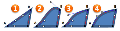
You can see how the angle and length of the A and B handles affect the line segment's curve.
Make the necessary adjustments to the points’ handles to create the desired shape for your object. I recommend removing unnecessary points. For example, if you can achieve the same curve with two points instead of three or four, you’re going to have smoother line segments with fewer points.
As you work with the points, you might find that you need to alter the point type (corner, straight, or smooth). You right-click on a point and select the point type you want. Ellen Finkelstein defined each point type as follows: a corner point allows for a sharp corner, a smooth point allows for a non-sharp corner, and a straight point doesn’t allow for corners. Resetting the point type can fix a problematic point in your shape as you’re editing.
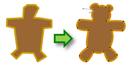
Take the basic structure of the object and edit each point to create the desired shape. I had to reposition some of the points once I got into editing mode.
Step 4 – Add detail layers
Now that you have the main shape in place, you can add more details to your object by layering additional shapes on top of the main image.

I needed to ninja-fy this teddy bear.
Once you’ve finished adding the final touches to your image, I recommend grouping your object so that it stays intact when you reposition or resize it in your slides. If you add an outline to your object, you need to be careful if the object is resized that you adjust the outline’s weight because the line weight will not adjust as you resize the object. You can avoid this issue if you create the outline by drawing instead of just adjusting the shape’s outline thickness or line weight.
Final Words
As I mentioned at the beginning, it can be time-intensive to draw in PowerPoint. You need to have a compelling reason to draw an object because it will take an investment of your time.

Could I have just used this clip art instead? Maybe. Determine upfront whether or not to proceed down the path of drawing.
You don’t need to draw a shape from scratch. One time-saving trick is to convert a shape into a freeform object , and then edit it as I’ve shown in this article. Another tip is to simply edit an existing clip art image so that it better meets your needs. You might even be able to ungroup a clip art image and steal a component of it that you need. PowerPoint ninjas strive to use their time efficiently because it is a precious resource that can’t be squandered or it can lead to problems. Good luck!
- Redmond, We Have a Problem: Freeform Drawing in PowerPoint 2007
- Editing Drawing Shapes in PowerPoint 2007
- How to Create a Sexy Curved Arrow in PowerPoint
- PowerPoint Color Transparency Tip
- PowerPoint Ninja Toolbox: Drawing Guides
Tags: clip art , Drawing , Freeform , Freeform drawing , Graphics , Illustrator , Scribble
Comments (2)
2 Responses to “Drawing in PowerPoint 101”
Great practical tips! Thanks!
[…] Drawing in PowerPoint 101 […]
Leave a Reply
Name (required)
Mail (will not be published) (required)
Comment text
The PowerPoint Ninja Blog covers practical PowerPoint topics, tips, and tricks. If you’re looking to move from PowerPoint apprentice to ninja, subscribe to this RSS today!
| Subscribe via RSS | Subscribe via Email |
- Choose Your PowerPoint Fonts Wisely
- PowerPoint Design Principle #3: Contrast
- Tips for Removing the Background from Images in PowerPoint 2010
- How Recover an Unsaved PowerPoint 2010 File
- 10 Ways to Spot a Lame Corporate PowerPoint Template
SpeakingSherpa
Become an Inspiring Speaker
How To Draw During Your Presentation
Posted on October 22, 2012 Written by admin Leave a Comment
If you want to deliver the most inspiring and motivating presentation possible, then your best choice is to use no slides at all. Doing so allows your audience to keep their eyes on you at all times and to use the visual portion of their brain to imagine how they will apply the amazing advice you are giving.
The second best choice is to draw a simple picture. My personal favorite example is Simon Sinek’s TEDxPugetSound presentation from 2009. At exactly two minutes into his eighteen minute talk, Simon walks to a flip chart, picks up a marker, and draws his famous Golden Circle. Imagine a target with three concentric circles. “WHY” is in the bull’s eye. “HOW” is in the middle circle. In the outer circle is “WHAT.” This simple drawing illustrates how great leaders inspire and how exceptional companies thrive.
Here are some simple public speaking tips for drawing during your presentation:
Tip #1: Make Your Drawings Simple
You do not need to be a great artist to pull this off. Just make your drawing simple, obvious, and legible. Make your text and figures as large as possible.
Tip #2: Pause While Drawing
One of the rules of public speaking is to never turn your back to your audience. There is no way to follow this rule when you draw. If you are drawing on a flip chart, your head is going to be turned away even if you manage to position the rest of your body sideways. Stop speaking while drawing. Your audience will not even notice that you stopped speaking since they will be concentrating on the picture being created.
Tip 3: Draw One Picture Only
Many speakers make the mistake of drawing or writing too much. The audience does not need you to take notes for them. Your entire talk should have one central theme and the one figure you draw should completely express your core message.
Tip 4: Draw In Pieces
Since you will not be speaking while drawing (see Tip #2), you do not want to draw too much at any one time. In Simon Sinek’s TED Talk referenced above, he actually draws out the entire why/how/what Golden Circle all at once. A better way to do this would have been to first draw the the three concentric circles but hold back on the text. Then, he could have written just “WHY” and expanded on that. He could have done the same thing for “HOW” and “WHAT” until the entire drawing was complete.
Tip 5: Remember To Put Your Pen Down When Not Drawing
This one is self-explanatory but you would be surprised at how many speakers hold onto their pen like Linus holding his security blanket.
Tip 6: Hide Your Drawing When You Do Not Need It
For as much good as the drawing does to create a visual representation of your core message, its mere existence takes your audience’s attention away from you. If you are using a flip chart, create your drawing on the second page so you can hide it with a blank first page. If you are using a whiteboard, there is not much you can do. This is the same concept that applies to using the “B” key to blank your slides in PowerPoint and to hiding props when not in use.
Tip 7: Do Not Draw And Use Slides
In speaking, there is such as thing as ‘too much of a good thing.’ Either draw or use slides. Trying to do both is clumsy and suggests that you forgot to put something into a slide.
Try It Out!
Outside of using no slides at all, drawing is one of the most powerful techniques you can use to reinforce your core message. Next time you speak, come up with a simple graphic that you can use to gradually reveal the key points of your talk.
Share this:
Academia.edu no longer supports Internet Explorer.
To browse Academia.edu and the wider internet faster and more securely, please take a few seconds to upgrade your browser .
Enter the email address you signed up with and we'll email you a reset link.
- We're Hiring!
- Help Center

Chapter 41 Presentation Drawings

Related Papers
Md Suzanul Islam Suzan
hrishikesh hkp
khalid mirza
Eric Mallari
Loading Preview
Sorry, preview is currently unavailable. You can download the paper by clicking the button above.
- We're Hiring!
- Help Center
- Find new research papers in:
- Health Sciences
- Earth Sciences
- Cognitive Science
- Mathematics
- Computer Science
- Academia ©2024
Improve your practice.
Enhance your soft skills with a range of award-winning courses.
How to Structure your Presentation, with Examples
August 3, 2018 - Dom Barnard
For many people the thought of delivering a presentation is a daunting task and brings about a great deal of nerves . However, if you take some time to understand how effective presentations are structured and then apply this structure to your own presentation, you’ll appear much more confident and relaxed.
Here is our complete guide for structuring your presentation, with examples at the end of the article to demonstrate these points.
Why is structuring a presentation so important?
If you’ve ever sat through a great presentation, you’ll have left feeling either inspired or informed on a given topic. This isn’t because the speaker was the most knowledgeable or motivating person in the world. Instead, it’s because they know how to structure presentations – they have crafted their message in a logical and simple way that has allowed the audience can keep up with them and take away key messages.
Research has supported this, with studies showing that audiences retain structured information 40% more accurately than unstructured information.
In fact, not only is structuring a presentation important for the benefit of the audience’s understanding, it’s also important for you as the speaker. A good structure helps you remain calm, stay on topic, and avoid any awkward silences.
What will affect your presentation structure?
Generally speaking, there is a natural flow that any decent presentation will follow which we will go into shortly. However, you should be aware that all presentation structures will be different in their own unique way and this will be due to a number of factors, including:
- Whether you need to deliver any demonstrations
- How knowledgeable the audience already is on the given subject
- How much interaction you want from the audience
- Any time constraints there are for your talk
- What setting you are in
- Your ability to use any kinds of visual assistance
Before choosing the presentation’s structure answer these questions first:
- What is your presentation’s aim?
- Who are the audience?
- What are the main points your audience should remember afterwards?
When reading the points below, think critically about what things may cause your presentation structure to be slightly different. You can add in certain elements and add more focus to certain moments if that works better for your speech.

What is the typical presentation structure?
This is the usual flow of a presentation, which covers all the vital sections and is a good starting point for yours. It allows your audience to easily follow along and sets out a solid structure you can add your content to.
1. Greet the audience and introduce yourself
Before you start delivering your talk, introduce yourself to the audience and clarify who you are and your relevant expertise. This does not need to be long or incredibly detailed, but will help build an immediate relationship between you and the audience. It gives you the chance to briefly clarify your expertise and why you are worth listening to. This will help establish your ethos so the audience will trust you more and think you’re credible.
Read our tips on How to Start a Presentation Effectively
2. Introduction
In the introduction you need to explain the subject and purpose of your presentation whilst gaining the audience’s interest and confidence. It’s sometimes helpful to think of your introduction as funnel-shaped to help filter down your topic:
- Introduce your general topic
- Explain your topic area
- State the issues/challenges in this area you will be exploring
- State your presentation’s purpose – this is the basis of your presentation so ensure that you provide a statement explaining how the topic will be treated, for example, “I will argue that…” or maybe you will “compare”, “analyse”, “evaluate”, “describe” etc.
- Provide a statement of what you’re hoping the outcome of the presentation will be, for example, “I’m hoping this will be provide you with…”
- Show a preview of the organisation of your presentation
In this section also explain:
- The length of the talk.
- Signal whether you want audience interaction – some presenters prefer the audience to ask questions throughout whereas others allocate a specific section for this.
- If it applies, inform the audience whether to take notes or whether you will be providing handouts.
The way you structure your introduction can depend on the amount of time you have been given to present: a sales pitch may consist of a quick presentation so you may begin with your conclusion and then provide the evidence. Conversely, a speaker presenting their idea for change in the world would be better suited to start with the evidence and then conclude what this means for the audience.
Keep in mind that the main aim of the introduction is to grab the audience’s attention and connect with them.
3. The main body of your talk
The main body of your talk needs to meet the promises you made in the introduction. Depending on the nature of your presentation, clearly segment the different topics you will be discussing, and then work your way through them one at a time – it’s important for everything to be organised logically for the audience to fully understand. There are many different ways to organise your main points, such as, by priority, theme, chronologically etc.
- Main points should be addressed one by one with supporting evidence and examples.
- Before moving on to the next point you should provide a mini-summary.
- Links should be clearly stated between ideas and you must make it clear when you’re moving onto the next point.
- Allow time for people to take relevant notes and stick to the topics you have prepared beforehand rather than straying too far off topic.
When planning your presentation write a list of main points you want to make and ask yourself “What I am telling the audience? What should they understand from this?” refining your answers this way will help you produce clear messages.
4. Conclusion
In presentations the conclusion is frequently underdeveloped and lacks purpose which is a shame as it’s the best place to reinforce your messages. Typically, your presentation has a specific goal – that could be to convert a number of the audience members into customers, lead to a certain number of enquiries to make people knowledgeable on specific key points, or to motivate them towards a shared goal.
Regardless of what that goal is, be sure to summarise your main points and their implications. This clarifies the overall purpose of your talk and reinforces your reason for being there.
Follow these steps:
- Signal that it’s nearly the end of your presentation, for example, “As we wrap up/as we wind down the talk…”
- Restate the topic and purpose of your presentation – “In this speech I wanted to compare…”
- Summarise the main points, including their implications and conclusions
- Indicate what is next/a call to action/a thought-provoking takeaway
- Move on to the last section
5. Thank the audience and invite questions
Conclude your talk by thanking the audience for their time and invite them to ask any questions they may have. As mentioned earlier, personal circumstances will affect the structure of your presentation.
Many presenters prefer to make the Q&A session the key part of their talk and try to speed through the main body of the presentation. This is totally fine, but it is still best to focus on delivering some sort of initial presentation to set the tone and topics for discussion in the Q&A.

Other common presentation structures
The above was a description of a basic presentation, here are some more specific presentation layouts:
Demonstration
Use the demonstration structure when you have something useful to show. This is usually used when you want to show how a product works. Steve Jobs frequently used this technique in his presentations.
- Explain why the product is valuable.
- Describe why the product is necessary.
- Explain what problems it can solve for the audience.
- Demonstrate the product to support what you’ve been saying.
- Make suggestions of other things it can do to make the audience curious.
Problem-solution
This structure is particularly useful in persuading the audience.
- Briefly frame the issue.
- Go into the issue in detail showing why it ‘s such a problem. Use logos and pathos for this – the logical and emotional appeals.
- Provide the solution and explain why this would also help the audience.
- Call to action – something you want the audience to do which is straightforward and pertinent to the solution.
Storytelling
As well as incorporating stories in your presentation , you can organise your whole presentation as a story. There are lots of different type of story structures you can use – a popular choice is the monomyth – the hero’s journey. In a monomyth, a hero goes on a difficult journey or takes on a challenge – they move from the familiar into the unknown. After facing obstacles and ultimately succeeding the hero returns home, transformed and with newfound wisdom.
Storytelling for Business Success webinar , where well-know storyteller Javier Bernad shares strategies for crafting compelling narratives.
Another popular choice for using a story to structure your presentation is in media ras (in the middle of thing). In this type of story you launch right into the action by providing a snippet/teaser of what’s happening and then you start explaining the events that led to that event. This is engaging because you’re starting your story at the most exciting part which will make the audience curious – they’ll want to know how you got there.
- Great storytelling: Examples from Alibaba Founder, Jack Ma
Remaining method
The remaining method structure is good for situations where you’re presenting your perspective on a controversial topic which has split people’s opinions.
- Go into the issue in detail showing why it’s such a problem – use logos and pathos.
- Rebut your opponents’ solutions – explain why their solutions could be useful because the audience will see this as fair and will therefore think you’re trustworthy, and then explain why you think these solutions are not valid.
- After you’ve presented all the alternatives provide your solution, the remaining solution. This is very persuasive because it looks like the winning idea, especially with the audience believing that you’re fair and trustworthy.
Transitions
When delivering presentations it’s important for your words and ideas to flow so your audience can understand how everything links together and why it’s all relevant. This can be done using speech transitions which are words and phrases that allow you to smoothly move from one point to another so that your speech flows and your presentation is unified.
Transitions can be one word, a phrase or a full sentence – there are many different forms, here are some examples:
Moving from the introduction to the first point
Signify to the audience that you will now begin discussing the first main point:
- Now that you’re aware of the overview, let’s begin with…
- First, let’s begin with…
- I will first cover…
- My first point covers…
- To get started, let’s look at…
Shifting between similar points
Move from one point to a similar one:
- In the same way…
- Likewise…
- Equally…
- This is similar to…
- Similarly…
Internal summaries
Internal summarising consists of summarising before moving on to the next point. You must inform the audience:
- What part of the presentation you covered – “In the first part of this speech we’ve covered…”
- What the key points were – “Precisely how…”
- How this links in with the overall presentation – “So that’s the context…”
- What you’re moving on to – “Now I’d like to move on to the second part of presentation which looks at…”
Physical movement
You can move your body and your standing location when you transition to another point. The audience find it easier to follow your presentation and movement will increase their interest.
A common technique for incorporating movement into your presentation is to:
- Start your introduction by standing in the centre of the stage.
- For your first point you stand on the left side of the stage.
- You discuss your second point from the centre again.
- You stand on the right side of the stage for your third point.
- The conclusion occurs in the centre.
Key slides for your presentation
Slides are a useful tool for most presentations: they can greatly assist in the delivery of your message and help the audience follow along with what you are saying. Key slides include:
- An intro slide outlining your ideas
- A summary slide with core points to remember
- High quality image slides to supplement what you are saying
There are some presenters who choose not to use slides at all, though this is more of a rarity. Slides can be a powerful tool if used properly, but the problem is that many fail to do just that. Here are some golden rules to follow when using slides in a presentation:
- Don’t over fill them – your slides are there to assist your speech, rather than be the focal point. They should have as little information as possible, to avoid distracting people from your talk.
- A picture says a thousand words – instead of filling a slide with text, instead, focus on one or two images or diagrams to help support and explain the point you are discussing at that time.
- Make them readable – depending on the size of your audience, some may not be able to see small text or images, so make everything large enough to fill the space.
- Don’t rush through slides – give the audience enough time to digest each slide.
Guy Kawasaki, an entrepreneur and author, suggests that slideshows should follow a 10-20-30 rule :
- There should be a maximum of 10 slides – people rarely remember more than one concept afterwards so there’s no point overwhelming them with unnecessary information.
- The presentation should last no longer than 20 minutes as this will leave time for questions and discussion.
- The font size should be a minimum of 30pt because the audience reads faster than you talk so less information on the slides means that there is less chance of the audience being distracted.
Here are some additional resources for slide design:
- 7 design tips for effective, beautiful PowerPoint presentations
- 11 design tips for beautiful presentations
- 10 tips on how to make slides that communicate your idea
Group Presentations
Group presentations are structured in the same way as presentations with one speaker but usually require more rehearsal and practices. Clean transitioning between speakers is very important in producing a presentation that flows well. One way of doing this consists of:
- Briefly recap on what you covered in your section: “So that was a brief introduction on what health anxiety is and how it can affect somebody”
- Introduce the next speaker in the team and explain what they will discuss: “Now Elnaz will talk about the prevalence of health anxiety.”
- Then end by looking at the next speaker, gesturing towards them and saying their name: “Elnaz”.
- The next speaker should acknowledge this with a quick: “Thank you Joe.”
From this example you can see how the different sections of the presentations link which makes it easier for the audience to follow and remain engaged.
Example of great presentation structure and delivery
Having examples of great presentations will help inspire your own structures, here are a few such examples, each unique and inspiring in their own way.
How Google Works – by Eric Schmidt
This presentation by ex-Google CEO Eric Schmidt demonstrates some of the most important lessons he and his team have learnt with regards to working with some of the most talented individuals they hired. The simplistic yet cohesive style of all of the slides is something to be appreciated. They are relatively straightforward, yet add power and clarity to the narrative of the presentation.
Start with why – by Simon Sinek
Since being released in 2009, this presentation has been viewed almost four million times all around the world. The message itself is very powerful, however, it’s not an idea that hasn’t been heard before. What makes this presentation so powerful is the simple message he is getting across, and the straightforward and understandable manner in which he delivers it. Also note that he doesn’t use any slides, just a whiteboard where he creates a simple diagram of his opinion.
The Wisdom of a Third Grade Dropout – by Rick Rigsby
Here’s an example of a presentation given by a relatively unknown individual looking to inspire the next generation of graduates. Rick’s presentation is unique in many ways compared to the two above. Notably, he uses no visual prompts and includes a great deal of humour.
However, what is similar is the structure he uses. He first introduces his message that the wisest man he knew was a third-grade dropout. He then proceeds to deliver his main body of argument, and in the end, concludes with his message. This powerful speech keeps the viewer engaged throughout, through a mixture of heart-warming sentiment, powerful life advice and engaging humour.
As you can see from the examples above, and as it has been expressed throughout, a great presentation structure means analysing the core message of your presentation. Decide on a key message you want to impart the audience with, and then craft an engaging way of delivering it.
By preparing a solid structure, and practising your talk beforehand, you can walk into the presentation with confidence and deliver a meaningful message to an interested audience.
It’s important for a presentation to be well-structured so it can have the most impact on your audience. An unstructured presentation can be difficult to follow and even frustrating to listen to. The heart of your speech are your main points supported by evidence and your transitions should assist the movement between points and clarify how everything is linked.
Research suggests that the audience remember the first and last things you say so your introduction and conclusion are vital for reinforcing your points. Essentially, ensure you spend the time structuring your presentation and addressing all of the sections.
Plan, Section, Elevation Architectural Drawings Explained
by Jorge Fontan | Last updated Jul 3, 2023 | Architects , Architectural Services , General Architecture
Plan, Section, and Elevation are different types of drawings used by architects to graphically represent a building design and construction. A plan drawing is a drawing on a horizontal plane showing a view from above. An Elevation drawing is drawn on a vertical plane showing a vertical depiction. A section drawing is also a vertical depiction, but one that cuts through space to show what lies within.
I am Jorge Fontan, an architect in New York and owner of Fontan Architecture . In this post, I will review some of the basic concepts of architectural drawing.
Plan Drawing Definition
Plan drawings are specific drawings architects use to illustrate a building or portion of a building. A plan is drawn from a horizontal plane looking down from above. This is as if you sliced through a space horizontally and stood over looking down on it. Plans are a common design drawing and technical architectural or engineering convention for graphic representation of architecture. With the exception of plan perspectives, plan drawings are orthographic projections. This means they are not drawn in perspective and there is no foreshortening.
There are different types of plan drawings:
- Plan Callout or Blow Up Plan
- Plan Detail
- Reflected Ceiling Plan or RCP
- Plan Perspective
Plan Drawings
A plan drawing shows a view from above. This is often used to depict the layout of a building, showing locations of rooms and windows, walls, doors, stairs etc. Although plan drawings can be drawn from above, they are often drawn cutting through the building with horizontal plane. The plan is typically cut at a height of about 4 feet, but the architect drawing the plan may cut it at a different height. This means that you have an imaginary plane cutting through the building at an elevation of 4 feet above the floor. Therefore, you see in the cut anything that the plane passes through.
Plan Callouts
Another common architectural convention is the use of plan callouts. A callout is an area within the plan that is drawn at a larger scale. For example, if I have a floor plan at 1/4″ = 1′-0″ scale of a house, I might have a callout of the kitchen and bathrooms, showing them at 1/2″ = 1′-0″ scale. Half inch scale is twice as large as quarter inch scale.
Plan Details
Details in architectural drawings are large scale drawings that typically show how something is built. Details identify all the materials and connections for construction. Details are normally 3/4″ = 1′-0″ or larger. Plan details are drawn in a plan view at a large scale to show the construction.
A site plan may or may not be drawn cutting through the building. A site plan is going to show more than just the building, including the entire site the building is located on. This can show the property lines, the building location, utilities, roads, landscape etc. A site plan will most typically be drawn from above the building, as if showing a roof plan of the building within the site plan. Sometimes the site plan can be drawn as a first floor plan being cut through the first floor. This is done to show the relationship from the exterior of the building to the interior entrance.
Roof Plan
A Roof Plan is a plan of a building or house that is not cutting through the building but drawn from above. This shows everything on top of the building including the roof layout, stair bulkheads, parapets, and potentially roof equipment.
Reflected Ceiling Plan (RCP)
A Reflected Ceiling Plan is a plan of the ceiling within a space. This is drawn looking down as if there is a mirror on the floor reflecting the ceiling. The reflected ceiling plan is often referred to as an RCP. This architectural drawing will show things light lighting, structure, ceiling heights, soffits, etc…. When I was in my first semester of architecture school the RCP was the hardest drawing for me to understand but it makes perfect sense once you get it.
Plan Perspectives
A plan perspective is a drawing of a plan but shown in perspective. This is more of a design drawing meant to show what the space is going to look like and less how the space will be built.
Elevation Drawing Definition
Elevation drawings are a specific type of drawing architects use to illustrate a building or portion of a building. An Elevation is drawn from a vertical plane looking straight on to a building facade or interior surface. This is as if you directly in front of a building and looked straight at it. Elevations are a common design drawing and technical architectural or engineering convention for graphic representation of architecture. Elevation drawings are orthographic projections. This means they are not drawn in perspective and there is no foreshortening.
There are different types of Elevation Drawings:
- Interior Elevation
- Elevation Call Out
- Elevation Detail
Section Drawing Definition
Section drawings are a specific type of drawing architects use to illustrate a building or portion of a building. A section is drawn from a vertical plane slicing through a building. This is as if you cut through a space vertically and stood directly in front looking straight at it. Sections are a common design drawing and technical architectural or engineering convention for graphic representation of architecture. Section drawings are orthographic projections (with the exception of section perspectives). This means they are not drawn in perspective and there is no foreshortening.
There are different types of section drawings:
- Section Callout or Blow Up Section
Plan Section Elevation Drawings
As an architect, I study drawing closely, but these are complicated and quite involved issues. In this article, we reviewed some of the basic concepts with regards to Plan, Section, Elevation Drawings in Architecture. This post does not assume to cover every possible issue or condition, but provide a general overview of the topic.
If you would like to read about the architectural process we have another post you can check out on How to Start an Architectural Design .
Thank you for reading our blog post on Plan, Section, Elevation Architectural Drawings.
I hope this was helpful. Please leave questions and comments below. If you would like to speak with an architect, you can contact us directly.
Contact Fontan Architecture
This post was written by Jorge Fontan AIA a Registered Architect and owner of New York City architecture firm Fontan Architecture. Jorge Fontan has earned 3 degrees in the study of architecture including two degrees from the City University of New York and a Masters Degree in Advanced Architectural Design from Columbia University. Jorge has a background in construction and has been practicing architecture for 20 years where he has designed renovations and new developments of various building types.
Related Posts
5 architecture phases of design explained, how i became an architect.
- Apartment Renovations (58)
- Architects (14)
- Architectural Services (5)
- Bathroom Design (13)
- Brownstones & Townhouses (6)
- Building Conversions (4)
- Building Systems (1)
- Commercial (16)
- Construction Practices (7)
- General Architecture (24)
- Home Design (11)
- Interior Design (41)
- Kitchen Design (8)
- Landmarks (7)
- Local Law 11 / FISP (11)
- Luxury Interiors (2)
- Materials & Finishes (5)
- Multifamily Residential (10)
- New Building Design (6)
- New York City (24)
- NYC DOB (53)
- NYC Zoning (227)
- Property Development (62)
- Renovations (43)
- Residential (9)
- Restoration (1)
- Sustainable Design (13)
- Uncategorized (1)
- History & Society
- Science & Tech
- Biographies
- Animals & Nature
- Geography & Travel
- Arts & Culture
- Games & Quizzes
- On This Day
- One Good Fact
- New Articles
- Lifestyles & Social Issues
- Philosophy & Religion
- Politics, Law & Government
- World History
- Health & Medicine
- Browse Biographies
- Birds, Reptiles & Other Vertebrates
- Bugs, Mollusks & Other Invertebrates
- Environment
- Fossils & Geologic Time
- Entertainment & Pop Culture
- Sports & Recreation
- Visual Arts
- Demystified
- Image Galleries
- Infographics
- Top Questions
- Britannica Kids
- Saving Earth
- Space Next 50
- Student Center
- Introduction
- Plane techniques
- The drawing surface
- Relationship between drawing and other art forms
- Metalpoints
- Graphite point
- Coloured crayons
- Incised drawing
- Pen drawings
- Brush drawings
- Combinations of various techniques
- Mechanical devices
- Applied drawings
- Figure compositions and still lifes
- Fanciful and nonrepresentational drawings
- Artistic architectural drawings
- 14th, 15th, and 16th centuries
- 17th, 18th, and 19th centuries

Our editors will review what you’ve submitted and determine whether to revise the article.
- The Met - How is a Drawing Made?
- Oregon State University - College of Engineering - The Importance of Drawing
- Boise State Pressbooks - Introduction To Art - Drawing
- Smarthistory - Preparatory Drawing During the Italian Renaissance, an Introduction
- Art in Context - Drawing Styles – Finding Your Unique Sketching Style
- The Canadian Encyclopedia - Drawing
- Humanities LibreTexts - Drawing
- University of Wisconsin-Madison Extension - Drawing and Painting
- drawing - Children's Encyclopedia (Ages 8-11)
- drawing - Student Encyclopedia (Ages 11 and up)
- Table Of Contents

drawing , the art or technique of producing images on a surface, usually paper , by means of marks, usually of ink , graphite , chalk, charcoal , or crayon .
Drawing as formal artistic creation might be defined as the primarily linear rendition of objects in the visible world, as well as of concepts , thoughts, attitudes, emotions, and fantasies given visual form, of symbols and even of abstract forms. This definition, however, applies to all graphic arts and techniques that are characterized by an emphasis on form or shape rather than mass and colour, as in painting. Drawing as such differs from graphic printing processes in that a direct relationship exists between production and result. Drawing, in short, is the end product of a successive effort applied directly to the carrier. Whereas a drawing may form the basis for reproduction or copying, it is nonetheless unique by its very nature.

Although not every artwork has been preceded by a drawing in the form of a preliminary sketch , drawing is in effect the basis of all visual arts. Often the drawing is absorbed by the completed work or destroyed in the course of completion. Thus, the usefulness of a ground plan drawing of a building that is to be erected decreases as the building goes up. Similarly, points and lines marked on a raw stone block represent auxiliary drawings for the sculpture that will be hewn out of the material. Essentially, every painting is built up of lines and pre-sketched in its main contours ; only as the work proceeds is it consolidated into coloured surfaces. As shown by an increasing number of findings and investigations, drawings form the material basis of mural, panel, and book paintings. Such preliminary sketches may merely indicate the main contours or may predetermine the final execution down to exact details. They may also be mere probing sketches. Long before the appearance of actual small-scale drawing, this procedure was much used for monumental murals. With sinopia —the preliminary sketch found on a layer of its own on the wall underneath the fresco, or painting on freshly spread, moist plaster—one reaches the point at which a work that merely served as technical preparation becomes a formal drawing expressing an artistic intention.
Not until the late 14th century, however, did drawing come into its own—no longer necessarily subordinate, conceptually or materially, to another art form. Autonomous , or independent, drawings, as the name implies, are themselves the ultimate aim of an artistic effort; therefore, they are usually characterized by a pictorial structure and by precise execution down to details.
Formally, drawing offers the widest possible scope for the expression of artistic intentions. Bodies, space, depth, substantiality, and even motion can be made visible through drawing. Furthermore, because of the immediacy of its statement, drawing expresses the draftsperson’s personality spontaneously in the flow of the line; it is, in fact, the most personal of all artistic statements. It is thus plausible that the esteem in which drawing was held should have developed parallel to the value placed on individual artistic talent. Ever since the Renaissance, drawing has gradually been losing its anonymous and utilitarian status in the eyes of artists and the public, and its documents have been increasingly valued and collected.
This article deals with the aesthetic characteristics, the mediums of expression, the subject matter, and the history of drawing.
Presentation Drawings
- To get a better picture in your own mind of how your new extension, building or development is going to look, just so you have the peace of mind that you are doing the right thing.
- To fully communicate the idea and feel of your new building or development to the planning department, planning committee or other interested parties. We have been asked in the past to help with another consultant’s planning application, which kept being refused planning permission – once we had given the proposal some life and realistic perspective, planning permission was granted without further ado.
- Where you are building a new house or development and you would like to sell ‘off-plan’ – we can show how your building is goiong to look once completed, from a bird’s eye view to see the whole site, or from a person’s perspective when standing in the garden or street.
You can see a couple of examples of these on our News page. Call us on 01903 205868 to discuss your requirements and see what we can do for you, or visit our Contact page to send us an email.
The Definition of Perspective in Drawing
- Fine Arts & Crafts
- Frugal Living
- Card Games & Gambling
- Cars & Motorcycles
- Playing Music
Perspective is what gives a three-dimensional feeling to a flat image such as a drawing or a painting. In art, it is a system of representing the way that objects appear to get smaller and closer together the farther away they are from the viewer.
Perspective is key to almost any drawing or sketch as well as many paintings. It is one of the fundamentals that you need to understand in order to create realistic and believable scenes.
Artists known for their use of perspective include Masaccio, a Renaissance painter who developed a realistic style by being among the first to apply the rules of perspective; Johannes Vermeer, a Dutch artist whose carefully lighted interiors often make clever use of perspective; and Gustave Caillebotte, whose "Paris Street, Rainy Day" is a powerful demonstration of two-point perspective.
Key Takeaways: Perspective
• Perspective is used to represent the ways objects appear smaller as they move farther into the distance. It adds depth and dimension to flat images.
• In art, there are three types of perspective: one-point, two-point, and three-point.
• Mathematical perspective in art was developed during the Italian Renaissance during the 1400s.
What Does Perspective Look Like?
Imagine driving along a very straight open road on a grassy plain. The road, the fences, and the power-poles all diminish toward a single point far ahead of you. That's single-point perspective.
Single- or one-point perspective is the simplest method of making objects look three-dimensional. It is often used for interior views or trompe l'oeil (fool the eye) effects. Objects must be placed so that the front sides are parallel to the picture plane, with the side edges receding toward a single point.
A perfect example is Da Vinci's "Adoration of the Magi." The building in the background faces the viewer, and the stairs and the side walls get smaller as they move toward a single point in the center of the painting.
Linear Perspective
When we talk about perspective drawing, we usually mean linear perspective. Linear perspective is a geometric method of representing the apparent diminishment of scale as the distance between an object and the viewer increases. Each set of horizontal lines has its own vanishing point . For simplicity, artists usually focus on correctly rendering one, two, or three vanishing points.
The invention of linear perspective in art is generally attributed to the Florentine architect Brunelleschi. His ideas continued to be developed and used by Renaissance artists, notably Piero Della Francesca and Andrea Mantegna. The first book to include a treatise on perspective, "On Painting," was published by Leon Battista Alberti in 1436.
One-Point Perspective
In one-point perspective, the vertical lines that run across the field of view remain parallel, as their vanishing points are at "infinity." The horizontal lines, however, which are perpendicular to the viewer, vanish toward a single point at the center of the image.
If you are experimenting with perspective, you can practice one-point perspective by doing this:
- Draw a straight line across the middle of your drawing. This is your horizon line. Locate a point along this line—it may be in the center, though it does not have to be—and mark it. This is your vanishing point.
- Draw the facade of a simple building to the right of the vanishing point.
- Using a ruler, draw a soft line from the top-left corner of the building to the vanishing point. Then draw another line from the bottom-left corner to the vanishing point. These lines show how the building will get smaller as it gets farther away from the viewer.
- Locate the end of the building somewhere along the lines you have just sketched. Mark it by drawing a line parallel to the building's facade. Erase the remaining line segments that connect to the vanishing point.
- Using the same method, add other buildings to the drawing.
Two-Point Perspective
In two-point perspective, the viewer is positioned so that the objects in the drawing or painting are viewed from one corner. This creates two sets of horizontals which diminish toward vanishing points at the outer edges of the picture plane, leaving only verticals perpendicular.
It is slightly more complex, as both the front and back edges and the side edges of an object must diminish toward vanishing points. Two-point perspective is often used when drawing buildings in landscapes.
Two-point perspective uses the same method described above. The main difference is that the viewer is looking from one corner rather than head-on. For this reason, you cannot begin the drawing with the building's facade. You must first draw the line that forms the corner of the building, then use one of the vanishing points to complete the facade.
Three-Point Perspective
In three-point perspective , the viewer is looking up or down so that the verticals also converge on a vanishing point at the top or bottom of the image. This is the most complex form of perspective. Unlike in one-point and two-point perspective, none of the lines in the drawing are perpendicular to the viewer. Instead, each one is drawn in the direction of a certain vanishing point. If you were drawing a building using three-point perspective, you would need to begin with only a single point located on the building, then use the vanishing points to define each side of the structure.
- Follow the Basic Rules and Principles to Create Great Art
- What Is 'Line' in Drawing?
- What Is a Vanishing Point in Art?
- What Are Orthogonal Lines in Drawing?
- How the Horizon Line Controls Perspective in Art
- What is a Working Drawing?
- Crosshatching - What is Crosshatching?
- 7 Steps to Setting Up for a Still Life Drawing
- Beginner Art and Drawing Lessons
- How to Use Negative Space
- What Is Contour Line in Drawing?
- Charcoal Art Fixative: The Controversy Explained
- What Is Hatching?
- Drawings of Angel Wings For Your Angelic Art
- Things to Draw: Objects and Still Life
- What is a Blending Stump or Tortillon?
COMMENTS
Presentation drawing in architecture is a creative visual form of communication used to convey information about buildings, structures, and other aspects of the built environment. It is an important part of the architect's skill set and allows them to effectively communicate their ideas. Presentation drawing is used to demonstrate a building ...
Presentation drawing is an essential aspect of the design process. It allows designers to communicate their ideas in a clear and compelling way and is crucial for getting buy-in from clients, colleagues, and contractors. Whether you're creating quick sketches or detailed renderings, there are a few key principles to keep in mind that can help ...
5. Impact on the Overall Project. Presentation drawings are the drawings that architects make to show the client their ideas for a building. Usually this includes the exterior design of the building, as well as details such as the materials used, the layout of the interior space, and sometimes even the furniture that will be used inside.
Produce architectural digital presentation drawings that effectively communicate the depth or 3rd dimension of an object, as well as material finishes and textures. ... Clearly define the purpose and objectives of the presentation at the outset. Consistent Visual Language: Maintain a consistent visual language throughout the presentation ...
For presentation plan drawings the necessary annotations are minimal. They include section tags, drawing titles, north arrows and scale notations. The sizes noted below are recommendations for 1/8" scale plans. If you are printing to a different scale, it is recommended that you adjust the sizes of the graphics.
Presentation drawings were finished, non-utilitarian works of art, as opposed to preparatory drawings for a work in another medium. The earliest known presentation drawings dating from the Italian Renaissance are two drawings of the 1420s by Lorenzo Monaco. From: presentation drawing in The Concise Oxford Dictionary of Art Terms ».
Presentation Drawings. The purpose of presentation drawings is to present the proposed building or facility in an attractive setting at the proposed site for promotional purposes. They usually consist of perspective views complete with colors and shading, although they may also contain nicely drawn elevation views with shadows and landscaping. ...
1. Drawing Improves Memory and Recall. Drawing engages both the visual and motor cortex of the brain, which enhances memory retention. When you draw during a presentation, you create a visual memory for yourself and your audience, making the information more memorable.
Define your objective: Clearly define the purpose of your presentation and the main ideas or arguments you want to convey. Organize your material: Gather and organize your material in a logical and coherent manner that supports your objectives. This may include drawings, images, models, diagrams, and text.
Presentation Drawings. Architectural presentation drawings are a type of drawing that is used to communicate an architect's design concept to a client. Presentation drawings are typically more detailed and polished than working drawings, and they often include elements such as colour, shading, and perspective in order to help visualize the ...
The single line drawing presentation styles is used extensively these days, where the presentation appears to be more an info-graphic than an architectural drawing. This style is used mostly when the 3D view expresses the major portion of the design and the elevation and section drawings are merely present for further understanding. Often ...
Winning a project bid requires architectural presentation drawings that demonstrate to the potential client the merits of the structure's design concept and is a direct indication of an architectural firm's skill in creativity and technical ability. Poorly drafted presentation drawings can result in losing great projects to other firms. We offer four different avenues to presenting your ...
We BACK! Draw with me! I hope you caught the livestream! Today, we cover How to make a Presentation Sketch like An Industrial Designer. Grab whatever youve g...
The first step is to draw the outline of the desired shape using the Freeform shape tool. In PowerPoint 2007, you'll find the Freeform shape on the Ribbon under the Insert tab > Shapes button. Drawing is as simple as left clicking to start drawing, clicking or adding a point whenever you want to change direction, and then closing the object ...
Here are some simple public speaking tips for drawing during your presentation: Tip #1: Make Your Drawings Simple. You do not need to be a great artist to pull this off. Just make your drawing simple, obvious, and legible. Make your text and figures as large as possible. Tip #2: Pause While Drawing.
An architectural drawing or architect's drawing is a technical drawing of a building (or building project) that falls within the definition of architecture.Architectural drawings are used by architects and others for a number of purposes: to develop a design idea into a coherent proposal, to communicate ideas and concepts, to convince clients of the merits of a design, to assist a building ...
Figure 41-13 shows an example of a freehand rendering. In addition to line methods, many styles of lettering are used on presentation drawings. Lettering may be placed with mechanical methods such as a lettering guide or rub-ons. Many illustrations are lettered with freehand lettering similar to Figure 41-14.
This clarifies the overall purpose of your talk and reinforces your reason for being there. Follow these steps: Signal that it's nearly the end of your presentation, for example, "As we wrap up/as we wind down the talk…". Restate the topic and purpose of your presentation - "In this speech I wanted to compare…". 5.
A plan perspective is a drawing of a plan but shown in perspective. This is more of a design drawing meant to show what the space is going to look like and less how the space will be built. Elevation Drawing Definition. Elevation drawings are a specific type of drawing architects use to illustrate a building or portion of a building.
Presentation skills are the abilities and qualities necessary for creating and delivering a compelling presentation that effectively communicates information and ideas. They encompass what you say, how you structure it, and the materials you include to support what you say, such as slides, videos, or images. You'll make presentations at various ...
drawing, the art or technique of producing images on a surface, usually paper, by means of marks, usually of ink, graphite, chalk, charcoal, or crayon.. Drawing as formal artistic creation might be defined as the primarily linear rendition of objects in the visible world, as well as of concepts, thoughts, attitudes, emotions, and fantasies given visual form, of symbols and even of abstract forms.
Presentation Drawings. We are often called upon to produce drawings and images of new buildings or developments, showing how they are intended to look once completed. These can be useful in the following situations: To get a better picture in your own mind of how your new extension, building or development is going to look, just so you have the ...
Updated on 05/05/19. Perspective is what gives a three-dimensional feeling to a flat image such as a drawing or a painting. In art, it is a system of representing the way that objects appear to get smaller and closer together the farther away they are from the viewer. Perspective is key to almost any drawing or sketch as well as many paintings.
Follow the Ladies' Singles draw at the 2024 Wimbledon Championships. View results and upcoming matches for your favourite players. Download the printable PDF. ... Alfie Hewett | Final Post-match Interview & Trophy Presentation. 02:03. video. SUN 14 JUL 2024 12:39 BST. Alfie Hewett becomes the 2024 Gentlemen's Wheelchair Singles Champion. 08:45 ...